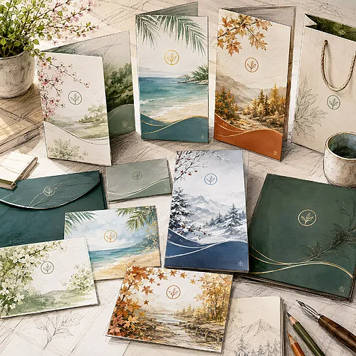
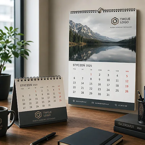
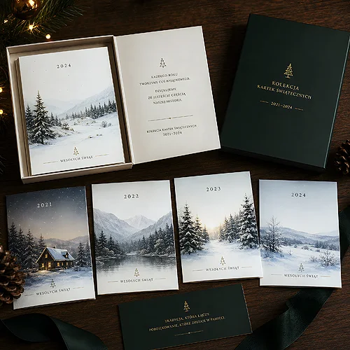
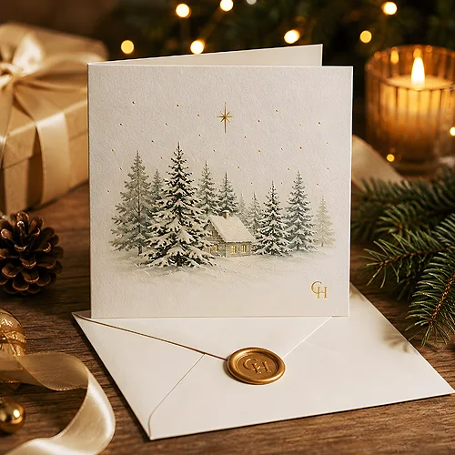
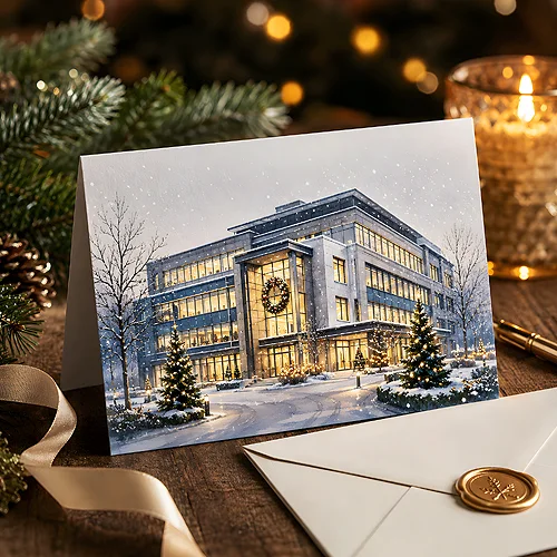
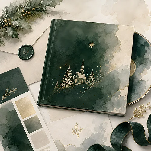
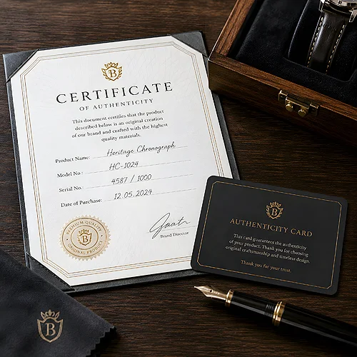
These articles share one observation. A brand shows up in details nobody plans separately. In the layout of a label. In the material a memory stick is made from. In packaging a customer keeps instead of throwing away. And in whether all your printed pieces look as if they came from the same place.
Consistency beats a new logo
The theme that returns most often is order. A recognisable style can be built on what you already have. Set a few constants and keep to them everywhere. It is not about a rigid rulebook, more about a customer recognising the next piece as part of the same whole.
- One place for the current logo and artwork, so an old version never reaches print.
- A repeatable way of marking ranges, editions and product variants.
- A fixed set of colours and lettering, small items included.
- The same paper and finish across pieces a customer receives together.
- Customer reviews always presented in a similar way.
A brand you can pick up
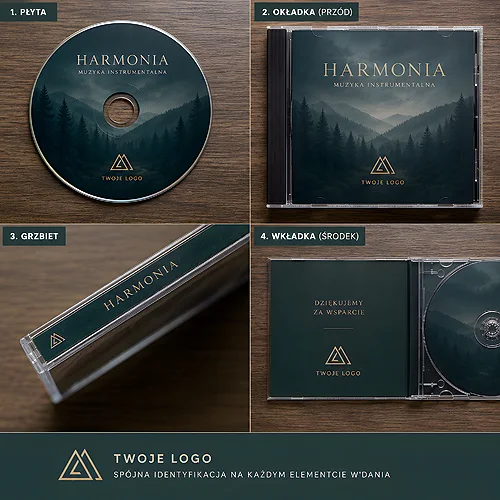
The second large group is about objects. The way paper or a small gift feels in the hand says something about a brand faster than a slogan. Hence the pieces on memory sticks in wood, metal or plastic, on keyrings matched to an industry, on printed packaging and on a disc sleeve used as advertising space. Hospitality has a thread of its own: welcome sets, key card holders, printed local guides and a branded disc playing in the background.
A good starting point is the article on building a style without touching the logo. After that, read about whatever you are ordering - packaging, a gift or materials for guests.