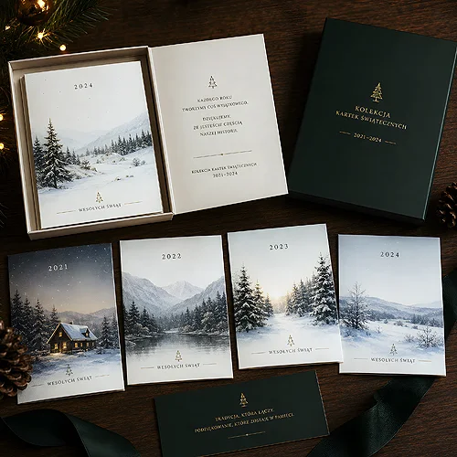
A photo shows how something looks. An illustration shows how something is meant to feel. It is a subtle but crucial difference - and that is exactly why a drawing can do for a brand what no photograph will achieve. It gives character, builds its own world, stands out in a sea of identical product photos.
But illustration does not fit everywhere. For one company it will be a bullseye, for another - a stylistic mistake that undermines the customer's trust. The secret is to know when to reach for a drawing and when to stay with a photo. Below we show which brands illustration suits best, how to choose its style and how to use it in print.
- Illustration builds a brand's own unique style - everyone has a stock photo, nobody has your drawing.
- It works best where character, emotion and personality matter more than a literal picture of the product.
- It suits creative, children's and atmospheric hospitality brands, and brands with a clear message.
- The drawing style must match the brand's tone - different for an elegant company, different for a fun and friendly one.
- In print, illustration gives an edge: it stays sharp at any scale and is easy to keep consistent.
What illustration gives a brand that a photo does not
The greatest advantage of a drawing is uniqueness. A photo, even a good one, can be bought by the competition - the same libraries are available to everyone. An illustration created in a specific style is yours alone. It is what makes a customer recognise, at a single glance, that the material belongs to your brand, even without a logo.
A drawing also gives full control over the message. A photo shows reality as it is - with all its clutter. An illustration shows exactly what you want, and only that. You can simplify a complex service into a clear image, show something abstract or build a mood that cannot be photographed.
- Standing out - your own style that nobody can copy with a single click.
- Simplification - you turn difficult concepts and processes into a clear, friendly image.
- Emotion and warmth - a drawing can be more approachable and likeable than a cold photograph.
- Coherence - it is easy to keep one style across all materials, from business cards to a poster.
Which brands illustration suits best
Not every company will gain from a drawing, but there are a few types of brands for which illustration is an almost natural choice. They share one thing: character and emotion matter more to them than literal realism.
Creative and lifestyle brands
Design studios, agencies, fashion brands, atmospheric cafes, handmade goods - everywhere here illustration underlines that the company has its own taste and idea for itself. Customers of these industries actually expect an expressive style, and a drawing delivers it in its purest form.
Products and services for children and families
Nurseries, children's products, family events, educational brands - illustration here is warm, safe and friendly. A drawn character builds affection faster than any photo and easily becomes a recognisable symbol of the brand.
Hospitality and HoReCa with character
Venues that build a mood happily reach for a drawing on menu cards and materials. An illustrated menu, hand-drawn dish icons or a decorative motif on the wall give an atmosphere that a photo of the food cannot always carry. This works brilliantly in places that sell an experience, not just a meal. A drawing has the most room on a folded menu card, where the motif can come back on the following panels.
Before ordering illustrations, check whether your brand rests on emotion and character, or on trust and specifics. If the customer buys credibility above all - as in finance, medicine or engineering - consider a good photo instead. Leave the drawing where personality matters.
When it is better to stay with a photo
To be fair, there are industries where illustration can do harm. Everywhere the customer buys trust and specifics above all, a drawing can be seen as less serious. Real estate, technical equipment, medical or legal services, premium products whose feel and material matter - here photography builds credibility, and illustration can blur it.
This does not mean a drawing is forbidden there. It is about proportion. Even a serious company can use illustration as an accent - to explain a process, for icons or to enliven a brochure. The key is to show the core of the message, that is the product or the work, credibly, and only support it with a drawing. We cover how the choice of style follows from a company's personality in our post on whether a brand is elegant, friendly or bold.
How to match the illustration style to the brand
Choosing a drawing is only the beginning - what matters is what kind of drawing. The same product drawn in two different styles will say something entirely different about the brand. The choice of style should follow from the brand's tone, not from a passing trend. It is worth going through a few steps in order.
- Name the brand's tone - elegant, friendly, bold? This is the first decision the rest depends on.
- Choose one line style - matched to the tone, not to whatever is currently in fashion.
- Set the palette - the illustration's colours tied to the brand colours give instant coherence.
- Check on a proof - see the drawing at a small and a large format before ordering the whole set.
The styles below are the most common starting points to choose from.
- Linear and minimalist - a thin line, plenty of air. Suits elegant, modern, technological brands.
- Flat and colourful - simple shapes, vivid colours. Universal, friendly, good for services and startups.
- Hand-drawn and organic - a visible line, a warm character. Ideal for handmade goods, cafes, brands with soul.
- Rich and decorative - details, ornaments, an expressive style. For premium brands and special events.
Whichever style you choose, stick to it consistently across all materials. Drawings in three different styles on three leaflets will undo the effect of coherence faster than they build it. It is also worth remembering that today illustration is often combined with photography and generated graphics - we cover what suits advertising in our post on product photo, illustration or AI graphics.
Illustration in print - what to remember
A drawing has one great advantage over a photo in print: if it was made as vector graphics, it stays perfectly sharp at any scale. You can print the same logo or illustration without loss of quality on a business card and on a poster. You do not have to worry about resolution or pixelation - the line is equally clean at any size.
It is worth taking care of a few technical things, though. Prepare the illustration's colours with print in mind, because a colour from the screen can look different on paper. Watch out for thin lines and small details that may merge at a small format. If the illustration has a background reaching the edge, bleeds will be needed. If in doubt, reach for our help with file preparation, so the drawing on paper looks as good as on the screen.
Illustration is not decoration but a strategic choice. For brands that live on character and emotion, it can be the fastest route to standing out. For those that sell specifics and trust, a good photograph remains the better partner. When you match the style to the company's personality and take care of coherence, a drawing will start working for the brand on every print that reaches the customer's hands.