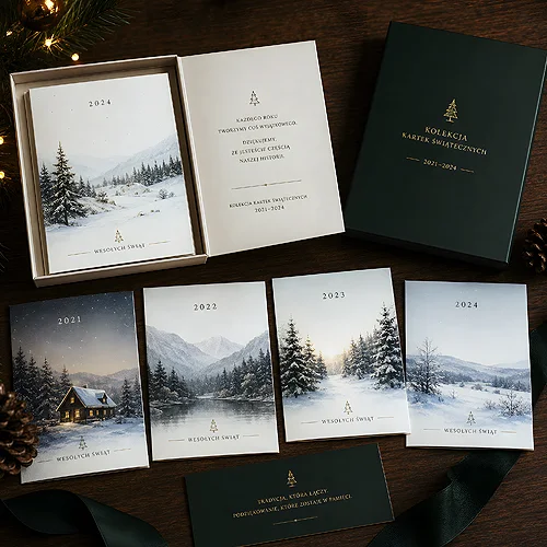
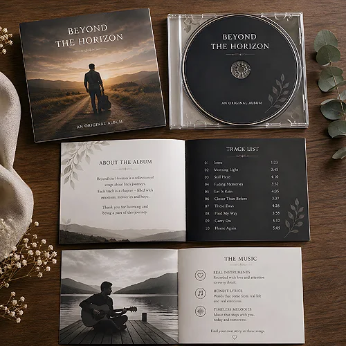
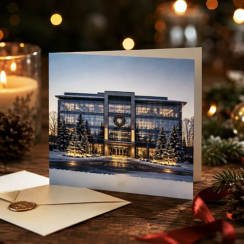
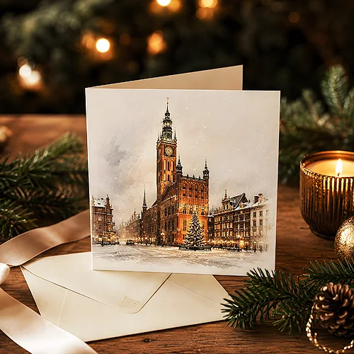
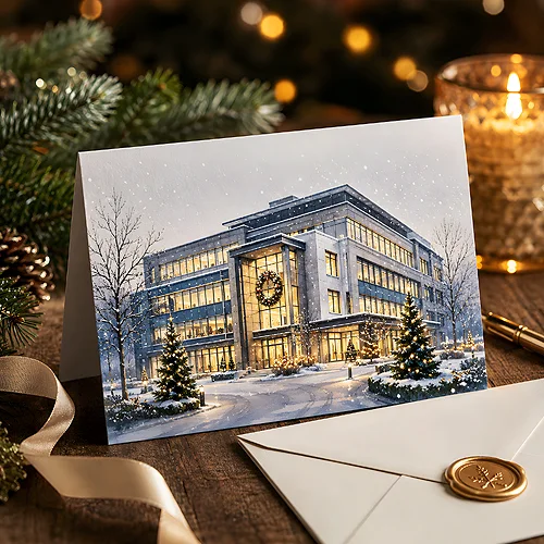
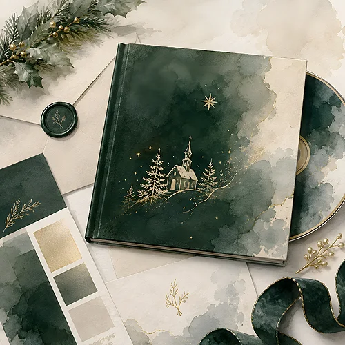
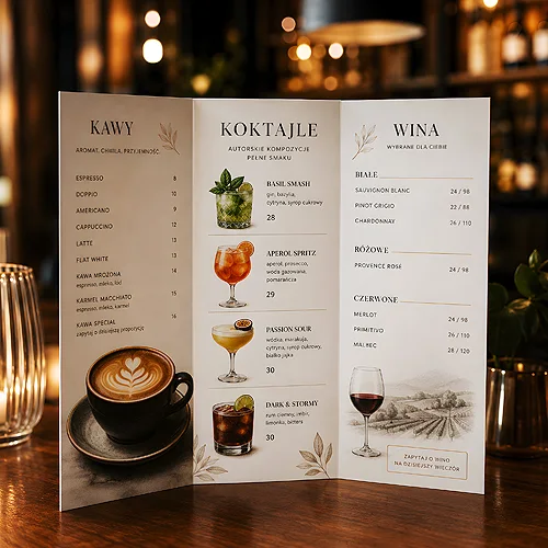
Design turns up here in very different situations. Sometimes it is a leaflet somebody should want to keep. Sometimes a menu where a guest has to find a dish in seconds. Sometimes a label that has to hold its own on a shelf. The questions repeat: what to show first, how much to fit in and what is better left out.
Decisions that come back in every project
Before you start moving things around, settle a few points. They usually matter more than any decorative detail.
- One message or several - a piece with a single clear idea works better than a list of every advantage.
- Photo or drawing - one strong image against a set of smaller elements.
- Plain or rich - the style should suit the reader and the place where the piece is handed over.
- How much empty space - margins and gaps help the reader more than another frame.
- Can everyone read it - letter size and contrast matter when older or partially sighted people are among the readers.
From sketch to finished piece
Several articles walk through the whole route: the first sketch, the format, colour versions and the last look before printing. There are notes on popular tools too. How to rework a Canva template so it does not look like hundreds of others. How layers and masks behave in GIMP. How artificial intelligence can help you try a few colour versions quickly. The same simple points come back at the end. Use good photos rather than something pulled off the internet. Leave a little spare space at every edge, so nothing important disappears when the sheets are trimmed. And remember that a colour on screen can look slightly different on paper.
If you are starting out, pick the article about the piece you are preparing. Then come back for the texts on colour and lettering - the advice is easier to use once something is already on the page.