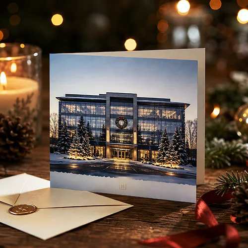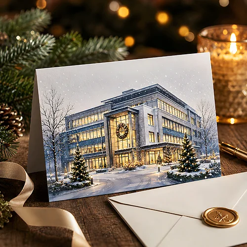
A company's headquarters is a place that clients, partners and employees know from everyday life - the entrance to the car park, the reception desk, the familiar sign by the door. When that same building appears on a Christmas card, wrapped in snow and lit by warm light from the windows, something lovely happens: a familiar place takes on a mood, and the card says "this is us" before anyone even reads the wishes.
Featuring your own headquarters on a Christmas card is one of the simplest ways to make wishes recognisable and personal. You do not need an expensive photo shoot or a design studio - a good photo or a simple sketch and an idea for moving it into a winter mood are enough. In this post we show, step by step, how to turn a photograph or drawing of a building into a warm, festive illustration that stays in the memory.
The beauty of this idea is that it works for any industry. A law office in a townhouse, a production hall, a small workshop, a modern office block - each of these buildings has its own character that can be shown beautifully in a winter guise.
- A company building on a card instantly signals "this is from us" - it works like a visual signature of the brand.
- The starting point can be an ordinary photo or a simple sketch - the idea matters, not a costly photo shoot.
- A winter mood is built from three layers: snow, light from the windows and a cool, evening background palette.
- Sometimes simplifying the building to a silhouette or a line drawing works better and more elegantly than full realism.
- Keep the colours, font and logo consistent with the company identity, so the card is part of the brand, not a detached graphic.
Why a company headquarters looks so good on a card
Festive wishes from a company easily get lost in a pile of similar cards. But when a familiar building slides out of the envelope - the very one the client passed on their way to a meeting or saw on the website - the card immediately gains context. The recipient knows who it is from even before glancing at the logo. That makes the wishes more personal and more memorable.
Your own headquarters is also part of the relationship-building that company Christmas cards as a tradition are all about. You show the place where your work is created - an open, warm gesture that subtly reminds people of the brand without a single word of advertising.
From a photo or sketch to a winter illustration
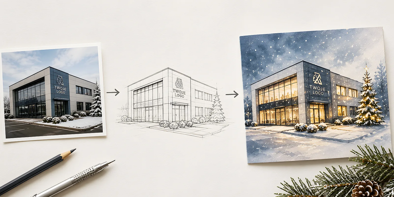
Going from raw material to a finished graphic takes a few stages. You do not have to go through all of them - sometimes a good photo and gentle editing are enough, and sometimes it is better to draw the building from scratch. It is worth knowing the whole path so you can consciously choose where to stop.
The starting point - photograph or drawing
You have two routes. The first is a photograph - if the building looks good, all you need is a shot from the right angle, ideally slightly from the side to show its form. The second is a drawing - when the surroundings are chaotic (neighbouring buildings, cables, a car park full of vehicles), it is easier to draw just the headquarters and leave out the distractions. A sketch can be based on a photo, so the proportions stay true while the clutter around disappears.
The winter layer - snow, light and evening
A festive mood is built from three layers added to the building:
- Snow - caps on the roof, ledges and windowsills, gently falling from above, a white layer in the foreground. This is the clearest signal of winter.
- Light from the windows - warm, yellowish rectangles of windows make the building look alive and cosy. A few glowing windows say more than a whole tree beside it.
- Evening time - a navy or steel-grey sky, perhaps a few stars or a faint glow. The contrast of warm windows against a cool background is the heart of a festive mood.
To this you add small accents: a string of lights above the entrance, a wreath on the door, a tree by the building, footprints in the snow. The key is not to overdo it - a few well-chosen details make a bigger impression than a scene overloaded with decorations.
Start from one strong source of light - lit windows or lights above the entrance - and only build the rest of the scene around it. When the eye has one warm point to settle on, the whole card instantly looks coherent and full of mood.
Realism or simplifying to a silhouette
Not every building benefits from a faithful, realistic rendering. Sometimes simplification brings more elegance - reducing the headquarters to a clean silhouette or a line drawing. This approach works brilliantly when:
- the building has a distinctive, recognisable shape (a tower, a steep roof, an archway),
- you want a modern, minimalist look that suits the brand,
- the surroundings are too built-up for a realistic background to look clean.
A line drawing in a single brand colour, white space and a small snow accent can look more stylish than a photorealistic scene. Full realism, in turn, works when the building is genuinely beautiful and you want to show it with pride - a historic townhouse, modern glazing, picturesque surroundings. Choosing between the two is above all a decision about the character of the brand, not about the "prettier" technique.
Consistency with the company identity
The building illustration cannot live a life of its own, detached from the brand. The card should be recognisable as yours, so the winter scene should draw on the same elements as the rest of the company's materials. Keep three things under control:
- Palette - use the company colours as the leading theme. If the brand is navy, turn it into the colour of the evening sky. Whether to go for a warm or a cool background is easier to decide once you have thought through how to match a palette to the character of a company.
- Logo - it should be present, but discreetly: in a corner, on the building's sign or beneath the wishes. We wrote about how to weave it in with class when discussing designing an elegant card with a logo.
- Typography - set the wishes in the company typeface. The same font as on your website and offers further binds the card to the brand.
Format, paper and finishing
A winter illustration of your headquarters deserves a medium that sets it off. You can order company Christmas cards as folded or single cards - the folded form gives more room for wishes inside and suits formal B2B relationships, while a single card is lighter and more modern.
Paper matters a great deal here. Thick, lightly textured cardboard gives the card substance and conveys the depth of a dark, evening background well. Decorative or eco paper adds character, while a matte or gently gloss lamination protects the colours and adds elegance. You will find more on how texture affects the perception of a design in our post on the natural texture of paper. You can, incidentally, carry the same building motif onto your company letterhead, so your festive correspondence stays coherent from the envelope to the signature.
A company headquarters turned into a winter illustration is a card you cannot mistake for any other. All you need is a good photo or a simple sketch, three layers of winter mood, and consistent use of the company colours and logo. The result is warm, personal and recognisable - and from the very first second, the recipient knows who is wishing them a merry Christmas.