There is a moment in mid-December when cards from business partners start piling up at reception or on the boss's desk. Most of them look like twins: a tree, snow, a star, greetings nobody reads to the end. And then one arrives that the recipient sets aside, saying - oh, these are the people with that series from last year. That is exactly the card we are talking about.
The difference between a card made "for one season" and a card from a collection rarely comes down to budget or an elaborate design. It comes from someone sitting down once and thinking about the card across five years rather than one December. From then on, every year adds a brick to something the recipient begins to recognise before even reading the company name.
Below we show how to plan such a series: what has to stay fixed, what should change every year and how to write the whole idea down so it survives a change of designer, a change of the person in charge and the natural pre-Christmas rush.
- A collection appears when part of the card is identical every year - format, layout, typography, the position of the logo and the way you sign off.
- What should change is the theme of the year: the illustration, the leading colour and the wording of the greetings. They give each edition its own character.
- The spine of the collection is an idea sketched several years ahead - successive details of your premises, the seasons, a cycle by one illustrator or a numbered edition on the back.
- If a different person designs the card each year, write a one-page card standard and hand it over together with the files.
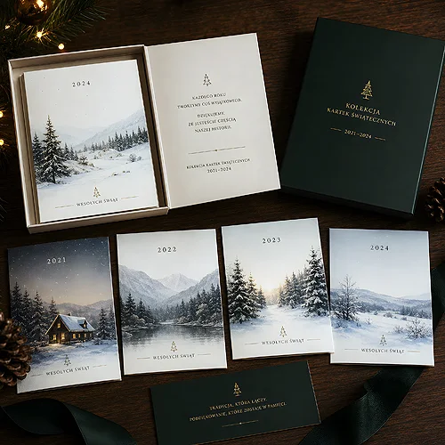
- Keep an archive of past editions - after a few years, simply showing the whole series side by side makes an impression.
A one-season card and a card from a collection
A single card has one job: to remind people about the company at a good moment of the year. It does that and disappears. A collection works differently - it builds up in the recipient's mind over years and at some point starts working on its own. The client stops seeing "a card from a supplier" and starts seeing the next piece of something already familiar.
It is a very cheap form of recognisability. It needs no campaign and no new logo, only consistency. We described a similar mechanism in our piece on how to build a recognisable visual style without changing your logo - repetition does more here than one spectacular design.
It is also worth remembering that the card reaches the same people once a year. Few company materials have such regular, predictable contact with the recipient. It would be a waste to spend that regularity on a design assembled from scratch every November.
What has to stay fixed
A collection rests on a handful of elements you never touch. They are what makes cards from different years look like siblings rather than a random pile.
Format and layout
Pick one format and stick to it for years. A folded A6 card, a square card, a tall DL card or a flat single card - the decision matters less than how long it lasts. The same goes for layout: if the illustration fills the whole front and the greetings go inside, keep it that way in the following editions. Recipients recognise shape and proportions faster than graphic details.
Typography and the position of the logo
Two typefaces - one for the greetings, one for the footer - are enough for the entire collection. The logo always in the same place and always at the same size. It looks like a trifle, yet in practice it accounts for half of the impression of coherence. If the logo sits in the centre one year, in the corner the next and on the back the year after, the series falls apart no matter how lovely the illustrations are.
The way you sign off
Decide once how the company signs the card: with the name alone, the name plus the team, the first names of the whole office, or a space for a handwritten signature from the person sending it. A handwritten signature in the same spot every year is one of the strongest elements of a collection - it turns print into a gesture.
Paper and finish
Repeat your paper choice just as you repeat the format. Thick board, decorative or eco paper, matt or gloss film - once you decide, let it become the hallmark of the series. Recipients also remember a card by touch. If you are torn between options, the overview in materials and papers will help.
What should change every year
The fixed elements are the skeleton. For a collection to stay alive, each edition needs its own character. Change deliberately, and only the things you planned as variable.
- The theme of the year - one illustration or one photograph the whole card is built around.
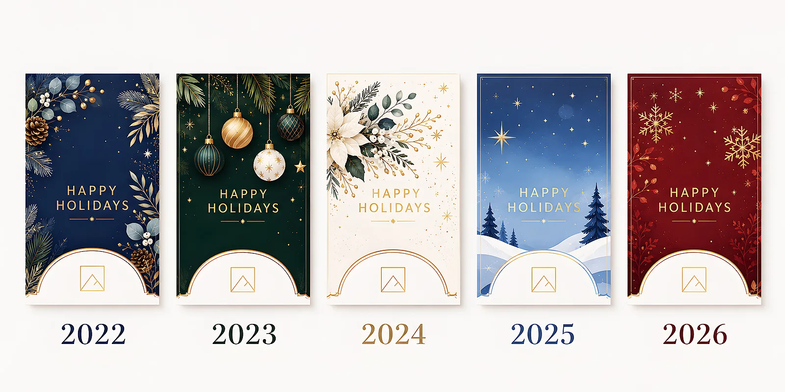
- The leading colour - one accent per edition, ideally picked from the wider brand palette so that years later the whole set still looks like one family.
- The wording of the greetings - a few sentences written afresh, referring to what actually happened in the company that year.
- A date or edition detail - a discreet year that keeps the whole collection in order later on.
The rule is simple: the variable layer should be visible at once, the fixed layer should work in the background. If placing cards from three years side by side shows both a difference and a family resemblance, you have set the proportions well.
Ideas for the spine of the collection
The hardest part is often deciding what should actually connect the successive editions. The spine of the collection is a promise you make to yourself several years ahead - thanks to it, the November question "what do we do this year?" stops being a problem.
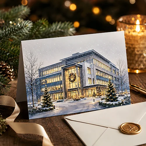
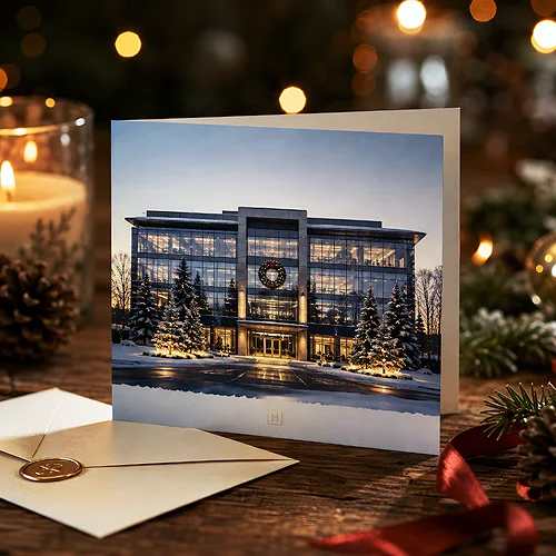
- Successive details of your premises - the entrance in year one, the staircase in year two, the view from the workshop window in year three. Warm, concrete and very much your own.
- The four seasons - a four-year cycle with a clear beginning and end, after which you can start a new series.
- A series of illustrations by one artist - the same hand across several years. The strongest version of a collection, because a drawing style is recognised instantly.
- People and tools of the trade - what the company does every day, shown from the side clients usually never see.
- A numbered edition on the back - a discreet edition number on the reverse. In itself it suggests there is more to come.
Numbering works much like it does with gifts - we wrote about it in our post on when limited series of branded gifts are worth it. Information about the edition changes how the recipient treats the object.
Before you order the first edition, sketch out the next three in a single line each. They do not need to be designed - one sentence per year is enough. If the idea carries three editions, you have the spine of a collection. If it runs out after one, you simply have a nice card.
How to write it down when someone else designs it each year
The biggest enemy of a collection is not a shortage of ideas but staff turnover. The designer changes, the agency changes, the person handling the mailing moves to another department - and after two years nobody remembers why the logo sat in that particular corner.
The remedy is a single sheet of paper, let us call it the card standard. It fits on one page and should include:
- format, orientation and the way the card folds,
- the names and sizes of the typefaces used for greetings and in the footer,
- the exact position and size of the logo,
- a description of the collection spine and what changes in a given year,
- the paper and finish the company settled on,
- photos or previews of every edition so far.
Hand this document over together with the production files to anyone who is going to touch the design. Keep it in the same folder as the open files - if it sits somewhere else, a year later nobody will find it. We covered the same idea in more depth when writing about building a coherent series of company gifts, because the mechanism is identical: a collection rests on a written decision, not on people's memory.
An archive of past editions and the effect after a few years
When ordering each new edition, add a few copies to the company archive. After three or four years you have something you cannot build in a single season: physical proof of consistency. Such a set looks great at a client meeting, in a display case at reception or in a photo for your end-of-year summary.
On the recipient's side, the most interesting thing happens. People start keeping the cards. They stand them on the windowsill, pin them to a board, and the following December they ask what you have come up with this time. A collection does what a single card never will - it turns an annual obligation into a small ritual somebody looks forward to. If you are looking for a starting point for the whole idea, we gathered the practical basics in our post on how company Christmas cards make a good impression, and ready options are waiting in the Christmas cards category.
Start with one decision: choose the format and the position of the logo, and promise yourself not to touch them for the next three years. Everything else - illustration, colour, greetings - can change freely. Collections are built precisely from small choices repeated stubbornly.