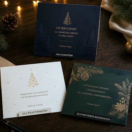
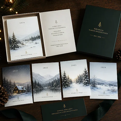
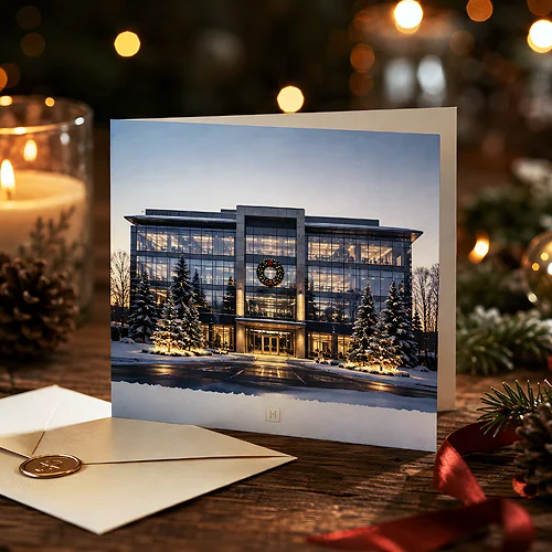
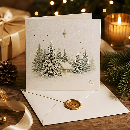
A card sent by a company does two things at once. It is a genuine gesture and a quiet reminder that you are still around. A printed card also lands differently from an email, which is why the list of recipients, the tone and the timing matter as much as the artwork.
Wording that does not read like a form
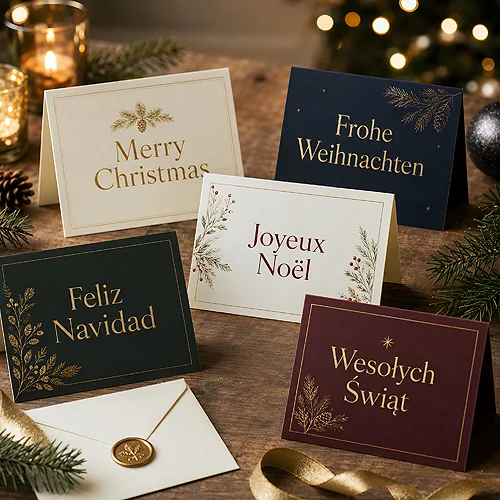
The usual problem is a greeting so general it would suit any company. One sentence about the past year, a shared project or the months ahead fixes that. Clients get a slightly more formal tone, your own team a warmer one. For recipients abroad, New Year greetings without references to one tradition are often the safer choice.
Artwork, paper and posting
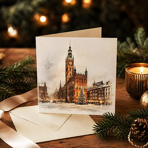
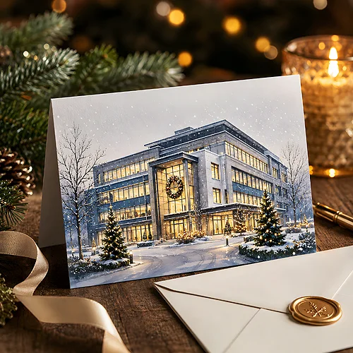
An elegant card is usually a simple one: the logo in a calm spot, a single motif and plenty of empty space. Many people put the design together in Canva and that is perfectly enough. Just leave a little spare room at the edges so nothing important disappears when the cards are trimmed, and use good photographs rather than something pulled off the internet.
- The recipient list - clients, partners and staff need a different tone, so two versions of the text are easier than one.
- A handwritten line - one sentence in your own hand stops the card feeling like a mass mailing.
- Envelopes and addresses - checked details and matching envelopes save the most trouble.
- Ordering early - December is the busiest month in the post, so it helps to have the cards in hand well before.
- The finish - matt film or Soft Touch changes the way a card feels in the hand.
If you are sending company cards for the first time, settle the recipient list and the tone first, then open the design. Everything else, from the format to the envelope, follows from there.