December looks much the same in many companies - someone mentions it is time to send cards, and suddenly a question lands on the desk that no one has a ready answer for: one shared card for everyone, or separate versions for clients, employees and partners? It seems like a trifle, yet it can change quite a lot in how your wishes are received.
The answer is: it depends - but not on budget, rather on how different the groups you are writing to really are. A business partner's board, a client you speak to once a quarter, and the team you share an office with are three completely different relationships. A card that fits one of them may sound perfunctory, or too formal, in another.
The good news is that differentiating does not mean designing three separate cards from scratch. In most cases one coherent graphic design and a few versions of the wishes text are enough. Below we show when one card is perfectly sufficient, when it is worth splitting the message, and how to do it without chaos in the order.
- A shared graphic design is the foundation - it builds recognition and keeps the whole mailing tidy.
- It is worth differentiating the wishes text when your relationships with the groups genuinely differ.
- Most often two or three versions of the text on one design are enough, rather than separate cards for each group.
- Personalisation with a name or company name works strongest with key recipients and smaller runs.
- Too many variants mean extra cost and a risk of mistakes - differentiate deliberately, not for variety's sake.
When one card is perfectly sufficient
A shared card for everyone works more often than it might seem. If your relationships with recipients are similar, and the wishes are meant to sound warm and universal, one good design does the job. Company Christmas cards have long been a tradition that builds relationships, and in many cases their strength comes precisely from coherence, not from the number of versions.
One shared card is worth choosing when:
- your recipient base is uniform - you write mainly to clients with a similar profile, with no clear split into groups;
- you value simplicity - one version means one order, one file to check and fewer chances for a mistake;
- you are building recognition - the same motif with every recipient reinforces the brand image more than several separate ideas.
In this variant, all your attention goes into the quality of a single design - good paper, a thoughtful layout, legible wishes. It is a sensible choice for smaller companies and wherever the recipient list does not naturally split into clearly different worlds.
When it is worth differentiating the message
There are situations where a single text for everyone sounds flat. This happens when you genuinely maintain different types of relationship - and each deserves a slightly different tone. Most often three groups stand out.
Clients
You write to clients from a place of gratitude for their trust and cooperation. The tone is warm, but keeps a certain distance - it is a business relationship. A short thank-you for the past year and an accent on future cooperation work well here. A card to clients is also closest to marketing, so it is worth taking care that gratitude does not turn into self-promotion.
Employees
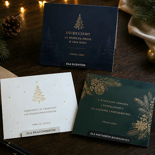
You speak to the team quite differently - warmer, more personal, with real appreciation for the shared work. Stiff, formal wishes ring false here. A card for employees is the moment to appreciate people by name and mention what you managed to achieve together.
Business partners
Partners and contractors are a more formal relationship, built on mutual respect. The tone is courteous and to the point, often with an accent on shared goals for the coming year. If you want such a card to set your company apart, you will gain more from a refined tone and detail than from loud graphics.
Versioning the text on a shared graphic design
This is the heart of the whole problem - and at the same time the simplest solution. In the vast majority of cases you do not need separate cards for each group. You need one design and a few versions of the wishes text.
The graphic design stays the same: the same motif, colours, logo and layout. Only the content inside changes - different words for clients, different for the team, different for partners. To the recipient, each of these cards looks like a coherent element of your brand, and at the same time says exactly what it should. If you are looking for ready phrases, our roundup of wishes texts for company cards can help.
Start with one neutral version of the wishes that suits everyone. Only then create its variants - a warmer one for the team and a more formal one for partners. Working from a single base text is faster, and there is less chance the versions will drift apart in style.
Personalisation - name, company name, individual accent
Differentiating the text is one thing, and personalising a specific copy is another. A recipient's name or their company name printed on the card mean it stops being a mass mailing and becomes a gesture aimed at one person. This works most strongly with key clients and partners, and with smaller runs where such a detail can be looked after.
Personalisation can be done at various levels - from adding a company name, through a named dedication, to a handwritten signature of a decision-maker. It is worth reaching for it deliberately: where the relationship matters, not across the whole list at once. Ready-made company Christmas cards pair one coherent design well with room for such a personal accent.
Logistics - how not to drown in variants
The biggest trap of differentiating is not the design cost, but the mess in ordering and dispatch. Three versions of the text mean three files to check, three quantities to count and three stacks of cards to sort. Without order, mistakes come easily - a client gets the wishes meant for the team, and a partner a text with an inside joke.
A few rules that keep it all in order:
- Count the recipients in each group before you decide on the number of versions. If one group is three people, it may not need a separate card, just a handwritten note.
- Limit the number of variants - two or three is a sensible maximum for most companies. Every further version brings more work and risk than real benefit.
- Label the versions already at the design stage, for example in file names, and stick to that when packing.
- Order with a margin - a few extra cards in each group save the day when the recipient list grows at the last minute.
If you want the cards to carry a coherent brand image too, it is worth making sure the design uses the same elements as the rest of your materials. A thoughtful design of an elegant card with the company logo helps here, looking good no matter how many text versions you place on it.
The choice between one card and several versions is not a question of how much you want to spend, but of how different your relationships are. A uniform recipient base is perfectly served by one good design. When you write to clients, the team and partners in different tones, split the text but keep a shared graphic design - and make sure the number of variants stays under control. Then every recipient gets wishes tailored to them, and your brand stays coherent and recognisable.