There is a moment when a company Christmas card stops being a set of wishes and starts to look like an advert. It usually happens when the logo grows into the hero - large, in the middle, in full colour, as if on a banner. The recipient feels it at once: they have received not so much warm words as a polite carrier for the brand. And it takes very little to make it the other way round - for the brand to be present, yet discreet.
The paradox is that the less pushy you are with the logo, the stronger it works. A card that first sends wishes and only then quietly reminds you who they are from builds goodwill. The one that shouts the company name lands on the pile of corporate boxes to tick off. Below we show how to place the logo so that the card stays a card.
The rule is simple: on a Christmas card the brand should be a signature, not a headline. A signature is placed discreetly, usually at the end and in a smaller font - and that is exactly how a logo works best too.
- On a Christmas card the logo plays the role of a signature, not the main character - the more discreet, the better.
- The best spot is the back or the inside footer, and the size - smaller than your first instinct suggests.
- A monochrome or single-colour version of the logo blends into the design better than full colour.
- The brand's presence is also built by your palette and font - often more effectively than the logo itself.
- The tone of the wishes should be human and warm, not sales-driven - it decides the reception most of all.

A logo like a signature, not a headline
Imagine a handwritten letter. The author's name appears at the end, in small script, not in large letters at the top of the first page. A Christmas card follows the same logic. First comes the gesture - the wishes, a warm word, a moment of attention given to the recipient. Only at the end comes the quiet note of who the gesture is from.
When you reverse this order and start with the logo, the card changes genre: from wishes it becomes a marketing message. The recipient reads this instantly, even if they cannot name it. That is why the first decision is simple - the logo steps out of the foreground and makes way for the content.
Where to place the logo
Placement matters as much as size. A well-chosen location makes the logo present without imposing itself from the doorstep.
- The back of the card - a classic. A logo on the back, at the bottom, works like a sender's stamp: it is there when someone looks for it, and it does not get in the way of the front.
- The inside footer - below the wishes, in one line with the company name or a short closing phrase. A natural place for a signature.
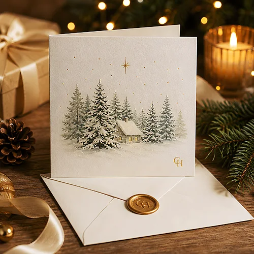
- The lower corner of the cover - if you want the brand present on the front, a small logo in the corner is enough. It does not have to be big to be noticed.
- An inner flap or wrap - in folded cards this is a discreet spot that reveals itself only after opening.
Avoid the centre of the cover and a large logo right above the wishes. These are the two spots that turn a card into a flyer fastest. If you want the brand visible straight away, reach for a brand-coloured background rather than an enlarged logo.
Size and colour version
The most common mistake is a logo one size too big. Instinct suggests it should be clearly visible, but on a card restraint works better. Shrink the logo by a step from what feels safe - the whole composition almost always gains from it.
The same goes for colour. The full brand colouring of a logo can be strong and pull attention. A monochrome version - in one colour, in a shade matched to the background - blends into the design and looks elegant. Dark graphite on light paper, or a delicate white on a dark background, does more for the card's class than a logo in the full palette.
Prepare a one-colour version of your logo and a version for a dark background in advance. That way, when designing the card, you will not be forced to squeeze a colourful mark where a calmer one fits. On how to take care of the correct files, we write in our post on how to prepare a logo for use in print and online.
A brand without a big logo - palette and font
The most interesting part is that the brand can be felt on a card even when the logo is barely visible. It is enough to reach for two carriers of identity that work quietly: your brand colour palette and your brand typeface.
If your brand uses a specific colour, use it as the background, an accent or the backdrop of the wishes. A recipient who knows the company will associate it without reading the name. The same with typography - wishes set in your brand font carry the brand's identity discreetly, yet strongly. Such a pairing - colour plus font - can be more recognisable than a logo stuck in the corner. On how to build this effect, we write more in our post on how to create a recognisable visual style without changing the company logo.
The tone of the wishes - human, not sales-driven
Even the best-hidden logo will not save a card if the text sounds like an offer. It is the words that most strongly decide whether the recipient feels wishes or a message. That is why it is worth writing like a human: address the recipient, thank them for the year together, wish them peace and rest - without slogans, without invitations to a sales contact, without any nudge to buy.
A warm, personal tone does more for your image than any logo. Paradoxically, it is what makes the brand stay in memory - because it is linked with a kind gesture, not an attempt to sell. We write more about this balance between relationship and promotion in our post on cards as a subtle marketing tool.
The balance between relationship and recognisability
The whole art lies in finding the middle. On one hand you want the card to be warm and personal. On the other - for the recipient to know who it was from once they set it down. These two goals do not clash if you set them in the right order: relationship first, recognisability second.
In practice this means a card in which the wishes play first fiddle, the brand is present in colour and typography, and the logo calmly signs the whole thing from the back or the footer. If you want to polish such a project in every detail, take a look at our post on how to design an elegant Christmas card with your company logo. You will find ready designs and the option of your own project in our range of Christmas cards, and you can easily carry the same consistent brand character onto the company letterhead you send the card with. A well-balanced card gives the best of both worlds: the warmth of a relationship and the quiet, confident presence of the brand.