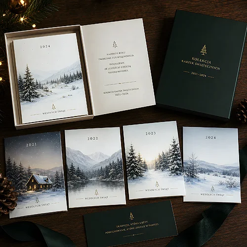
Many companies assume the road to recognition runs through a new logo. In reality, the logo is only the starting point - what truly sticks in a customer's mind happens around it. Consistent colors, a repeated font, one graphic motif on your business card, flyer and social media - this builds the "that is definitely them" feeling faster than any redesign of the mark. And, importantly, it is far cheaper than a full rebrand.
- Recognition is built AROUND your logo, not by replacing it.
- Set a few constants: a color palette, a font pair, one graphic motif, a photo style.
- The key is repetition - the same elements on business cards, flyers, online and on packaging.
- Roll it out in small steps; it is simpler and cheaper than a rebrand.
Why a logo alone is not enough
You see a logo for a fraction of a second - in the corner of a flyer, on a profile, on a stamp. The mark alone rarely does enough for someone to remember a company after a single contact. What actually works is a consistent system around the logo: colors, letters, repeatable shapes. The brain loves patterns. When it sees the same set of signals for the third or fourth time, it starts linking them to a specific brand - often before it consciously reads the name.
The good news is you do not have to invent this system from scratch. Most of it is usually already in your logo - you just need to extract and organize it.
Think of the brands you recognize instantly, before you even read the name. It is rarely the mark itself - most often you recognize a color, a distinctive pattern or the way they arrange photos. These "side" elements do the heaviest lifting for recognition, and at the same time they are the easiest to organize on your own.
The color palette - your strongest signal
Color is the first thing the eye registers from a distance - even before it recognizes a shape or text. That makes a consistent palette the cheapest and fastest route to recognition.
Start with 2-3 primary colors (often you can pull them straight from the logo) and add 1-2 supporting colors plus a neutral background. Write down their exact values - this matters, because "roughly the same blue" across ten materials reads as chaos, not a brand.
You do not need to use the whole palette on every medium. It is enough for one color to run through clearly and consistently - that one becomes your signature. The rest of the palette plays a supporting role: backgrounds, accents, small details. The simple rule "one color leads, the rest help" protects you from materials that are colorful but say nothing.
Note your color codes in one place - separate values for screen and for print. That way your blue looks the same on the website, on a classic business card and on a poster. A small detail that makes a huge difference.
A font pair that ties it all together
The second pillar is typography. You do not need ten typefaces - two are enough: one for headings and one for body text. The same pair, used consistently everywhere, makes your materials "speak" with one voice.
- Heading font - expressive, gives character (titles, slogans, section names).
- Body font - calm and readable, for longer content and contact details.
Choose typefaces that match the character of the company - an elegant venue and a car workshop need a different tone. Once you decide, stick to that pair on the website, in documents, on printed materials and in posts. Repetition matters more than the "perfect" font.
A repeatable motif - what stays in memory
The third element is one repeatable graphic motif: it can be a distinctive pattern, a set of icons in one style, a line, a shape or a way of cropping. It does not have to be complex - the simpler it is, the easier it is to repeat everywhere.
The same motif in the corner of your letterhead, as a post background and as an element on packaging creates a "common thread" that links different media into one whole. The customer does not need to analyze it - they simply feel it is consistent.
Photo style and layout - consistency in the details
Photos often break an image more than anything else. One warm and bright, another dark and cold - and the brand impression falls apart. Set a simple recipe for photos: similar colors, a comparable mood, a repeatable way of cropping. It is not about studio perfection, just about making all photos look like one family.
Add to that the layout - a shared grid, repeatable margins, the same place for the logo and contact details. When a business card, flyer and post share a similar rhythm and order, the whole thing instantly looks professional.
Recognition is not one striking material, but ten ordinary ones that look like a single family.
Tone of communication - a brand has a voice too
Visual style is not only about images. How you write and speak is part of the same puzzle. Decide whether you address the customer informally or formally, whether you are matter-of-fact or rather warm and playful. The same tone on the website, in an email and on a flyer makes the brand consistent "in words" too.
How to roll it out in small steps
You do not have to do everything at once - and you should not. Recognition grows with each new consistent material.
- Pull 2-3 colors from your logo and note their exact values.
- Choose a font pair - one for headings, one for body text.
- Set one repeatable motif or icon style.
- Write a simple recipe for photos and a shared layout for materials.
- Start with the materials you print most often - the rest can follow later.
Instead of replacing everything at once, apply the new rules whenever you reprint. Ran out of business cards - you order them already in the new style. After a few months your whole set of materials is consistent, and you never paid for a one-time overhaul.
If you want to go further and organize the whole thing without large costs, read our piece on how to build a consistent visual identity without a big budget - we walk through the next steps one by one.
In the end, the most important thing: consistency beats flair. You do not need a new logo for people to start recognizing you. You need a few simple rules and the patience to repeat them. The rest takes care of itself.