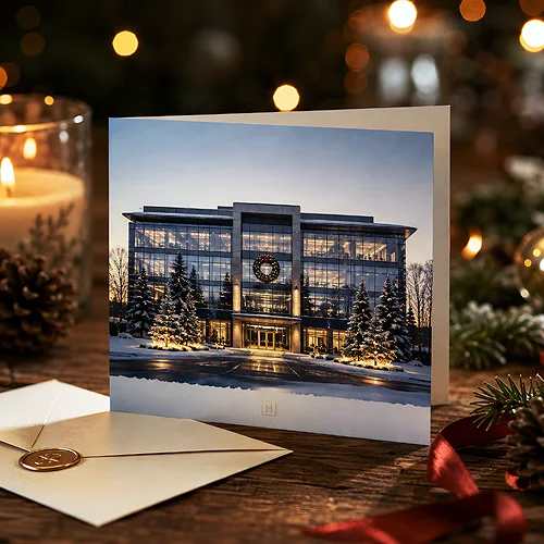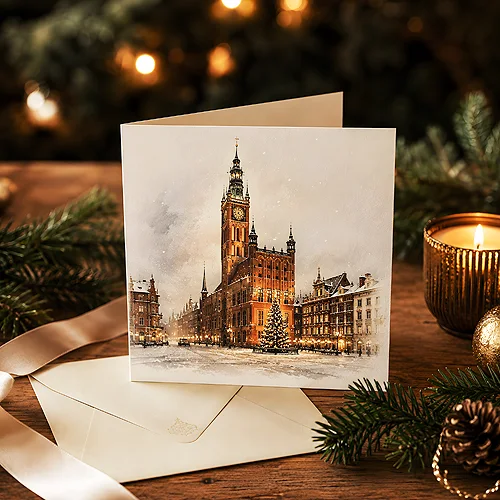
Every city has its landmark that residents recognise at a single glance - the town hall tower, the bridge over the river, a distinctive townhouse on the market square, the skyline seen from the bridge. When such a motif lands on a company Christmas card, covered in snow and lit up, something more than a pretty graphic happens. The card begins to say "we are local" - and that one phrase can bring people closer than the most elaborate wishes.
A local motif is an idea that works wonderfully for companies tied to a particular place: local service providers, restaurants, law offices, shops, institutions. The recipient - a client, a neighbour, a partner from the same city - sees a familiar view and immediately feels a sense of community. It is a subtle but powerful tool for building bonds with the local community.
In this post we suggest how to choose a city element, match a style to it and tie the whole thing to your brand so the card is recognisable rather than pushily promotional. Because it is exactly in this balance - between local sentiment and corporate elegance - that the whole charm of this idea lies.
- A distinctive city element on a card signals "we are local" and builds a bond with the local community.
- The motif works especially well for companies strongly tied to a place: services, hospitality, retail, institutions.
- Choose an element residents recognise, not just a pretty one - what counts is the association with the city.
- Match the style to the brand: a line illustration is modern, watercolour is warm, retro is nostalgic.
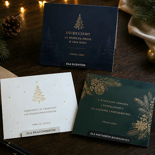
- Introduce the brand discreetly - a subtle logo and company colours instead of pushy advertising.
Why a local motif works - "we are local"
People have a soft spot for places they know. The sight of a hometown market square or a tower you pass every day evokes a warm association before we even consciously think of the company. A card with a local motif plays on that sentiment: it shows that the sender is part of the same community, not an anonymous brand from nowhere.
It is also a clever, unobtrusive way to remind people of yourself. Instead of shouting an advertising slogan, the card quietly builds a positive association with the brand - exactly as we described in the context of Christmas cards as a subtle advertising tool. For a local business this is especially valuable: a client from the neighbourhood who feels a connection is more likely to return and recommend you.
How to choose a distinctive city element
Not every view is suited to a card. It is about an element that residents recognise instantly and that works well with the character of the company. It is worth looking at the choice from two angles.
Recognisability above all
The most important question is: will the recipient immediately tell which city it is? Go for a motif strongly associated with the area:
- An architectural symbol - the town hall tower, a church, a historic gate, a distinctive high-rise.
- The market square or old town - a row of townhouses, a fountain, a well-known square.
- A bridge or river - a crossing that orders the city skyline.
- A panorama - a recognisable line of roofs and towers seen from one point.
If you are torn between two places, choose the one that more quickly triggers the reaction "oh, that is right here". Recognisability matters more than whether the object is the prettiest in the city.
An element that suits the brand
The second criterion is a fit with the character of the company. An elegant law office will naturally reach for a dignified, classic building; a cafe or a craft workshop - for a cosy alley or an intimate corner of the old town. It also helps if the place has some connection with the company: near the headquarters, a favourite area, a spot close to the premises. Then the motif is not only local, but also yours.
Before you choose a motif, ask a few people from the team what first comes to mind at the phrase "our city". If most point to the same object - you have a winner. The best motif is the one everyone recognises, not just tour guides and architecture enthusiasts.
Style of execution - line illustration, watercolour, retro
The same bridge or square can be shown in many ways, and the style strongly affects the message of the card. Match it to how the brand wants to be seen:
- Line illustration - clean, thin lines in a single colour. Modern, minimalist, elegant. It handles simplification well and pairs nicely with a logo.
- Watercolour - soft patches of colour, a warm and artistic feel. It suits brands that want to come across as friendly and heartfelt.
- Retro style - a nod to old postcards, a muted palette, a touch of nostalgia. It builds a sense of tradition and rootedness.
To each of these styles add a winter layer: snow on the roofs, warm light in the windows, delicate flakes. Whatever the technique, the point is for the view to be festive yet calm - the card should invite the eye, not tire it. If you are looking for ways to make the design truly stand out, take a look at our post on how to make a company stand out with business wishes.
Tying it to the brand without being pushy
The biggest risk of a local card is tipping too far towards advertising. When the logo is too big and the wishes turn into an offer, the whole sense of closeness disappears. The art lies in weaving the brand in discreetly, so it supports the motif rather than covering it.
- A discreet logo - in a corner, beneath the wishes or on the back of the card. It should sign off the sender, not dominate the view.
- Company colours in the background - use the brand palette to tint the sky or the details, so the card stays recognisable as yours.
- Wishes in the foreground - it is they, not an advertising slogan, that should carry the warmth. Look for good words in our roundup of wishes for company Christmas cards.
Such a balance means the card first moves people with the local view, and only then - as if in passing - reminds them who sent it. It is exactly this mechanism that makes company Christmas cards build relationships rather than simply take up space on the desk.
Format, paper and a small gesture with the wishes
A local motif deserves careful execution. Christmas cards in a folded form give room for the city view on the front and the wishes inside, and the paper does the rest. Thick, lightly textured cardboard conveys the depth of the illustration well, decorative or eco paper adds character, and a matte or gently gloss lamination protects the colours. These are small things, but together they decide whether the card looks considered.
If you want to go a step further and give local clients something more than wishes, you can enclose a small thank-you voucher with the card in the same graphic style. It is a nice gesture that combines festive sentiment with real value - and ties the client even more closely to the local brand.
A Christmas card with a distinctive city landmark is a design that impresses through the simplicity of the idea. Choose a view everyone recognises, dress it in a style that suits the brand, add a winter layer and introduce the logo discreetly. The result is local, recognisable and warm - and the recipient, looking at a familiar square or tower, will feel what it is all about: that you are from here, just as they are.