Canva is great for quick design and you really do not need to be a graphic designer to create a lovely Christmas card in it. You just need to know what to watch out for so the project on your screen turns into a beautiful print rather than a letdown with a cropped greeting or odd colours. Let us walk through it calmly, step by step.
- Set the right size and orientation, and for a folded card plan the pages and the spread.
- Remember the bleed - Canva does not add it by default, so make a larger document or turn on the bleed guides.
- Keep text and logo in the safe margin, away from the trim edge.
- Colours on screen (RGB) tend to look brighter than in print (CMYK) - avoid loud neons.
- Export to PDF Print at high quality, with bleed and crop marks if available.
Start with size and orientation
Before you dive into the design, decide what kind of card this will be. Single page or folded? Portrait or landscape? This choice drives everything else, so it is worth making at the start rather than halfway through.
In Canva, create a project with a custom size in millimetres instead of using a ready screen format. That way you can be sure the proportions match what comes off the printing press.
A folded card - think about the pages
If the card is to fold, prepare it as a spread: one document with pages sitting side by side that, once printed and folded, form the cover, inside and back. Plan what goes on each page before you start filling the project with graphics.
- Cover - a festive theme and a short line.
- Inside - the main greeting, the part people read the longest.
- Back - the company logo, contact details, and possibly greetings in a second language.
Bleed and margins, an invisible safety grid
This is the most important part of the whole guide, because this is where things most often go wrong. Bleed is an extra strip of graphics extending beyond the trim line - usually a few millimetres on each side. Thanks to it, if the blade cuts the card slightly off, no white strip shows up at the edge.
In its basic mode Canva does not add bleed automatically, so you need to help it a little. You have two simple routes.
First method - a larger document
Create a project a few millimetres larger than the target card size on each side. Stretch the background and every element that should reach the edge all the way to the borders of this enlarged area. After trimming, the printer leaves exactly the format you wanted, and the graphic runs neatly right to the edge.
Second method - the bleed guides
In the edit view, turn on Canva's print guides (the bleed option, if it is available in your version). They show you where the safe zone ends. The rule is simple: background to the very edge, and important things - text, logo, faces in photos - kept inside, with a margin from the cut.
Picture two frames around the card. The outer one is the bleed - that is where the background reaches. The inner one, a few millimetres from the edge, is the safety margin - do not let any text or logo cross it. Everything important fits within that inner frame and nothing gets cut off.
Choosing and reworking a template - so it does not look like thousands of others
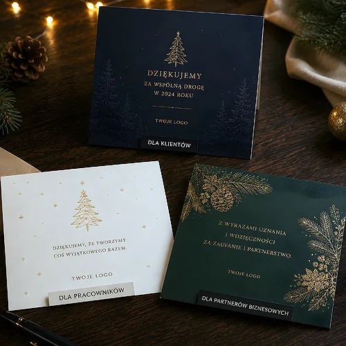
Canva tempts you with hundreds of ready card templates and that is a fine starting point. The catch is that thousands of companies use the same template, so it is worth reworking it until it becomes truly yours.
- Swap in your logo - upload your own in good quality and place it calmly, without squeezing or stretching.
- Set your brand colours - replace the template's default palette with your company's shades while keeping the festive feel.
- Add your own photo - a shot of your team, product or place gives the card character that stock cannot.
Even small changes stop the card from looking anonymous. And if you want to go a step further and build relationships with clients, look for inspiration in the post on how company Christmas cards help build relationships with clients.
Typography of greetings - so it reads well
Festive greetings should move people, not tire their eyes. Go for legibility and simplicity rather than a decorative firework.
- Limit the number of typefaces to two, at most three - one decorative for the headline, one calm for the greeting text.
- Build a hierarchy - headline large and bold, greeting medium, company details smallest.
- Leave room to breathe - do not cram the card with text, a little empty space adds elegance.
- Plan a place for the logo and company details so they are not squeezed in at the last moment.
Overly decorative, thin fonts look pretty on screen but on paper they can blur or get lost. Check whether the headline reads from an arm's length away - that is a good test.
Festive colours versus the reality of print
A screen glows with its own light and shows colours in RGB mode, which can be very vivid. Print works differently - inks on paper mix in CMYK mode and reflect light instead of emitting it. In practice this means colours in print tend to be a touch darker and less loud than on the monitor.
For a Christmas card this matters, because reds, greens and golds are the heart of such a project. A few simple rules help avoid disappointment:
- Avoid very saturated neons - a vivid green or loud pink from the screen will come out on paper differently than you expect.
- Choose deep rather than shouting colours - bottle green and warm red print beautifully and festively.
- Be careful with large dark backgrounds - they can come out stronger than they look on the monitor.
The screen promises more glow than paper can deliver - design with the print in mind, not the glowing monitor.
Exporting to print and common pitfalls
Project ready? Now the most important moment - saving it in a format the printer will accept without a hitch.
How to export from Canva
In the download menu choose PDF for print (PDF Print). It is a format made precisely with the printing press in mind. If your version of Canva allows it, also tick:
- Bleed - so the graphic runs past the trim line.
- Crop marks - small lines showing where the card should be cut.
- High quality - make sure the uploaded photos are at good resolution, because small images turn into blurry patches.
Fonts in a PDF are usually embedded or flattened automatically, so the text will not shift on its way to the printer. Still, it is worth opening the exported file and giving it a calm look before you send it.
Mistakes that catch nearly everyone
Before you send the file, check whether you fell into one of these traps:
- RGB colours instead of CMYK - vivid on-screen colours come out muted. Choose toned-down, deep shades.
- Elements too close to the edge - text or a logo right at the border risks being cut. Keep them in the safe margin.
- Low photo resolution - an image that looks fine on screen can be blurry on paper. Use good quality files.
- No bleed - without it a white strip may appear at the edge. Plan the bleed from the very start.
Before sending, zoom your PDF to one hundred percent on screen and inspect the edges and small text. If the photos are sharp and the text clean even up close, the file is ready. Blur when zoomed in is a sign the resolution is too low.
And that is essentially it - you have a card that looks on paper as good as you designed it. The finished file simply needs to be sent to print. If you want to be sure everything is right on the technical side, check our guide to preparing files for print, and for festive company cards visit our shop. Want to explore the topic more widely and apply these rules to other projects? Take a look at the post on how to prepare a Canva project for professional print.