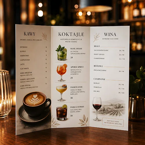
A guest opens the drinks menu for a few seconds before making a decision. In that brief moment, the menu can be a plain list or a quiet adviser suggesting what is worth trying. The difference is not in the number of items but in how they are arranged, described and highlighted. A well-designed drinks menu works like the best waiter - discreetly, yet effectively.
It is a sales tool that works all day and never takes a holiday. Coffee in the morning, a cocktail in the evening, wine with dinner - each of these has its moment and its group of guests. The menu's job is to make the choice easy, appetising and naturally guided towards what you want to sell. Below we show how to design such a menu step by step.
- Order and layout decide what the guest notices first - place your best items where the eye naturally falls.
- Highlight recommended and higher-margin items - with a frame, an icon or a separate spot, not with clutter.
- Descriptions that build appetite (aroma, origin, way of serving) sell better than the name alone.
- Divide the menu into clear sections: coffees, cocktails, wines, non-alcoholic drinks.
- Ensure legibility in low light and consistency with the food menu and the interior of the venue.
Layout and order - where the eye falls
Before a guest reads a single word, their eye travels across the page in a fairly predictable pattern. It usually stops first at the top of the menu and at items surrounded by white space. These are the most valuable spots - and that is where it is worth placing the items you care about most.
It is not about cramming everything at the top. It is about deliberately spreading out the accents: the first item in a section and the last one stick in the memory more firmly than those in the middle. If you have a signature cocktail or a specialty coffee, do not hide it among ten others - give it room and a prominent spot.
The principles of guiding the eye are universal, whether you are designing a drinks menu or another piece. It is worth looking at our post on how to design a menu so the guest quickly finds the most important information - the same mechanisms of hierarchy and organising content work in any menu.
Do not arrange items strictly by price - from cheapest to most expensive. The guest then starts scanning the menu like a price list and picks the lowest figure. Group by the character of the drink and place items of different levels side by side, and the choice becomes a matter of taste, not calculation.
Highlighting the items you care about
A menu where everything looks the same leaves the guest alone with the decision. A menu that gently suggests makes the choice easier and increases the sales of specific items. The key is restraint - if you highlight half the drinks, you highlight none.
- A frame or background - a subtle field around a recommended item draws the eye without shouting. It works for a signature or seasonal drink.
- An icon or short label - a discreet "recommended" or "new" mark guides the undecided. Keep one, at most two kinds of such markers.
- A separate spot - signature cocktails or a wine list can have their own highlighted section that announces something special.
- More description - an item with an elaborate, appetising description naturally seems more important than one given by name alone.
Higher-margin items are not always the most expensive - sometimes they are exactly the ones a venue earns most healthily on. Highlighting them subtly can genuinely change the sales structure over the course of an evening.
Descriptions that build appetite
The name says what it is. The description makes the guest want it. "Cappuccino" is information. "Velvety cappuccino on locally roasted beans, with a delicate hint of cocoa" is an invitation. A few well-chosen words can raise the perceived value of a drink more than any graphic trick.
Effective descriptions appeal to the senses and to a story. Aroma, texture, the origin of the beans or grapes, the way of serving - all of this builds an image of the taste before the drink reaches the table. Do not overdo the length: two or three apt phrases work better than a whole sentence of epithets. The point is for the guest to feel the taste in their head, not to read an essay.
Sections that organise the choice
It is worth dividing drinks into clear groups so the guest immediately knows where to look. A classic split is coffees and hot drinks, cocktails, wines, non-alcoholic drinks. Each section can have its own character - a different heading, a slightly different accent - but all must keep to one consistent aesthetic. Clear sections shorten the decision time and keep the menu from overwhelming, even when there are quite a few items.
Legibility and consistency with the venue
The best-described cocktail will not sell if the guest cannot read it. Many venues serve drinks in dimmed light, and then a small, pale font on a dark background becomes illegible. It is worth testing the menu in the conditions it will really be used in - at the table, at the time of day when the venue is buzzing.
- Contrast and text size - the text must be readable effortlessly, including for a guest who does not have their glasses to hand.
- Room between items - a cramped list tires the eye; spacing organises and calms.
- Consistency with the food menu - drinks and dishes should look like siblings, not like two different venues. We wrote about keeping one language across materials in our post on the consistency of the food menu, wine list and seasonal menu.
- A nod to the interior - the menu's colours and style work best when they resonate with the character of the place.
For serving drinks, dedicated solutions from our HoReCa range work brilliantly - from folded cards to rigid tabletop formats. The choice of form depends on how and where the guest is meant to use the menu.
Format and updating - a menu that keeps up
The form of the menu is not only aesthetics but also practicality. A folded card holds many items and looks good in the hand. A rigid tabletop card acts as a permanent part of the arrangement and encourages an order before the guest even asks for the menu. The choice depends on the rhythm of the venue and the moment the guest reaches for a drink. Where the drinks list fits on one side, reach for the single-card menu - a flat card with no folds, just as readable at the table as at the bar.
Updating is a separate matter. A drinks offer is alive - seasonal cocktails come in, the wine list changes, iced drinks reign in summer. Instead of reprinting everything with every change, it is worth designing the menu so a seasonal insert can be added. That is flexible and lets you respond to the season without a revolution.
- Start with the goal - decide which items you want to sell most often and which will get the best spot.
- Arrange the sections - divide drinks into clear groups and plan the order within each.
- Add appetising descriptions - include sensory detail where you want to guide the guest's choice.
- Check in practice - test legibility in real light and consistency with the rest of the materials.
- Plan the inserts - leave room for seasonal changes so the menu keeps up with the offer.
A drinks menu that supports sales does not manipulate the guest - it simply makes a good decision easier and turns the choice into a pleasure. A thought-through layout, appetising descriptions and consistency with the venue make a difference the guest will not name but will feel. Before you prepare the files for print, it is worth looking at our help on preparing files - a good menu begins with a well-prepared design.