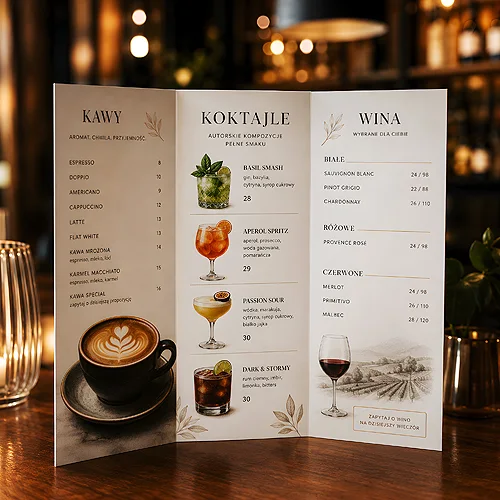
A guest picks up the menu and for the first few seconds does not really read it - they scan. Their eyes move across the page, look for anchor points and subconsciously decide where to stop. If the menu is well guided, in that time they will land on the dishes you most want to sell. If not, they wander, ask the waiter and order whatever happened to catch their eye. Good navigation in a menu is not decoration - it is the way you lead a person by the hand toward a decision.
- Split the menu into clear sections in a natural order: starters, mains, desserts, drinks.
- Build a hierarchy - signature dishes, the dish of the day and seasonal items should catch the eye first.
- Mind readability: the right typeface and size, contrast, short descriptions and clear labels.
- Place the price right next to the dish, without dotted leaders pulling the eye sideways.
- The scan-in-seconds rule - if the guest gets lost on the page, there are too many items.
Guide the eye - a logical split into sections
Before you touch fonts and colours, arrange the content. A menu works best when it mirrors the natural order of a meal: starters first, then soups and mains, and desserts and drinks at the end. The guest then does not have to wonder where to look for anything - they follow a rhythm they know from life.
Every section needs a clear heading. It tells the eye "a new topic starts here" and lets the reader jump quickly to the group they want. Keep headings in one style and size so the whole card has a consistent rhythm.
Leave some breathing room between sections. A subtle line or a little extra spacing is enough to stop the dish groups from merging into one block. White space is not wasted space - it is what makes a card look ordered and keeps it from overwhelming the reader.
Order matters
Order counts within a section too. The eye first lands at the top of a list, so that is the natural spot for items you want to feature. You do not need tricks - simply place the most important dishes where the eye stops first.
Visual hierarchy - what should catch the eye
Not all items are equally important for the venue. A signature dish, the dish of the day or a seasonal suggestion deserve to stand out from the background. That is the heart of hierarchy - you consciously decide what the eye should stop on first.
You have a few calm tools for highlights: a subtle frame, a soft background behind an item, a slightly larger or bolder dish title, a small icon by the chef's special. Each of them works - as long as you do not use them all at once.
The most common trap is overload. When everything is highlighted, nothing is - the eye does not know where to look, and the whole hierarchy blurs. Pick one, at most two ways of accenting and keep them across the entire card.
Try the "squint test". Look at the design with your eyes half closed so the text goes blurry. The elements that still stand out are your hierarchy. If half the page stands out, you have too many highlights.
Readability - font, contrast and description length
Even the best layout will not help if the guest cannot comfortably read the content. Choose typefaces with clearly drawn letters and make sure the dish text never shrinks to a size that forces people to bring the card closer to their eyes. Save decorative fonts for section titles at most - dish descriptions simply need to be easy to read.
Mind the contrast between text and background. Dark letters on a light background are a safe choice; light print on a dark background looks striking but can be tiring, especially in dim venue lighting. Remember that menus are often read in the evening, by candlelight, not in a bright office.
Keep descriptions short. One or two lines hinting at the flavour or the key ingredient do a better job than a long paragraph. The guest scans - the fewer words they have to process, the faster they decide.
Labels that help people choose
Simple symbols next to dishes genuinely make life easier: marks for vegetarian and vegan items, a spicy-dish sign, allergen information. Build a small, legible set of icons or abbreviations and explain them in one place - ideally in the corner of the page or at the bottom of the card. That way someone with a specific need finds their dish right away, without questioning the staff.
Price by the dish - without dotted leaders
Price placement is a detail that strongly shapes how the card feels. What works best is a price set close to the dish name, so the eye takes in both at a single glance. The guest sees the item and instantly knows where they stand.
Avoid dotted lines dragging the eye across half the page to the amount. Such "leaders" make the eye slide down to the price and treat it as the first piece of information, instead of getting interested in the dish itself. A calmer layout, where the price simply accompanies the name, is more pleasant and less pushy. It is also worth keeping the price column in the same quiet style as the rest of the text - it does not need to shout.
Format and length - single card or folded menu
The choice of format follows from how many items you have and how you want to manage them. A single-page card works great for a venue with a short, focused offer - everything is visible at once, with no page turning. If the offer is broader or you want to separate dish groups, a folded menu is often a better fit, tidying the content across several panels and giving more room to breathe.
Whatever the format, the scan-in-seconds rule applies: a single page should hold as many items as the eye can take in without effort. Better to give sections some air and add a panel if needed than to cram everything in tiny print. Choosing paper and finishing is a separate topic that affects durability and impression - you will find pointers on the menu cards page.
If you change the offer seasonally, consider a version with a separate insert for the dishes of the day. The main card stays consistent, and what changes is updated more cheaply and quickly, without reprinting the whole thing.
Common mistakes and how to avoid them
The most common problem is a list that is too long. When there are too many items, the guest feels overwhelmed and either picks something familiar or asks the waiter. A shorter, well-considered card almost always sells better than an encyclopaedia of dishes.
The second mistake is chaos - no clear sections, random order, highlights scattered without a plan. The remedy here is going back to basics: a clear split, consistent headings, one way of accenting.
The third is the lack of a main point. If a glance at the card does not reveal the venue's speciality, the hierarchy is not working. Decide what should be the page's first "hero" and build the rest around it.
If you want to dig deeper into readability itself, take a look at the piece on designing a legible menu card - it nicely complements what we cover here. And when you plan a consistent set of in-venue materials, the article on the consistency of the food menu, wine list and seasonal menu comes in handy. A good menu does not have to be flashy - it has to be clear. Take care of order, hierarchy and breathing room, and the guest will find the key information on their own, in a few seconds, and leave the venue feeling that everything was obvious.