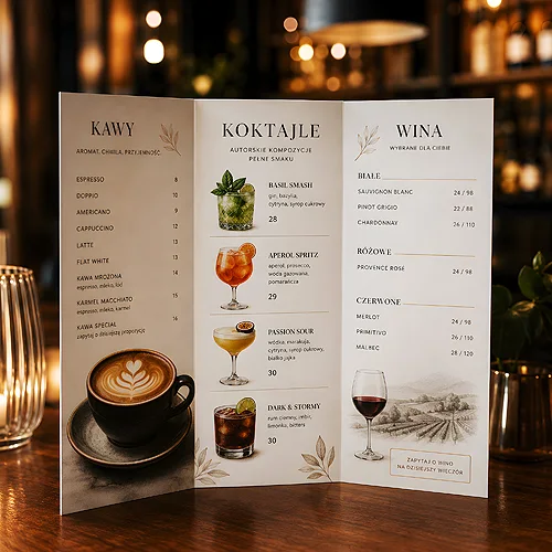
The menu is the most-read document in any venue. A guest spends a few minutes with it before deciding - and in that time the card either guides them confidently to a choice or loses them in a jumble of names and tiny print. A well-designed menu works on the atmosphere, speeds up service and quietly suggests what is worth ordering.
- Dish layout and section order lead the eye - start with what you want to sell most often.
- Clear typography and a strong hierarchy matter more than ornament - the guest should find a dish in seconds.
- Short, appetizing descriptions work better than long ingredient lists.
- Photos help only when they are truly good - otherwise it is better to skip them.
- Match format and paper to how the venue works: durability, hygiene and easy card replacement.
Start with structure, not graphics
Before you pick colours and a font, arrange the content. A menu is a path along which you guide the guest - not a random list. Group dishes into logical sections: starters, soups, mains, sides, desserts, drinks. Guests know this order from other venues, so they read it automatically, without effort.
Within a section, order matters too. The eye most often lingers at the top of a list and at its end, so these are good spots for dishes you want to sell. Middle positions tend to be skipped - worth remembering when you lay out the card.
A shorter menu, a surer choice
Faced with dozens of items, a guest often postpones the decision or picks what they already know. A concise card with a thoughtful selection makes choosing easier, and it simplifies your kitchen work and supply. If the offer is broad, split it across a few cards instead of cramming everything onto one page.
Typography and hierarchy - readability first
Menus are often read in dim light, in a hurry, sometimes without glasses. That is why readability beats fashion. Choose a font with clear, open letters and do not go too small with the size. The dish name should stand out at once, the description be clearly smaller, and section headings unmistakably separate one part from another.
Build the hierarchy with three simple tools: size, weight and spacing. Dish name - bigger and stronger. Description - smaller and lighter. Between sections - clear breathing room. You do not need frames and lines everywhere; often well-distributed space is enough for the eye to find the order on its own.
Check the card the way a guest will see it: print a test copy and read it under lighting like the one in the dining room, holding it in your hand rather than on screen. That immediately reveals whether the print is too small and whether dish names stand out.
Dish descriptions - appetizing, but concrete
A good description whets the appetite and clears up doubts, rather than reciting a recipe. Instead of listing every ingredient, highlight what makes the dish special: the way it is prepared, the origin of a key product, the character of the flavour. A few apt words work better than a long sentence the guest has to fight through.
Remember the information that genuinely helps the choice: markings for vegetarian and vegan dishes, spiciness and, above all, allergens. This is not only about the guest's comfort - in many places it is an obligation. Capture it in a consistent, simple system of symbols that repeats across the whole card.
It is also a good idea to gently highlight a few items you care about most - a signature dish or a seasonal proposal. A subtle mark, a frame or a short 'we recommend' note is enough, just do not overdo it: when everything is highlighted, nothing stands out. One or two accents per section are plenty to lead the eye where you want it.
Photos - when yes, and when better not
A photo can sell a dish, but only if it is truly good. Shot professionally, in a consistent style, on decent paper - it builds appetite and trust. Poor-quality photos, in random light or clashing in style, do the opposite: they undermine the impression of quality across the whole venue.
In many concepts - especially those with ambition and a coherent aesthetic - an elegant, well-set card without photos looks better than an album full of pictures. If you do go for photos, limit them to selected dishes and take care of high resolution and good paper, so the colours do not come out flat.
A menu does not have to be flashy - it has to be so clear that the guest finds their dish before they have time to grow impatient.
Format and type of card - match it to the venue
The choice of format depends on how your venue works. A single-page card suits a concise offer and quick table turnover. A multi-page or folded menu gives room for a broader offer and division into sections. A folded card has the advantage of holding a lot of content compactly and sitting conveniently on the table. That exact format is our folded menu, where the list of dishes and the seasonal suggestions fit into a single print.
A menu placemat can be an interesting option: a card that serves both as a table mat and a list of dishes. It works great in quick and family concepts, because it is cheap to replace and greets the guest right at the table. You will find more about printed table accessories in the post on placemats and accessories for hospitality. The card design itself is easiest to build using ready formats of menus and dish cards.
Separate cards for drinks and special offers
Consider separating drinks, wines or a special offer into their own cards. A wine list follows its own rules and usually looks better as a standalone print, while a separate dessert card, brought out after the main course, is a natural moment for extra sales. This split lightens the main menu and keeps each card shorter and more readable.
It is also worth designing a light card for the dish of the day or seasonal offer. This is the element that changes most often, so it should be simple to print and replace - that way you update only it, and the rest of the menu stays unchanged.
Durability and hygiene - paper that survives service
A menu lives in tough conditions: grease, moisture, wet hands, dozens of touches a day. That is why paper and finishing are not cosmetics but a practical decision. Thicker paper holds its shape and does not go limp. Lamination protects against soiling and lets you wipe the card clean, while giving it an elegant matte or glossy character.
It is worth separating what changes often from what stays. A durable, laminated cover and replaceable inserts with the list of dishes make it easy to update without reprinting the whole thing. Choosing weight and finishing is best done by looking at the available materials and papers - one thing suits a bistro, another a fine dining restaurant.
Make two versions of the cards: a durable, laminated card for the standard offer and a cheap, easily replaceable insert for seasonal and daily dishes. You update only what changes, and the rest of the card serves through the whole season.
Consistency with the brand and the venue's decor
The menu is part of the decor, not a separate print. The colours, font and style of the card should harmonise with the logo, sign and interior. Taking the card in hand, the guest should feel the same mood as when looking around the room. This consistency builds a sense of polish and professionalism - and works in favour of the whole venue's brand.
A menu rarely works alone. Table numbers, tags, counter materials and other small prints work alongside it, creating a coherent visual language. A comprehensive approach to prints for gastronomy is made easier by the offer dedicated to the HoReCa sector, where the card and accessories keep a single aesthetic.
Language versions and updates
If you host tourists, prepare a foreign-language version - usually English. Do not translate mechanically: dish names and descriptions should sound natural in the second language and keep the same appetizing tone. Make sure the layout and hierarchy are the same as in the Polish version, so both cards look like one coherent family.
A menu is a living document. Prices, the availability of seasonal products and the whole offer change, so design the card to be easy to update. Replaceable inserts, a separate daily card and a tidy design file will make future changes take a moment rather than a whole evening. A well-thought-out menu is an investment that works for a long time on impression and convenience - yours and your guests'.