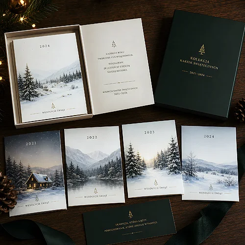
Think about how many pieces of packaging passed through your hands over the last week. You unpacked and threw most of them away in seconds, without a second thought. Now recall that one box you kept - because it was pretty, handy, or you simply felt it would be a shame to bin it. That is exactly the effect we are after. Packaging that lands on the shelf instead of in the bin works for the brand long after the product was bought.
This is not a matter of chance or budget alone. Packaging that people want to keep shares a few common traits - and most of them can be designed deliberately. Below we show what decides whether a box stays with the client, and how to translate those principles into a concrete project.
- Packaging stays when it has further use - it works for storage, as a gift, or as part of a collection.
- Material and finish quality is read by touch - solid cardboard and a pleasant texture build value.
- Aesthetics over loudness - a restrained, coherent design ages better than pushy advertising.
- Emotion and personalisation make throwing a box away feel like losing something personal.
- Match the form to the content - one type of packaging stays with a gift, another with a practical product.
Why most packaging ends up in the bin
Before you design something meant to stay, it is worth understanding why the rest disappears. Typical packaging does one job - protect the product in transit - and there its role ends. When it is no longer needed, it gives no reason to keep it. It is thin, impersonal, and looks exactly like hundreds of others.
Packaging that survives the moment of unpacking has to offer something more. Usually it is one of three things, and ideally a combination of them: further usefulness, clearly higher quality, or emotional attachment. The rest of this article breaks each of these levers down into concrete design decisions.
Usefulness - give the box a second life
The simplest way to make packaging stay is to make it still useful once empty. People are reluctant to throw away things that might still come in handy. If your box looks and works like a proper container, the client will instinctively set it on a shelf rather than in the bin.
- Solid, reopenable construction - a box with a proper closure naturally invites keeping something in it.
- A size that comes in handy - packaging for small items, documents or accessories gets a second life as an organiser.
- A neutral interior look - if the inside does not shout a logo, it fits more easily into a home's order.
- A form that suggests storage - the shape of a gift box or a disc case itself hints that it is worth keeping.
You can see this clearly on protective packaging for discs. A rigid cardboard envelope protects the contents and at the same time looks like something worth keeping in a drawer, rather than crushing and binning. A well-made digipack works similarly - a cardboard form with room for coherent graphics is often treated as part of a collection, not disposable packaging.
Quality you can feel in your hand
We largely perceive the value of packaging by touch. Before the client reads anything, their hand has already judged whether the box is solid or thin and cheap. That first physical contact decides half of the impression - and it is something you can design deliberately.
Material and weight
Thicker, rigid cardboard immediately communicates: this is something proper. Packaging that does not bend between your fingers and holds its shape confidently gains value before you even look at the graphics. Thin, flimsy material does the opposite - it suggests a disposable thing you can safely throw away.
Surface finish
Texture makes a bigger difference than it seems. A matte, slightly rough surface feels elegant and expensive, and subtle finishes in key spots - the logo, the title - give the box character. The point is not to decorate everything at once. One well-chosen finishing accent does more than ten effects fighting for attention.
Before you approve the design, do a simple thought test: take the finished packaging in your hand and ask yourself whether you would want to keep it. If the answer is not an immediate yes, return to the material and finish before touching the graphics. It is touch, not colour, that most often decides whether a box survives.
Aesthetics that will not date
Packaging designed like a loud advertisement has a short shelf life - the harder it shouts about a promotion, the sooner it looks worn out. The boxes people keep are usually restrained and coherent. They look more like an object than a carrier of a marketing message.
This does not mean the brand should vanish. It is about proportion. A logo present but not dominant, a coherent palette, legible typography and plenty of breathing room create an impression of class that does not bore you after a week. A few rules that help a design not to date:
- Limit the colours - two or three shades held consistently look more mature than a rainbow of accents.
- Leave space - an empty field is not wasted; it gives the design breath and elegance.
- Choose timeless typography - a legible, calm typeface outlasts a trendy effect.
- Avoid dates and promotions on the box - anything tied to a specific campaign quickly makes packaging outdated.
If you want to see how packaging can work for a brand harder than many a campaign, take a look at our post on why product packaging can matter more than advertising.
Emotion and personalisation - a box too good to throw away
The strongest reason people keep packaging is emotional. A box tied to a memory - a gift, an important moment, a person - gains a value you cannot buy with cardboard thickness. Throwing such packaging away feels like discarding a piece of that moment.
Personalisation is the simplest lever here. A name, a date, a short dedication or an individual graphic turn an anonymous box into something that belongs to a specific person. This works especially strongly with gifts and keepsakes, where the packaging is part of the experience, not just a shield for the product. A representative four-panel digipack gives plenty of room for such a personal setting, and elegant folders can turn an ordinary set of documents into something a client holds with pride.
It is also worth remembering that a premium effect does not always need elaborate production. Sometimes a simple but considered detail is enough - more on that in the post on how a band, sleeve or sticker lets you personalise packaging inexpensively.
From idea to finished design - an order that works
Once you know the levers, it is worth arranging them in a sensible order. The steps below help you design packaging that has a real chance of staying with the client, rather than ending up in the bin.
- Start with who and what for - one type of packaging stays with a gift, another with a practical product.
- Choose the form and material - decide on construction and weight before touching the graphics.
- Design a restrained, coherent look - a logo present but not dominant, a limited palette, plenty of breathing room.
- Add a personal element - personalisation or a detail that builds emotional attachment.
- Check usefulness once empty - consider whether the box can be reused.
Packaging that stays is not a luxury reserved for big brands. It is the result of a few deliberate decisions: solid material, calm aesthetics, a touch of emotion and a form that stays useful for longer than a day. Designed this way, a box stops being a cost and becomes quiet advertising that returns to the client every time they reach for it. If you want to translate these principles into a concrete project, browse the available forms in the products section or write to us via contact.