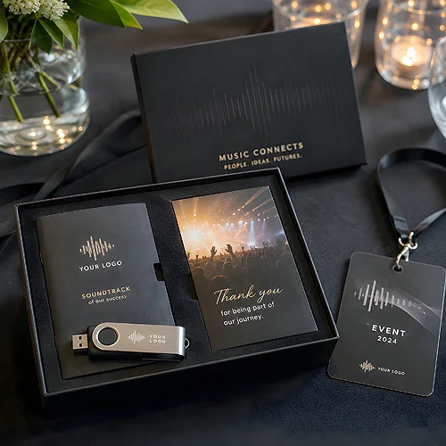
The disc plays, but it is the booklet that tells the story. It is where the lyrics live, along with the thank-yous, the names of the people who made the album, and those small details that turn a recording into something worth owning. A well-designed booklet is not an add-on - it is part of an experience the listener leafs through, returns to and remembers.
Designing a booklet is the art of fitting a lot of content into a small format so that it stays legible and beautiful. You have to reconcile the track list, lyrics, photos, brand information and finishing into a coherent whole that harmonises with the cover. Below we go through it step by step - what to include, how to arrange the pages and how to care for the details that make the difference.
- The booklet is part of the album experience - a place for lyrics, thank-yous, credits and the brand's story.
- Plan the content before you design the layout: track list, lyrics, credits, photos, a word about the artist or brand.
- Page hierarchy and coherence with the cover decide whether the whole looks like one considered product.
- Typography must stay legible despite the small format - choose type size, spacing and contrast carefully.
- Paper and finishing build character - matte, texture and format shape perception as strongly as graphics.
- The number of pages ties in with folding and stitching, and a QR code completes the bridge to the digital version.
Why an album needs a booklet
In an age when music is listened to mostly through streaming, a physical album has become a gesture - something you collect, hand over and leaf through. The booklet is the heart of that gesture. It is what gives the listener a reason to pick up the release and stay with it longer than a single play.
For a brand, a booklet is more than a table of contents. It is a space to tell a story, show the people behind the project and build an emotional bond. A music disc has long been a deliberate element of an image - we wrote about it in the context of music on a promotional disc matched to the industry - and the booklet is where that narrative unfolds most fully.
What to include inside
Before you arrange the pages, list everything that is meant to appear in the booklet. Only a full list lets you sensibly plan the layout and the number of pages. A classic booklet consists of a few fixed elements you can expand depending on the character of the release.
- Track list - the foundation of navigating the album, usually with running times and order. It is worth making it legible at first glance.
- Lyrics - for many listeners the most important part. They need the most space and the most careful setting.
- Thank-yous - a personal accent that builds warmth and shows the human side of the project.
- Line-up and credits - who played, who produced, who was responsible for the graphic design. It is a mark of respect for the co-creators.
- Photos - portraits, shots from the session, images that build the mood. Visually they tie the whole together with the cover.
- A word about the artist or brand - a short text that sets the album within a broader story and identity.
Not everything has to go into every release. It is worth knowing the whole list at the start, though, because it determines how many pages you really need and how you lay them out.
Layout, hierarchy and coherence with the cover
Once you know what goes inside, the moment of arranging the pages arrives. Here hierarchy matters most - the reader must know at once where the track list is and where the lyrics are, and move smoothly from page to page.
Rhythm and flow of the pages
A good booklet has its rhythm. The opening usually sets the mood - a photo or a short word. The middle is the heart of the content: lyrics laid out so each has room to breathe, interspersed with shots for a visual pause. The closing holds the credits and thank-yous. Such a flow makes leafing through the booklet an experience rather than a tedious search.
One language with the cover
The booklet cannot look detached from the rest of the release. The same palette, the same typography and the recurring graphic motifs from the cover must carry through to the inside. Visual coherence decides whether the album looks like one considered product or a collection of loose elements. We wrote more about how the cover carries the aesthetics and communication of the whole in our post on the cover of a disc as an advertising surface.
Before you design the inside, set a grid and margins shared across all pages. A repeatable structure - the same spacing, the same position of numbers - works invisibly, but it is what makes the whole look professional. Chaotic margins show even when the graphics are beautiful.
Typography in a small format
The greatest challenge of a booklet is legibility. The format is often small and the content plentiful - especially when the lyrics are long. Here every typographic decision counts.
- Type size - choose it so the text reads comfortably at arm's length, but without wasting space. Too small tires the eye, too large eats up pages.
- Line spacing - a touch of air between the lines makes even dense text breathe and keeps it from merging into a block.
- Contrast and background - dark text on a light background or light on dark must have clear contrast, otherwise the letters vanish, especially over photos.
- A limited number of typefaces - one typeface for headings and one for body text is quite enough. Multiplying fonts quickly creates a mess.
It is worth remembering that fine print demands care at the file-preparation stage. Thin lines and small letters can be capricious, so it is good to look in advance at the tips on preparing files, so the design looks as good in print as it does on screen.
Paper, finishing and the number of pages
The material and the way of finishing build the character of the booklet as strongly as the graphics. The same design on matte, lightly textured paper and on smooth glossy paper looks and feels completely different.
Matte paper gives an intimate, elegant tone and handles text well - it does not reflect light, so it reads comfortably. A smooth, satin stock brings out the saturation of photos and feels more modern. Texture, in turn, adds a sense of craft and a premium touch. The difference shows most in photographs and in long stretches of text, and how each stock behaves is set out in the section on materials and papers.
The number of pages is not only a matter of content. It ties in with how the sheets are folded and joined - booklets are folded and stitched in multiples, so it is sensible to plan the volume with an eye to how it will physically come together. This form works best in digipaks and full music albums, where the booklet has a natural place in the fold-out structure of the release. The options cover booklets and inserts: an insert of 2, 4 or 6 pages, and a stitched booklet from 8 to 36 pages.
A bridge to the digital version
A modern album rarely lives in physical form alone. A QR code woven into the booklet can complete the bridge between the release and its digital version - leading to a playlist, bonus materials or the artist's page. It is a small element that significantly broadens the experience.
- Find a discreet spot - the code does not have to shout. It looks good on the last page or near the credits, where it does not disturb the rhythm.
- Mind the contrast and size - the code must be large and clear enough for a camera, with a margin of light space around it.
- Describe where it leads - a short line beside the code encourages scanning and says what to expect.
- Test before printing - check the code at its final size before the whole thing goes into production.
A well-designed booklet is a detail the listener will feel even if they do not name it. Plan the content, arrange the pages with rhythm, keep one language with the cover and care for legibility despite the small format - and the booklet will become what it should be: part of a story the listener gladly returns to. It is precisely this care for detail that turns an ordinary release into something you want to own.