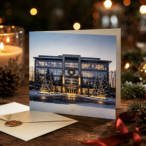
You face a simple choice: show a real photo or commission a drawing? Both styles can catch the eye, but they do it differently. A photo says "this is real, you can trust me". An illustration says "I am different, you will remember me". In this post we show when realism works and when artistic styling does. Without playing favourites - because both approaches have their strengths. The point is to match the style to your goal, your product and the character of your brand.
- A photo builds trust - it shows how something really looks.
- An illustration stands out and adds character - it is easier to remember.
- Food, products and people usually look better in good photos.
- Ideas, services and emotions are often told better by a drawing.
- There is no single right answer - the goal and brand consistency matter.
When a photo builds trust
Realistic graphics means mainly photography, or graphics that mimic a real photo. Its biggest strength is credibility. When someone sees a real product, a real dish or a real face, they instantly feel they are dealing with something tangible. The brain likes what it can recognise - and it recognises a photo in a split second.
That is why a photo wins wherever "how it really looks" matters. A restaurant menu with an appetising photo of a dish works harder than a drawing of a plate. A leaflet with a real photo of a salon interior earns more trust than a stylised sketch. The customer wants to know what they will get before they walk in or buy.
Photos do especially well in three areas: food, specific products and people. An appetising photo of a dish stirs the imagination of taste. A sharp product photo shows details whose quality you cannot draw. And a real face builds a relationship - we look someone in the eye and feel there is a human on the other side. That is priceless on materials meant to persuade a purchase, like advertising posters promoting an offer.
If you reach for a photo, take care of its quality. A blurry, dark or stretched photo does the opposite of what you want - it undermines trust instead of building it. Better to use one truly good photo than several mediocre ones.
When an illustration stands out and stays in memory
Artistic styling means a drawing, an illustration, a simplified form - anything that deliberately moves away from realism. Its strength is different from a photo. An illustration does not pretend to be reality, it interprets it. That lets it show things you cannot photograph: an idea, an emotion, an atmosphere, a promise.
A drawing is also easier to remember. In a sea of similar stock photos, a distinctive illustration catches the eye at once. It is personal - someone created it specially for this brand, so it carries a unique character. That is why brands that want to look original and friendly often choose their own graphic style instead of photographs.
Illustration works great wherever anything is hard to photograph. How do you show a consulting service or an abstract idea? It is easier to draw a scene or a symbol than to struggle with a staged photo. A drawing also tells stories well and builds a warm, informal tone - which is why it is often chosen by materials aimed at children, craft brands and casual events.
A photo shows how something is. An illustration shows how something should feel. Choosing between them is choosing between proof and mood.
Realism and styling can play together
It does not have to be an either-or choice. Many successful projects combine both worlds. A real product photo against an illustrated pattern. A real face with simple graphic elements drawn around it. A photo of a dish in a frame decorated with a drawing. Such a mix gives you the credibility of a photo and the character of an illustration at once.
The key is hierarchy - one element plays first fiddle, the other only supports it. If you want to build trust in a product, let the photo be large and clear, and let the illustration stay as background or detail. If you care about character and lightness, reverse the proportions. What matters is that both styles form a coherent whole rather than fighting for attention.
Remember the technical side of printing too. A very fine, detailed illustration can lose sharpness on a small format, and a low resolution photo will blur on a large poster. Before you send your design, check that the graphic fits the size - our file preparation guide will help.
How to match the style to the goal and the brand
Start with a question: what is supposed to happen in the viewer's head? If you want them to believe and buy a specific product - go with a photo. If you want them to remember the brand and feel its character - consider an illustration. The goal matters more than the trend. A pretty drawing will not help if the customer needs to see what the goods look like.
The second question is about the brand. An elegant, serious company usually looks better in realism and restrained photography. A young, creative brand, or one aimed at children, can boldly reach for daring styling. The style of your graphics is part of your identity - it should match how you want to be perceived. It is worth returning here to the basics we described in our post on the design principles worth knowing.
Do a simple test: imagine your material next to your competitors' materials. If everyone bets on photos, a good illustration can set you apart. If everyone draws, a strong, real photo will catch the eye. Sometimes the best choice is the one others are not making.
Choose consciously, then print
There is no style that is better once and for all. A photo and an illustration are two different tools, each for a different job. A photo brings trust and specifics, an illustration brings character and memory. The best effect comes from a conscious choice matched to the goal, the product and the brand, not to a passing trend.
If you work with computer generated graphics, it is worth knowing its traps - we described them in our post on what quality problems AI graphics cause in print. And when your design is ready, whether you go for realism or styling, we will gladly print it for you - from advertising leaflets to posters up to SRA3 or 300 x 640 mm.