Artificial intelligence can create an image in a few seconds that looks stunning on screen. No wonder it increasingly ends up straight in projects for leaflets, posters or covers. There is just one catch: graphics that look great on a monitor are not always ready for print. The good news is that most problems are easy to spot and fix - you just need to know what to look for. Let us go through it calmly, step by step.
- AI images are often too small - they turn blurry when enlarged.
- Small details can carry little mistakes, for example in text or hands.
- AI usually creates in screen colours (RGB), while print works in ink (CMYK).
- AI graphics often have no bleed, that is the margin for trimming.
- It is worth checking what rights to the image a given tool grants you.
Too low resolution, that is blur when enlarged
The most common trouble is size. Many tools create images sized well for the screen by default, but too small for print. On the monitor it looks sharp, and after enlarging to an advertising poster format the characteristic softness and loss of detail appear.
The rule is the same as with ordinary photos: what counts is the number of pixels relative to the print size. If you want to go deeper, read the post on what photo resolution is right for printing. In short: the bigger the print, the more pixels the graphic must have.
Before you start creating an image in AI, choose the largest available size or the high-resolution option in the tool. Enlarging a finished, small image will not add detail to it - it is better to ask for a large version right away.
Odd details and small artefacts
Artificial intelligence handles the overall mood of an image very well, but it can go wrong in small details. Classic examples are captions that up close turn out to be a jumble of meaningless letters, and hands with an unusual number of fingers. There can also be faint smudges or repeating patterns where there should be none.
On screen, looking at the whole, this is easy to miss. In print, however, every detail is sharp and visible, especially when someone picks up the material and looks closely. That is why it is worth zooming into the image on the monitor and calmly reviewing it piece by piece, especially faces, hands and any text. If something looks odd, you can usually fix it in a graphics program or ask AI for a new version of that fragment.
AI gives a great starting point, but it is the human who decides what really ends up on paper.
RGB colours instead of print CMYK
AI tools create images in screen colours, that is in the RGB model - the same one your monitor glows in. Print, however, works with ink, in the CMYK model. Some of the intense, luminous colours from the screen are simply unattainable in print, so after printing they can come out calmer or slightly muted.
This is not a mistake, just the natural difference between light and ink. It is worth expecting it, especially with strongly saturated, neon colours. Before you send the file to print, switch it to CMYK mode in a graphics program and check whether the colours still suit you - that way you see an effect closer to the print than to a glowing screen. You will find more about why this happens in the post on why colours on screen differ from the print.
No bleed and accidental cropping
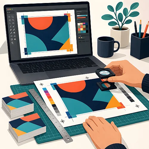
Bleed is a small margin of the image extending beyond the cut line. Thanks to it, no white strips are left on the edges after trimming. AI graphics are usually made without this margin, so if the image is meant to reach the very edge of the print, you need to add that bleed in a graphics program.
It is also worth watching the frame. AI likes to place important elements near the edge, and in print part of the surface goes under the blade. So leave some room around the most important things, so nothing essential gets trimmed. For simpler projects, such as advertising leaflets, it is enough to keep important elements at least 5 mm from the cut line.
If AI graphics are meant to fill the whole page, prepare the file with a small surplus of image on all sides. This surplus will be cut off during trimming, so no white edge appears on the finished print.
Rights to the image - what to remember
Before you use AI graphics in company materials, check the terms of the given tool to see what rights it grants you to the created image. The rules differ between services, and for commercial use this matters. It is a short step that helps avoid unnecessary doubts in the future.
Also be careful that the generated image does not contain elements too similar to someone else's marks or characters. AI sometimes unknowingly echoes well-known motifs. When you create something for sale or wide publication, it is better to choose a neutral and clearly original design.
How to calmly check and fix an AI file
You do not have to be a designer to catch the most important things. It is enough to go through a short checklist before you send the project to print.
- Zoom into the image on screen and review the details - faces, hands and all captions.
- Check the dimensions in pixels and compare them with the planned print size.
- Fix the text manually if AI added captions - it is best to retype it in a font.
- Switch the colour mode to CMYK and see whether the colours still suit you.
- Add bleed if the image is meant to reach the edge of the print.
Such a short review takes a few minutes and saves disappointment at collection. If you want to be sure about a specific order, we are happy to advise how to prepare the file - write to us through our contact page or visit the file preparation section. It is also worth remembering that AI is a great supporting tool, not a replacement for a human - we write more about it in the post on whether artificial intelligence will replace the designer.