33 guides on getting a design ready for print. We write them for people who prepare their own materials or are just starting out. Instead of theory you will find calm explanations and a list of things worth looking at before you send a file.
A few things that solve most of the trouble
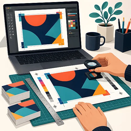
- A little extra at the edges. It helps to run the background slightly past the outline of the design and keep text and logos away from the border, so nothing important is trimmed off.
- Colour. A screen gives out light and paper reflects it, so very intense shades from a monitor often come out calmer once printed. That is normal and can be anticipated.
- Good quality photos. An image taken from a website, or a small photo enlarged a great deal, turns soft and blurry on paper.
- Lettering. It is worth saving the file so the letters look the same on every computer, whatever typefaces happen to be installed on it.
- PDF. This is the most predictable way to save a finished design, because it holds the page layout.
Canva, AI images and tidy company files
Several texts deal with Canva: making double-sided artwork, reworking a ready template so it does not look like a thousand others, and saving the result for print. A separate thread covers images from AI generators. They can look convincing on screen and then show blurred edges and odd details once enlarged. There is also an everyday topic, namely organising company files so the right version of the logo is always at hand.
Before you send the design
It helps to go through it calmly, point by point: size, colour, photo quality, and the spelling of names, addresses and dates. You upload the file in our system once the order has been placed. If you would rather have someone look at the design first, a paid check by a graphic designer can be added. It is useful for materials that cannot be corrected after printing, such as invitations carrying a date.