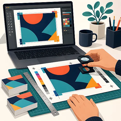
Before you send your design to print, it is worth sitting down for a moment and going through it calmly, point by point. This is not an exam or anything scary - it is simply a few minutes that can save you a lot of nerves once the parcel arrives. We have prepared a checklist you can work through from top to bottom. No rush, one step at a time.
- Dimensions and bleeds - the right format, bleeds usually 3 mm, text away from the edges.
- Colours - CMYK mode, thoughtful blacks and consistency with your brand identity.
- Images - at least 300 dpi at actual size, sharp and free of blur.
- Fonts - converted to outlines or embedded, letters legible.
- Content - correct contact details, read aloud, no typos.
- Final - a 100 percent preview, a test print and a second pair of eyes.
1. Dimensions and bleeds - is the design the right size
Start with the basics, that is the format. Check that your design has exactly the size you are ordering - otherwise the program may rescale it and everything will shift slightly. It is the simplest point, and very often skipped.
- Format - the design at the target size, one to one, with no scaling "by eye".
- Bleeds - an extra margin beyond the cutting line, usually 3 mm on each side. Thanks to it, no white strip appears at the edge after trimming.
- Safety margin - keep important elements, that is text and the logo, at least 5 mm from the cut line. The guillotine always has a tiny margin of error and you do not want it to clip the end of a line.
- Cutting lines - if the program adds them, check that they are in place and do not run into the graphics.
The rule is simple - the background and graphics should reach all the way to the bleed, while the content should stay safely inside. These are two different margins and it is worth thinking about them separately.
2. Colours - what you see on screen versus what comes out on paper
A screen shines with light, paper reflects it, so the colours will never be identical down to the last hair. You can, however, bring them very close if you take care of a few things before sending.
- CMYK mode - print works in this colour space. A file saved in CMYK gives the most predictable result. We do not accept RGB files - convert the design to CMYK in the Coated Fogra 39 profile before sending.
- Blacks - this is a common trap. For small text use text black (the black channel only), because it is sharp and does not smudge on small letters. For large, deep background areas, rich black works well and looks intense and full.
- Consistency with your identity - if you have brand colours, check that they match your logo and other materials. A consistent brand is one that is easier to remember.
3. Images - are the photos sharp enough
Nothing ruins a good design like a blurry photo. On screen it can look passable, and on paper it disappoints. That is why images deserve a separate moment.
- Resolution of at least 300 dpi - and that at 1:1 scale, meaning at the size it will actually be printed. A photo taken from the internet is usually too thin for print and you can see the little squares once enlarged.
- No blur - look closely at every photo enlarged. If the edges are soft and out of focus, it is better to find a sharper version of the file.
- Embedded or attached - in working files images are sometimes only "linked". Make sure they are embedded in the final file, so nothing goes missing along the way.
A simple sharpness test: enlarge the photo on screen to about 200 percent. If it looks good at that zoom, it will most likely be sharp on paper too. If it falls apart already now - look for a better source.
4. Typography - so the text is legible and free of slip-ups
Letters are the heart of most designs, so they are worth checking carefully. This is about both the technical side and plain proofreading.
- Fonts outlined or embedded - "outlines" turn letters into shapes, so the text will not change even if we do not have the same typeface. It is the surest way to make the text look exactly as you designed it.
- Legible sizes - the fine print must be readable. Very small letters and thin lines can vanish on paper.
- No "orphans" - these are single words, for example "and" or "a", left at the end of a line. They look untidy, and they are easy to push to the next line.
- Typos - and here the most important advice: read the whole text aloud. Really. The eye reads what it expects to see, while the ear catches mistakes the eye missed.
5. Content - the key information that has to be correct
You can have a beautiful design and still slip up on a wrong phone number. That is why we check the data and content especially carefully - they are what actually works after printing.
- Contact details - address, phone number, e-mail, opening hours. Call the number given and type the website into a browser. If they work live, they work.
- Prices and dates - if they appear at all, check that they are current. Out-of-date information on a printed material stays with you for a long time.
- Call to action - a clear message telling the reader what to do: call, visit the site, come in. Without it, even a pretty flyer will not work the way it should.
Gathering these rules in one place makes checking easier - we describe some of them in our guide on preparing files, and we clear up the most common doubts in the FAQ section.
6. Technical matters - order in the file
At the end of the technical part, a few things that are easy to forget and that can cause trouble during production.
- Page count and order - for multi-page materials, check that there are as many pages as needed and that they run in the right order.
- Orientation - portrait or landscape, on every page as intended.
- PDF/X-1a:2001 - if your program offers such a preset on export, choose it. It is the print standard that watches over colours, fonts and bleeds for you.
- No unnecessary layers or comments - notes, hidden layers or comments from the design stage should not make it into the final file.
A good print file is one that has everything it needs, and nothing more.
7. Final - one last look before sending
Only four steps are left, but they are the ones that catch the most. Do not skip them, even when you are in a hurry.
- 100 percent preview - view the finished file at actual size, page by page. Nothing shifted? Very good.
- Test print - print the design on your home printer, and if you want to see it on the final paper, order a proof print. It is not about the colours (those will differ), but about proportions, layout and whether the text fits where it should.
- Second pair of eyes - ask someone to take a look. A fresh view catches mistakes you simply no longer see after hours of work.
- The right file version - make sure you are sending the final version, not a working one from before the corrections. This is a surprisingly common slip.
A quick two-minute test for when you really have no time: a glance at the bleeds and text margins, a check that it is CMYK, one photo enlarged for sharpness, reading the contact details aloud, and a single 100 percent preview of the whole thing. That is the absolute minimum that catches most problems.
In closing - it is simpler than it seems
You do not need to be a graphic designer to check your design well. This list looks long, but once you have gone through it a time or two, it starts to work on its own - like fastening your seatbelt before a drive. And if you want to see where people trip up most often, take a look at the post on the most common file mistakes or calmly walk through preparing a file step by step.
And if anything worries you - just write to us. If you want our designer to look the file over, tick file verification when you order - you will get a preview to approve before the design goes to print. It is better to ask early than to regret it later, and there really are no silly questions here.