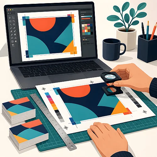
You send a file to the print shop and the waiting begins - will it pass, or come back with notes? The good news is that almost every correction comes from a few repeatable mistakes. Once you know them, you will start catching them before you even export. We gathered the ten most common slip-ups and, for each one, show you simply how to fix it.
- Most corrections come from missing bleed, wrong colours and low resolution.
- You can fix most mistakes in a minute - before you send the file.
- The safest format is a PDF with embedded fonts and text converted to curves.
- Our file preparation guidelines walk you through it step by step.
You do not need to be a designer to prepare a good file. You just need to know what the print shop looks at first - and check it on your side. Let us go through the list.
- No bleed. Bleed is the extra artwork extending beyond the trim line - with us it is 3 mm on each side of the job. Without it, thin white strips can appear at the edge after cutting. Fix: extend backgrounds and photos past the format and export the file with bleed enabled.
- Colours in RGB instead of CMYK. Screens shine in RGB, while print is made in CMYK. If you leave the file in RGB, vivid greens and blues may come out duller in print than on your monitor. Fix: switch the document to CMYK while still designing and work in the Coated FOGRA39 profile (Coated FOGRA27 for discs and UV printing). Leave no Pantone colours and no monitor profiles in the final file. We explain more in our article on which colour mode to choose for print.
- Resolution too low. What looks sharp on screen is not always enough for print. The standard is 300 dpi at the final size. Fix: check the resolution of your graphics before placing them, and do not force-enlarge small images - adding pixels will not bring back sharpness.
- Fonts not embedded or not converted to curves. If the print shop does not have your typeface, the text may swap to a different one and shift. Fix: enable font embedding when exporting to PDF, and convert graphic text (logos, slogans) to curves - then the letters are shapes, not fonts.
- Wrong dimensions or format. A business card designed at A4 size, or a flyer in proportions other than ordered, is a classic. Fix: set the document to the exact target format from the start, and compare the dimensions with your order before sending.
- Text too close to the edge. Cutting has a small tolerance, so text right at the border can end up unpleasantly trimmed. Fix: keep important text and logos within the safe margin - at least 5 mm from the trim line inward, which is 8 mm from the edge of the file with bleed.
- Low-quality photos. Images pulled from the internet or heavily compressed can show visible squares and blurred edges. Fix: use photos in their original, high quality and avoid saving repeatedly in formats that compress the image heavily.
- No allowance for cutting in repeating elements. Frames, lines and backgrounds sitting neatly at the edge look great in the file, but can turn out uneven after cutting. Fix: do not place thin frames exactly at the border, and always leave bleed so small blade shifts stay invisible.
- Wrong file format. We do not accept source files from graphics programs (PSD, AI, INDD, CDR), editable documents (DOC, DOCX, PPT) or PNG with transparency at all - such a file comes back to you with a request to export it. Fix: save the finished design as PDF/X-1a:2001. We also accept TIFF (one file = one page, CMYK, 300 dpi, no layers, LZW compression) and high-quality JPG (CMYK, 300 dpi) for simple designs without text.
- Mixed-up pages and order. In folders, booklets and calendars it is easy to reverse the order or lose a page. Fix: arrange pages in sequence in a single PDF, in the order they should follow after folding, and review the whole thing from first to last before sending.
Before you send the file, do a quick check-up round: format matching the order, bleed, CMYK, 300 dpi, fonts embedded or on curves, text within the safe margin. Four minutes here save you a day of waiting for corrections.
Why these small things matter
Print is ruthlessly literal - it reproduces exactly what is in the file. A screen forgives and boosts, while the printing press only faithfully carries colour, sharpness and position onto paper. That is why polishing the file before sending is not a formality, but real time and nerves saved.
A good file is one that prints exactly as you see it on screen - with no surprises after trimming.
It is also worth remembering that the choice of paper affects how colours behave. A warmer, absorbent paper renders colours differently than a coated one, so with delicate shades it is worth thinking about this at the design stage. We write about it in our article on what paper weight means in practice.
Where this topic comes up most
Most questions about files appear with small formats, where every millimetre shows - like business cards or promotional flyers. There, a missing bleed or text right at the edge stands out immediately. But the same rules apply to every project, from posters to packaging.
If you are unsure about a specific format, check our frequently asked questions - we gathered answers there for the situations that come up most often. And once your file is ready, simply upload it to your order.
A simple habit instead of stress
It is not about becoming a file-preparation specialist. It is about one simple habit: before you click "send", go through the checklist top to bottom. Over time it becomes a reflex, and your files will pass on the first try. And if something raises doubt - better to ask before printing than to fix afterwards. We are here to help you with exactly that.