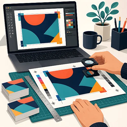
It is one of the most common worries we hear before printing: "will the colours come out just like I see them on screen?". The reassuring answer is that small differences are completely normal - and they are not a printing error. A screen and a sheet of paper are two different worlds that show colour in entirely different ways. Once you understand why, the stress fades and your design goes to print without surprises.
- A screen emits light (RGB), while paper reflects light off ink (CMYK) - two different mechanisms.
- Ink cannot reproduce the brightest, neon-like colours of a backlit monitor.
- Every screen shows colour slightly differently - the same photo never looks identical on two monitors.
- The type of paper changes how colour reads: matte softens it, gloss brings it to life.
- You can tame it: design in CMYK, order a proof and set realistic expectations.
Screens emit light, paper reflects it
The biggest difference sits right at the foundation. A monitor is a light source - every pixel glows on its own and mixes three colours: red, green and blue. That is the RGB model. This is why on-screen colours can be so intense and "electric" - you are looking straight into a source of light.
Paper works the other way around. It does not glow on its own - light from the room falls onto the ink and bounces back to your eyes. Printing uses four inks: cyan, magenta, yellow and black, which is the CMYK model. Instead of adding light, the inks absorb it. That is why a print will always be a touch calmer than a backlit screen - and that is perfectly fine.
A screen adds light, paper reflects it. It is not the same scene seen twice, but two different technologies showing the same idea.
Colour range, or why neons fade
Each method has its own range of colours it can show - the technical word is gamut. The RGB screen covers a huge, very vivid palette. CMYK print also handles most colours beautifully, but its range is simply different and in a few places narrower.
You see it most with highly saturated colours: intense greens, electric blues, bright oranges or neon pinks. On a monitor they look dazzling, because they glow. On paper, ink has no way to reproduce that glow, so those colours come out a little softer. This is not a fault - it is the natural limit of ink.
The good news: the overwhelming majority of colours - corporate navies, warm reds, pastels, beiges, greys - print beautifully and very close to what you see on screen. Only the loudest shades can catch you out.
Every monitor shows it differently
There is one more reason that is easy to forget: no two screens are identical. The same file on your laptop, on your phone and on a colleague's monitor looks slightly different - warmer here, cooler there, brighter elsewhere.
Brightness, factory settings, the age of the panel and even the lighting in the room all play a part. A screen that has not been calibrated (that is, tuned to a reference) shows colours "its own way". So print cannot hit exactly what you see - because what you see depends on the particular device in front of you.
Before judging your project's colours, set your screen brightness to a moderate level and look at the file in daylight. A very brightly lit monitor can "promise" colours that ink will not deliver.
Paper has a say too
The same file on two different papers looks different - and that is entirely natural. The surface the ink sits on helps shape the final colour.
- Matte paper gently scatters light, so colours are muted, elegant and easy on the eye. Ideal when you want a calm, refined character.
- Gloss paper reflects light more strongly, which makes colours feel more vivid and deep, with stronger contrast. Great for photos and rich graphics.
- The colour of the paper itself matters: a slightly cream stock lifts colours differently than a snow-white one.
So when choosing a stock, think not only about the feel but also about how the colours will read. If you are not sure which option to pick, we will guide you - as we explain in our guide to materials and papers.
How to minimise surprises
You do not have to be a designer to keep the result predictable. A few simple habits make a huge difference.
- Design in CMYK. If you work in print mode from the start, your screen shows colours close to those on paper right away - fewer surprises. There is more on choosing a mode in our post CMYK or RGB - which colour mode to choose for print.
- Keep colour values consistent. Save your key shades - logo colour, brand background - as exact values and use them the same way everywhere. That keeps the print repeatable.
- Set realistic expectations. If your design rests on a neon colour, assume from the start that it will be calmer on paper. That lets you design something that looks great in print.
- Consider a proof. For a large run or a colour that really matters, a test print shows the real result before full production begins.
Do not judge a finished print in dim evening light. The same sample in daylight can look completely different - paper reflects whatever lights it up.
Relax - it is not an error
The most important thought to close on: the difference between screen and print is a normal phenomenon, built into the nature of printing, not a mistake by the printer. Once you know about it, it stops being a surprise and becomes something you simply factor in at the design stage.
Our job is simple: to print your file as faithfully and beautifully as ink and paper allow. And if you want someone to look the file over first, choose the graphic designer's file check in the calculator. We have gathered practical advice in our guide to preparing files for print, and if you have a specific question about your project, take a look at our frequently asked questions or write to us. We will gladly help you choose colours and paper so that the result makes you happy.