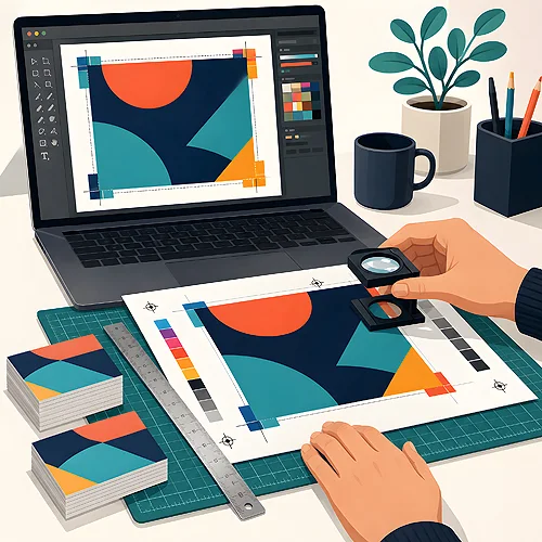
There is a moment just before approving a print run when the design looks perfect - on screen. Vivid colours, even text, everything in its place. And then the parcel arrives and it turns out the pink shifts towards purple, the address is missing a letter, and the bleed came out so that the blade cut off a piece of the logo. These things happen not because someone was careless, but because a monitor and paper are two different worlds.
A proof print is a way to reconcile these two worlds before the whole run goes ahead. It is a control copy - your design actually printed, ready to view in your hand. It sounds like an extra step that lengthens the work, but in practice it is the cheapest insurance policy you have. Below we calmly explain what a proof will show, what it will not reveal and when it is really worth reaching for.
- A proof is a trial print of the design on paper - a control copy to view before the full run.
- A screen emits light (RGB), paper reflects light (CMYK) - which is why colours on the print can differ from the monitor.
- Typos, wrong spacing and small errors are much easier to catch on paper in your hand than on screen.
- On a proof you also check bleeds, cut lines, format and registration - that is, whether anything important gets trimmed off.
- It is worth ordering for a large run, an important project or unusual paper - where a mistake costs the most.
Why colour on screen lies
The most common disappointment in print is colour. A design on a monitor looks juicy, and the print comes out darker or in a different shade. This is not a fault - it is physics. It is worth understanding, because then it stops being surprising.
A screen creates colours from the light it emits itself - mixing red, green and blue (RGB). Paper works the other way round: it does not glow, it reflects light from its surroundings, and colours are formed from four inks (CMYK - cyan, magenta, yellow and black). The range of colours a glowing screen can show is wider than what can be reproduced with ink on paper. That is why the most vivid greens, intense oranges or deep navies usually lose a little of their on-screen intensity in print.
On top of that comes the paper. The same file on white smooth board and on cream, rough paper gives two different impressions - the paper affects how the ink looks and how deeply it soaks in. We write more about how the substrate itself changes the perception of colour in our post on light on metallic and textured papers. A proof shows all of this at once - colour, ink and paper - exactly as the recipient will see it.
What a proof catches better than a screen
Colour is not everything. A print held in your hand has this magical quality that suddenly you see on it things that slipped past on the monitor for weeks. Changing the medium changes the way you look.
- Typos and small errors in the content - on screen the eye glides over text, on paper you read it differently, more slowly. A missing letter in a surname or a wrong digit in a phone number can jump out only on the print.
- Bleeds and cut lines - that is, whether the background reaches all the way to the edge and whether nothing important sits too close to the border. On a proof you see for real where the cut runs.
- Format and proportions - a design that seemed spacious on a large monitor can suddenly feel cramped in the target format in your hand, or the other way round. You really feel the size only physically.
- Registration and finish - how the fold sits, whether elements from two sides line up, how the finishing looks. Things a screen simply cannot convey.
For prints with a lot of small text a proof is especially valuable - only on paper can you see whether everything is really legible. We expand on this thread in our post about legibility with a large amount of information.
Digital proof versus a print on the target paper
Not every proof print is the same. It is worth knowing the two main kinds, because they differ in what they can show - and why they are made.
Digital proof
This is a control print from a device calibrated to reproduce the target colour as faithfully as possible. It works great for verifying colour, layout, text and the overall impression. It is fast and convenient, but usually made on a standard substrate, not on exactly the paper the run will use.
A print on the target paper
This is a trial copy made on the same material and with the same technique as the final run. It shows the most, because it accounts for the real paper - its whiteness, texture, absorbency - and how the finish behaves on it. It is the most reliable check, especially when the paper is unusual or the colour exceptionally important.
If colour is critical - the company red in a logo, a specific brand shade - ask for a print on the production paper, not just a digital preview. It is the only way to see the colour exactly as it will come off the press. With us a proof print is ordered as an add-on to an order already placed, for packaging, booklets and UV printing on a disc. Before you order a proof, though, it is worth tidying up the file itself - how to do that we explain in our guide to preparing files.
When it is really worth ordering a proof
Not every print needs a proof - for a simple, repeatable design on standard paper, careful file checking is often enough. There are situations, however, where a trial copy pays for itself many times over. Here is the order in which it is worth assessing the need.
- A large run - the more copies, the more expensive a mistake multiplied across the whole becomes. In sizeable production the cost of one proof is disproportionately small against the risk.
- An important, one-off project - wedding invitations, trade fair materials, a catalogue for a product launch. There is no second chance there, and a slip-up is visible to everyone.
- Unusual paper or finish - metallic, textured, dyed-through substrates can surprise you. We write about how deeply dyed-through paper changes the effect in our post on paper dyed through in the mass.
- Colour critical for the brand - when the shade must match the visual identity or a previous print, a proof removes the guesswork.
- A first collaboration or a new project - when you simply want to gain confidence before approving a larger production, a proof gives peace of mind.
In these cases a proof print is not an extra expense but a sensible safeguard. The most painful mistakes are those discovered only after receiving the whole run, when nothing can be changed anymore. A proof moves that moment of discovery earlier - when a correction is still a trifle, not a catastrophe.
What a proof will not show
To be fair: a proof print is a powerful tool, but not a fortune teller. It is worth knowing where its abilities end, so as not to expect miracles from it.
- Pixel-perfect repeatability - printing is a process in which small colour variations between copies fall within the norm. A proof shows the direction and appearance, not a mathematical template for every single piece.
- Durability over time - how the print will withstand months of carrying or sun in a shop window, a single copy will not reveal. Here knowledge of materials helps - more on that in our guide to papers.
- Errors you would not notice yourself - a proof shows what is in the file. If a typo slips past you on paper just as on screen, the print will multiply it. That is why it is worth handing the design to a fresh pair of eyes.
- On-screen brightness - a proof will not make the ink glow like a monitor. It shows real, paper colours - and that is its advantage, not a flaw.
Being aware of these limits makes a proof even more useful - you know what to ask it and what to look for elsewhere. Treat it as the last, calm stage before printing: the moment when your design first becomes a real, paper thing you can view, turn between your fingers and approve with a clear conscience. That moment of calm before a large run can be worth more than all the rush that would replace it.