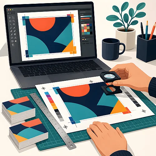
You know that feeling when a design looks perfect on screen - vivid colours, sharp text, everything in place - and yet the printer asks for a different file? It is not a whim. The screen and the printing press are two different worlds, and a pretty preview and a print-ready file are two entirely different things.
It is worth understanding this difference before you send anything to print. That way you avoid disappointment when you pull leaflets out of the box in colours different from your monitor, or with text trimmed by a millimetre. Below, in plain terms, we explain what sets an ordinary preview apart from a production file and how to prepare the latter so the print comes out exactly as you expect.
- A preview is usually a JPG or PNG in RGB, low resolution, without bleed - great for the screen, too weak for the press.
- A production file is most often a PDF in CMYK, at 300 dpi, with bleeds and embedded fonts.
- A screen emits light (RGB), print reflects light (CMYK) - which is why the same colours can look different.
- Bleed, meaning 3 mm of background extending beyond the format, protects against white edges after trimming.
- Text converted to curves and embedded fonts guarantee the letters will not change at the printer.
- Before you send the file, run through a simple checklist - a few minutes that save the whole print run.

Why "it looks good on the monitor" is not enough
A monitor is a device that emits its own light. Every pixel gives off light and mixes three colours: red, green and blue (hence the abbreviation RGB). This lets the screen show very bright, almost glowing colours. Paper does not glow - it only reflects the light that falls on it. Print builds the image from four inks: cyan, magenta, yellow and black (CMYK), laid down in tiny dots.
This is a fundamental difference. Something that glows an intense blue or green on screen will be calmer and more muted on paper. Not because the printer did something wrong - the ink simply cannot physically reproduce the glow of a diode. On top of that, the preview you get in a graphics program or from the internet is usually heavily reduced and compressed so it loads quickly. On a small image everything looks sharp, but that is an illusion - enlarged to the real format, detail would be missing.
RGB versus CMYK - where colour shifts come from
The most common surprise after receiving a print concerns colours. A design saved in RGB (screen mode) may change slightly once translated into CMYK inks, because some screen colours have no exact ink equivalent. Programs do this translation automatically, but the result can be unpredictable - especially with saturated purples, intense greens or bright oranges.
That is why a production file should be prepared in CMYK from the start. Then you see colours closer to what will come off the press, with no surprises at the printing stage. A separate topic is deep black - the black colour alone can be built in several ways, and each looks different on paper. We expand on this in a separate post about the types of black in print, as it is a frequent source of disappointment with dark backgrounds.
If a specific, faithful colour matters to you - for example a brand colour from a logo - set it in CMYK mode already at the design stage, rather than hoping the automatic conversion from RGB will "somehow get it right". Choosing the colour in the target mode is the simplest way to keep the print from surprising you.
Bleeds and cut lines - the millimetres that save a design
This is one of those details invisible on a preview, yet it decides whether a design is fit for print. Presses print on sheets larger than the target format, and then a guillotine trims everything to the right size. Cutting is never perfect to the hair - a minimal shift is allowed.
If the background ended exactly on the cut line, the slightest deviation would leave a thin white strip at the edge. To prevent that, the background and graphic elements are extended beyond the format - usually by 3 mm on each side. That is the bleed. Similarly, important content (text, logo) is kept a safe distance from the edge, so it does not get accidentally trimmed.
Three terms worth telling apart
- Bleed - an extra 3 mm of background extending beyond the format edge, trimmed together with the sheet.
- Cut line - the point of the intended trim, that is the final size of your leaflet or business card.
- Safety margin - the zone inside the design where you keep text and important elements, so they do not sit too close to the edge.
An ordinary JPG preview has none of this - you see a smooth rectangle with no margin. That is why a file that looks great on screen may prove useless in production if it lacks bleeds. You will find more about the preparation rules in our file preparation section.
Resolution, or why a small image is not enough
Resolution tells you how many dots fall on one inch of print. The print standard is 300 dpi - at that density the eye cannot distinguish individual dots and the image is smooth. Web graphics and previews usually have 72 dpi, because that is enough for the screen. Enlarged to a leaflet format, they become soft and blurry.
Here a common mistake appears: enlarging a small photo in the hope that it will "somehow print". Unfortunately, stretching an image does not add detail it never had - it only enlarges the existing pixels. We explain this mechanism in more detail in the post about why enlarging a small photo does not improve quality. In short: for print you need material that is suitably large from the outset.
Production file checklist
Before you send the design, it is worth running through a few points. It takes a moment and protects you from a reprint and lost time. Ideally, do it in this order.
- PDF format - save the design as a print-oriented PDF, not as JPG or PNG. PDF keeps vectors, text and quality at the right level.
- CMYK mode - make sure the colours are in CMYK, not screen RGB.
- Resolution 300 dpi - check that graphics and photos have the right density for the target format.
- Bleed 3 mm - the background should extend beyond the format, and important content should stay away from the edge.
- Embedded fonts or curves - convert text to curves or embed the fonts in the file, so the letters do not change on another computer.
- Correct size - the document format must match the product ordered, without forced scaling.
It is also worth remembering that the file you open on your own machine may look different from what reaches production. We write more about this trap in the post on a transparent background in a logo and choosing the file format - the choice of file format can decide the final effect.
When you prepare the file well - it is downhill from there
It sounds like a lot of detail, but in practice it is a handful of habits that quickly become second nature. Once you understand that a preview is for judging the idea and a production file is for the press, you stop confusing the two. The result? A print consistent with what you planned, without corrections or surprises.
If you are unsure whether your file is ready, it is best to prepare it in advance rather than at the last minute before ordering leaflets or business cards. And when something is unclear, take a look at our help section or add the graphic designer's file check in the calculator - you will then get a preview to approve before printing. A few minutes to check the production file is the cheapest insurance for the whole print run.