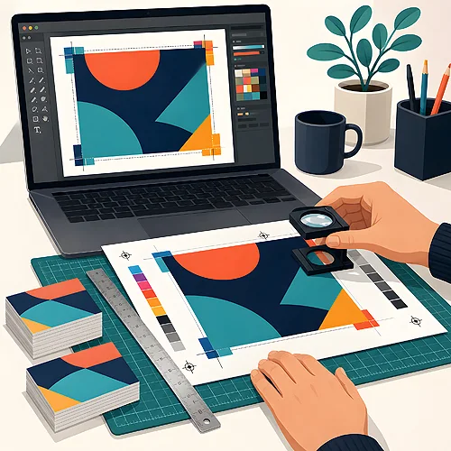
You have a finished design, it pleases the eye on screen and you finally want to print it - and suddenly there are questions about bleeds, colour profiles and curves. Sounds like technical jargon, right? Relax, preparing a file for print is not black magic, just a short list of proven steps. Let us go through them in order, so that in the end your file is ready with no surprises - and so you know what you are doing and why.
- Set the right format and add bleeds - 3 mm beyond the trim line on each side.
- Work in CMYK mode and turn on the Coated Fogra 39 profile (for printing on CD discs - Coated Fogra 27).
- Graphics and photos at 300 dpi at the final size.
- Convert fonts to curves so the text looks the same everywhere.
- Keep important content at a safe distance from the edge.
- Export to PDF and do a final check before sending.
This guide leads you step by step - from a blank document to a ready file. You do not have to do everything at once; treat it as a list you tick off in order. And if anything is unclear along the way, you will also find the whole thing in expanded form in our guide to preparing files.

Step 1. Format and bleeds - leave a margin for cutting
Start by setting the right document format - exactly the one the finished print should have. An A5 flyer is A5, a business card is the business card size. This is the foundation the rest stands on.
Now the most important part: add bleeds. A bleed is an extra strip of graphics extending 3 mm beyond the trim line on each side. What for? Imagine a stack of printed sheets cut with a single move of the guillotine. The knife never hits the exact same spot to the hair - there is always a bit of tolerance. If the background reaches only to the very edge, the slightest shift will leave a thin white strip at the border. The bleed is a buffer that prevents this: the background runs a little further, so even when the knife wobbles, the colour reaches the very end.
The bleed applies only to backgrounds and graphics meant to reach the edge - extend those elements 3 mm beyond the format. Do NOT drag important content (text, logo) into the bleed; keep it away from the cut, more on which in step 5.
Step 2. Colours in CMYK and the right profile
A screen creates colour with light, and paper - with ink, so the two work on different principles. A monitor uses the RGB model (red, green, blue), and print uses the CMYK model (cyan, magenta, yellow, black). If you hand over a file in RGB, the colours will be converted to CMYK anyway - only automatically and out of your control, which can be a lottery. That is why it is better to work in CMYK from the start: you then see on screen roughly what will really appear on paper.
The second element is the colour profile - a kind of translator that says how colours should look on a given substrate. For standard printing on coated paper, set the Coated Fogra 39 profile. It is a proven European standard for coated papers. One exception: for printing directly on CD discs a separate profile is used - Coated Fogra 27 - because the disc surface takes the ink differently. If you want to understand more deeply where the differences between screen and print come from, see the post on CMYK, RGB and colour profiles.
Step 3. Resolution of 300 dpi - so nothing goes blurry
Resolution, that is the number of dots per inch (dpi), decides how sharp the print is. The standard in print is 300 dpi at the final size. This means the photo should have those 300 dpi at exactly the dimension it will appear at on the print - not after enlarging.
There is a common trap here. A graphic from the internet looks great on screen, because a monitor only needs 72 dpi. But in print the same amount of detail spreads over a larger space and the image becomes blurry or jagged. Enlarging a small photo will not add details it never had - it is a bit like trying to add letters to a word that was not there. That is why, already when choosing photos, reach for suitably large files.
A simple test: if you have to enlarge a photo a lot to fill the design, that is a warning sign. Vector graphics (a logo, icons in a curve format) are resistant to scaling - you can enlarge them freely. Photos and scans - not so much.
Step 4. Fonts to curves - text that looks the same everywhere
Imagine you send a file and the computer on the other side does not have the same font as you. What happens? The system substitutes another one - and your elegant text suddenly looks different, the letters shift, and the design loses the look you polished so carefully. To avoid this, convert fonts to curves (it is also called "converting to outlines").
In simple terms: instead of the note "here is the letter A in this font", the text becomes an ordinary drawing - a set of shapes. Thanks to this it looks identical on every computer, no matter which fonts are installed. It is one of those small tasks that save the biggest disappointments. Just remember to do it at the very end - after converting to curves the text can no longer be comfortably edited, so first finish and check the content.
Step 5. Safe margins - keep content away from the edge
Since the guillotine knife has its tolerance (remember the bleeds from step 1?), the same principle works the other way. If text or a logo end up too close to the edge, the slightest shift of the cut can trim them or dangerously touch the border.
That is why set yourself a safety margin - at least 5 mm between the trim line and important content, which is 8 mm from the edge of the file with bleed. Everything that must stay whole and look good (captions, contact details, a logo) keep in this safe zone, away from the trim line. You gain not only the certainty that nothing gets cut off, but also good looks - content stuck to the very edge feels cramped and accidental, while with some breathing room around it looks far more professional right away.
The bleed is a margin outward, the margin is a reserve inward. Two simple buffers that make the print look exactly as you planned - even when the knife wobbles by a millimetre.
Step 6. Export to PDF - one file that contains everything
When the design is ready, export it to PDF. It is the most reliable format for print, because it locks the layout, colours, photos and curves into one file - nothing shifts along the way. In the export settings it is worth choosing the option meant for print and making sure the file keeps the bleeds and the photos at full resolution (without aggressive compression that can soften the graphics).
If your design has several pages or consists of separate elements, it is good to gather them into one tidy PDF - it is then easier to check the order and avoid a mistake. You do not have to know all the advanced options; in most graphics programs the default "PDF for print" does a good job if you have the earlier steps ticked off.
Step 7. The final check before sending
The home stretch is left - a quick review before you click "send". This moment can catch small things easy to overlook in the heat of work, and hard to undo later.
- The format is right and the 3 mm bleeds are in place.
- The file is in CMYK with the correct profile (Coated Fogra 39, and for CD discs - Coated Fogra 27).
- The photos are 300 dpi at the final size and not blurry.
- The fonts are converted to curves.
- Important content sits at a safe distance from the edge.
- The text has been read calmly - typos, phone number, address.
This list is your parachute. If any point raises a doubt, it is better to stop now than to fix things after printing. The most common questions that come up when handing over files we have gathered in the questions and answers section - it is worth looking there if something is unclear.
And that is all - seven steps that turn a design on screen into a print-ready file. In time you will go through this list instinctively, and preparing a file will stop being stressful. And if you would still rather be sure or have an unusual project, simply write to us - we will gladly suggest how to button up the file to the very last detail. You will find more on bleeds themselves and the most common mistakes in a separate post on bleeds and preparing files for print.