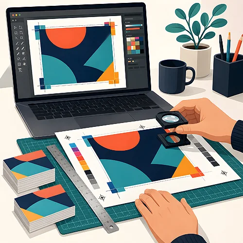
Most printing problems come not from the press but from the file. A white strip along the edge, cut-off text, a blurry logo or colours different from the screen - all of it can be foreseen and eliminated before the design goes to print. Below is a practical guide on how to prepare a file without errors, ending with a ready-made checklist.
- Bleed of 3 mm on every side and a safety margin for important elements.
- CMYK colour mode, the Coated Fogra 39 profile for standard work.
- Resolution of 300 dpi, fonts converted to curves, a finished PDF file.
- Before sending, run through the checklist - a few minutes saves corrections and delays.

Bleed - why 3 mm saves your design
Bleed is the part of the artwork that extends beyond the final edge of the page. The standard is 3 mm on every side. After printing, the sheet is trimmed to size, and the blade never lands perfectly to the millimetre. Without bleed, the slightest deviation leaves a thin white strip along the edge - with it, the background runs past the cut line and everything looks even.
The rule is simple: anything meant to reach the very edge (a background, a photo, a colour band) must extend into the bleed. The bleed itself will be cut off - it is a buffer, not part of the visible design.
The safety margin
The flip side of the same rule is the safety margin inside the page. Keep important elements - text, logo, contact details - a few millimetres away from the cut line. That way, with the same blade deviation, nothing essential gets trimmed off or ends up right at the edge, which always looks like a mistake.
Colours - CMYK and the Coated Fogra 39 profile
A screen emits light and works in RGB mode, while print reflects light off ink and works in CMYK. These are two different colour spaces. If you send a file in RGB, the colours will be converted automatically - and may come out differently than you intended. So prepare a print design in CMYK from the start.
For standard work on coated paper, use the Coated Fogra 39 colour profile. It defines how the colours in the file translate into ink - sticking to one correct profile is the simplest way to make the print match your expectations.
Printing on CD discs is a separate case - there the Coated Fogra 27 profile applies, not Fogra 39. If you are designing a disc, set that profile from the start so the colours match the surface.
Resolution - 300 dpi is the standard
Resolution tells you how many dots fall on each inch of the print. For printing the standard is 300 dpi - at that value the eye does not see individual pixels, and photos and graphics are sharp. A photo that looks great on screen can be too small for print, because a monitor is happy with a much lower resolution.
The key rule: resolution counts at the final size on the print. Enlarging a small photo will not add detail - it only blurs what is already there. Always start with graphics of the right size.
Fonts to curves and flattening
The font you used in the design may not be installed on the computer where the file is opened. The system will then substitute a different typeface and the whole layout will shift. The solution is converting text to curves (vector shapes) - the letters stop being text and become a drawing that looks identical everywhere.
While you are at it, it is worth flattening the design - merging layers and transparencies so nothing behaves differently at the print shop. A flattened, tidy file means fewer surprises at the output.
Format, orientation and PDF export
Finally, check the basics: the right format (size) and correct orientation - portrait or landscape - matching the design. Export the finished material to PDF, because it is the safest format for print: it preserves the layout, embeds the graphics and reads the same on both sides.
A good PDF is one that looks at the printer exactly the same as it does on your screen.
Checklist before sending the file
Before you click "send", go through this list in order:
- Bleed of 3 mm added on every side, background and photos extend into the bleed.
- Important elements moved away from the edge onto the safety margin.
- CMYK colour mode, Coated Fogra 39 profile (for CD discs - Coated Fogra 27).
- Resolution of 300 dpi at the final print size.
- Fonts converted to curves, design flattened.
- Correct page format and orientation.
- File saved as PDF.
Not sure about one of the points? Take a look at our file preparation section - we guide you step by step through the settings, and we have gathered the most common questions in the FAQ. Better to ask before printing than to fix things after.
Summary
A print-ready file comes down to a few proven settings: 3 mm bleed and a safety margin, colours in CMYK with the Coated Fogra 39 profile, 300 dpi resolution, fonts to curves and export to PDF in the correct format. Running through the checklist takes a few minutes and saves corrections and delays.
Want to see how it works on a concrete example? Ordering business cards lets you practise the whole process on a small format - and if in doubt, our help is close at hand. The exercise works best on classic business cards, because on such a small surface a 3 mm bleed and the safety margin take up a visible part of the design.