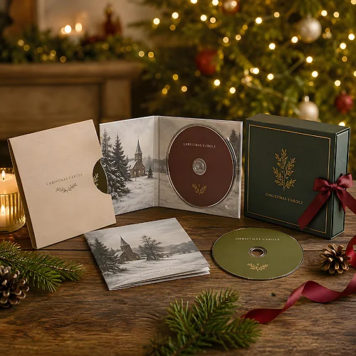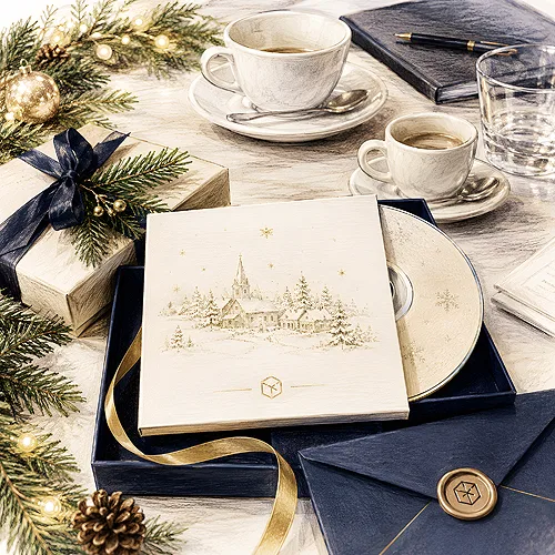
There is a thin but distinct line between a company gadget that ends up in a drawer and a disc you want to place on a shelf next to your favourite albums. Both can contain the same carols. The difference lies in how they look and how they are packaged. A festive promotional disc designed with an eye for detail stops being a gadget and becomes a gift the recipient takes seriously.
In this post we show how to move from "a disc with a logo" to something that looks like a real release. We focus on the cover, the print on the disc, the packaging and the insert - the elements the eye reads as a signal of quality before the first carol even plays. Each of them alone seems a small thing, but together they make all the difference.
- Whether a disc looks like an album is decided by details: the cover, the print, the packaging and the insert.
- The cover is the face of the release - it needs a strong theme, a title and coherent typography.
- A full print on the disc replaces the bare silver surface and completes a coherent design.
- Packaging, for example a digipack, builds the impression of a real release and protects the medium.
- An insert with a track list and a few words from the brand gives the disc the character of an album.
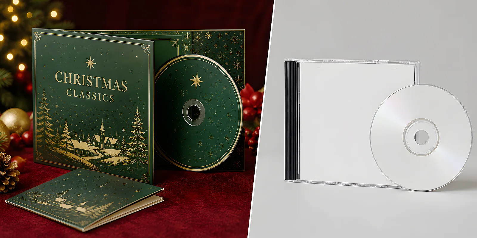
Start from an idea, not a logo
The most common mistake is treating the disc as a carrier for a logo. A company takes a festive photo, drops the logo in the corner and considers the design finished. The result looks exactly like what it is - an advert on a disc. A real album starts from an idea for the whole: from a leading theme, a mood and a title that gives the disc character. The logo is then one of the elements, not the main character.
Consider what story this disc should tell. Warm, family holidays in a traditional style is a different aesthetic than a modern, minimalist approach with one strong theme. Choose one direction and stick to it consistently across all elements. If you are looking for inspiration for festive graphics, our post on how to design an elegant festive card with a company logo will help - the same rules of coherence work for a disc.
The cover - the face of the release
The cover is the first thing the recipient sees, and it decides whether they reach for the disc with curiosity. A good album cover has a few features that are easy to carry over to a promotional design.
- A strong, clear theme - one dominant graphic element instead of several competing ones. It can be an illustration, a photo or an abstract pattern tied to the holidays.
- A title, not just a company name - a disc with a title ("Carols for a Good Evening", "Christmas Our Way") instantly sounds like a release, not an advertising folder.
- Coherent typography - one, at most two typefaces, well matched to the mood. An ornamental script for the title, a simple one for the rest.
- Space and breathing room - do not fill the whole surface. Empty space around the theme lifts the sense of class.
It is worth placing the company logo discreetly - at the bottom of the cover or only on the back of the packaging. The recipient knows who gave them the disc anyway, and subtlety builds the impression that this is a gift, not an advertising carrier.
The print on the disc - an end to bare silver
Even the most beautiful cover loses out when a bare, silver disc with a handwritten note waits inside. A full print on the disc is the element that most strongly separates an album from a gadget. A printed disc with a theme tuned to the cover looks like part of a coherent release, not a random medium.
What to place on the disc
On the disc surface it is worth repeating the theme from the cover, adding the title and perhaps a short track list or a delicate graphic detail. Do not overdo the amount of text - the disc should be tasteful, not covered in small print. Our discs and packaging section will help you decide on printing techniques and choose between print and pressing. You will also find ready print options in the CD and DVD with print category.
Keep one theme across all elements: the cover, the disc, the packaging and the insert. The same palette, the same typography and the same graphic detail make the whole thing read like a thought-through set. This is the simplest rule that separates an amateur gadget from a professional release - and it costs nothing but a moment of attention at the design stage.
Packaging - it is what turns a disc into an album
Packaging decides the first contact with the gift and how it will be remembered. A standard plastic case looks like a carrier. A cardboard, folding pack with a full print looks like a release from a music shop shelf. That difference is felt immediately - in the touch, the weight, the way it opens.
- Digipack - a cardboard, folding pack that best captures the character of a real album. It showcases the graphic theme brilliantly and gives room for an insert.
- A decorative case - when the disc is meant to be an exceptional gift, extra finishing lifts the whole presentation.
- Special finishes - matte or gloss lamination and a velvety Soft Touch finish - the kind that makes the packaging inviting to touch.
When choosing packaging, it is worth thinking about how the disc will reach the recipient. We write more about matching packaging to the situation in our post on digipack or CD sleeve. You will find the range of folding cardboard packs in the digipack section.
The insert and details that build character
Real albums hold something more inside than the disc alone. An insert with a track list, a few words about the release or festive wishes from the brand gives the whole thing character and gives the recipient a reason to look deeper. It is also the place where you can discreetly include information about the company, without turning the cover into an advert.
It is worth keeping the paper and finish of the insert coherent with the rest of the packaging. The same style, the same palette and the same fonts make every element confirm the same impression of quality. If you are planning a print and want to prepare the files correctly, take a look at our file preparation section - well-prepared artwork is the basis of a clean, sharp result.
From design to a finished album - the order of work
For all the elements to play together, it is worth working in a logical order. Below is a simple plan that helps avoid mess and last-minute corrections.
- Set the theme and the mood - traditional or modern, warm or minimalist. This is the foundation for all the elements.
- Design the cover - theme, title, typography. It sets the tone for the rest.
- Carry the theme onto the disc and packaging - repeat the palette, the typography and the graphic detail.
- Add the insert and finishes - a track list, a word from the brand, paper and enhancements coherent with the whole.
- Check the files and order - make sure the artwork is prepared correctly before production.
A festive promotional disc does not have to look like a gadget with a logo. It is enough to treat it like a real release - with an idea for the cover, a coherent print, tasteful packaging and an insert with character. These details do not require a big budget, only a little attention at the design stage. And the effect is felt immediately: the recipient gets not a gadget, but an album they want to keep.