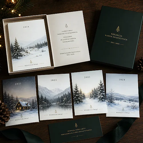
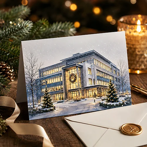
You know the feeling: the design is finished, everything is on it, and yet something is off. It does not look bad, but it does not look elegant either - it is simply average. The first instinct is to start from scratch, but usually you do not have to. Elegance is born from a few calm tweaks, not from tearing the whole thing down.
In this post we show what to fix first so an average design gains class - without redrawing the graphic, without new photos, without hours of work. It is a list of the things that make the biggest difference for the least effort, ordered from the strongest to the subtlest.
- Elegance is most often the result of simplifying, not adding - fewer elements, more air.
- Spacing makes the biggest difference: enlarge margins and the white space around text.
- Limit typefaces to two and sizes to a few - typographic chaos gives away an amateur.
- Mute the palette to two or three colours and one accent; remove random colours.
- Align everything to a shared grid - even edges read instantly as order.
- Finishing details and good paper seal the impression at the printing stage.
Start with spacing, not with the graphic
If you could only fix one thing, make it the spacing. Average designs are most often too tight - text presses against the edges, elements crowd side by side, everything fights for attention. Elegance is breathing room. Enlarge the margins, add space between paragraphs, move the title away from the body. Suddenly the same material starts to look more expensive, even though you changed not a single word.
Empty space is not wasted - it guides the eye and says what matters. Instead of squeezing another element into the gap, treat it as part of the design. Premium brands do exactly this: they give their messages plenty of air, because confidence does not need to shout.
Try a simple test: increase all margins and spacing by a third, then judge the design with fresh eyes. In nine cases out of ten the version with more air looks more elegant - and that without touching the graphic itself.
Tidy up the typography
The second source of mediocrity is typography left to chance. Three different typefaces, a shadow under the heading, text scattered across several sizes with no logic - these are signals we subconsciously read as a lack of practice. The good news: tidying up typography is quick and does not require changing the content.
Fewer typefaces, more hierarchy
Settle on at most two typefaces: one for headings, one for body. Often even a single typeface in a few weights is enough. Instead of multiplying sizes, build a clear hierarchy - a large title, a distinctly smaller subtitle, calm body text. When the eye immediately knows where to look first, the design feels considered.
- Limit typefaces - two at most, ideally from one family or clearly complementing each other.
- Reduce sizes - a few levels are enough; each should have a clear role.
- Remove the gimmicks - shadows, outlines and gradients on letters age a design faster than anything else.
- Mind the line spacing - a touch more leading makes text read lighter and look tidier.
If you want to go further in this direction, the post on whether minimalism or rich graphics works better helps organise the decisions about how much is too much.
Mute the palette and add one accent
Random colours are the third classic reason a design looks cheap. Four shades with nothing in common instantly betray a lack of plan. Elegance likes restraint: two or three calm colours as a base and one stronger accent for whatever should catch the eye.
Choose a main colour, pair it with a neutral background - white, ivory, a gentle grey - and leave one accent for a button, a headline or a detail. Everything else should recede. A muted palette feels more mature than a rainbow, because it signals that someone made a deliberate choice. If you are building materials for a company, it is worth setting these colours once and keeping them everywhere - the post on how to create a coherent visual identity on a small budget helps with that.
Align everything to a grid
Messy alignment is the quiet killer of elegance. An element shifted by a few pixels, text centred one moment and left-aligned the next, margins of different widths - each such small thing tells the eye something is wrong, even if we cannot say what. The cure is a shared grid.
Set a few vertical lines and keep all elements to them. The edges of text, photos and blocks should relate to one another, not sit wherever they happen to fall. Even, repeatable spacing reads as order, and order is the foundation of an elegant impression. For more on arranging content and photos on a shared framework, see our post on a grid-based design.
The order of tweaks that make the difference
To avoid working blindly, it is worth fixing a design in a set order - from the changes with the biggest effect to the details. This order means you see improvement after every step, and you do not waste time on trifles before fixing the foundations.
- Spacing - enlarge margins and the space around text; usually the strongest effect.
- Typography - reduce typefaces and sizes, build a readable hierarchy.
- Palette - mute the colours to a few shades and one accent.
- Alignment - place everything on a shared grid, line up the edges.
- Details - refine the small things: consistent icons, uniform corners, photo quality.
After these five steps most average designs simply look more mature - and that without redrawing anything from scratch.
Details and printing seal the impression
The final few percent of elegance play out at the printing stage. Even the best-arranged design loses on poor paper, while good paper can lift an ordinary material a class higher. The choice of stock, weight and finish is not cosmetics - it is part of the design that you feel by touch. The widest choice here is left by classic flyers, where format, paper, print and lamination are set separately - the same design on two stocks gives two different impressions.
- Paper with character - a light texture or a refined shade of white adds gravity right away. You will find stocks like that in the Prestige lines, the Prestige flyers among them.
- Finishing in moderation - a matt or velvet Soft Touch lamination on one side does more than gloss across everything.
- Precise files - correct bleeds, safety margins and colour profiles make the printed result match the design.
Before you send a design to print, it is worth checking the technical side - our file preparation guide helps with that. And when you want to see how these tweaks turn out on a finished material, simple classic carriers like flyers, business cards or posters work well - they are where it is easiest to see how big a difference a few calm decisions make.
Elegance is not a matter of talent or a big budget - it is most often the result of what you take away, not what you add. More air, fewer typefaces, a calmer palette, even edges and good paper turn an average design into one that looks considered. And you do not have to start over - it is enough to improve what you already have.