Imagine your company turning into a person for a moment. What would they look like? Dressed in black, calm and measured? Or smiling, warm, in a colourful jumper? Or self-assured and loud, the kind who walks in and gets noticed right away? Every company has a character. And the best designs are the ones where that character shows at first glance - before anyone reads a single word. In this post we will show how to turn a company's personality into colours, fonts and graphics.
- Every brand has a character - it is worth naming it before you start designing.
- Elegant speaks softly: muted colours, serif fonts, plenty of white space.
- Friendly is warm: soft colours, rounded shapes, a more relaxed typeface.
- Bold is not afraid to be seen: strong contrasts and large typography.
- The choice depends on who you are and who you talk to - not on trends.
Start with a question: what is your company like?
Before you pick a colour or a font, pause for a moment. Think about how you want people to feel around you. Safe and calm? Welcome, like at a good friend's place? Or full of energy, ready for something new?
This is not a question about taste. It is a question about who you are and who you speak to. A law firm and a burger food truck sell completely different things and talk to different people - so they should look different. Once you name your company's character in a single word, the rest of the decisions get much easier.
Below are the three most common characters. Do not treat them as rigid boxes - think of them as three directions you sit somewhere between. Many brands mix two of them, and that is perfectly fine.
An elegant brand - speaks softly, yet is still heard
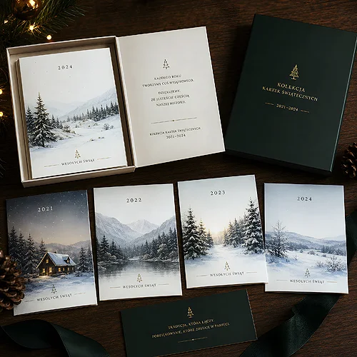
An elegant company does not shout. It knows its worth and does not need to prove it with big letters. This character suits premium brands, cosmetics, jewellery, law firms, hotels or services where trust and class matter.
You will recognise it in a design by three things. First, muted, calm colours - black, deep navy, beiges, a touch of gold. Second, serif fonts, meaning ones with small decorative endings on the letters, like in a good book - they look dignified and classic. Third, plenty of light, meaning empty space around the text. It is that emptiness that makes a design look expensive.
Elegance is the art of taking away. The less you shout, the more you are heard.
A classic, minimalist business card on elegant paper can say more about a company than a long description. If you want to go this way, restraint is your friend - fewer elements, more breathing room.
When you aim for elegance, test every element with one question: would the design lose its meaning without it? If not - remove it. Here, less usually means better and more expensive.
A friendly brand - like a good acquaintance
A friendly company puts you at ease straight away. It does not intimidate or keep its distance. This character works beautifully for cafes, children's shops, clinics, workshops and local services - anywhere you want people to feel welcome.
How does it show in a design? Warm colours - oranges, yellows, greens, muted pastels. Rounded shapes instead of sharp corners: soft forms, curved buttons, gentle lines. And a more relaxed font - sans serif, simple, sometimes slightly handwritten, the kind that smiles at the reader. The whole thing should feel light and approachable, not stiff.
A friendly character works best where you want to have a conversation rather than impress. A good example is a local business's promotional flyers - a warm colour, a friendly tone and clear information do more than a stiff, formal look.
A bold brand - walks in and gets noticed
A bold company is not afraid to be seen. It wants you to look at it, and it says so openly. This character suits brands for young people, events, sports, the creative industry and clubs - anywhere energy is part of the product.
In a design, a bold brand gives itself away through strong contrasts - a bright colour on a dark background, black with one intense accent, pairings that catch the eye from a distance. Add large, expressive typography: words that take up half the surface and do not ask for attention, they take it. Less subtlety, more character.
Boldness is a great choice when you fight for attention in a crowd - on a wall of posters, at a trade fair, in a city full of ads. But be careful: bold does not mean chaotic. Even the strongest design needs order for the message to stay readable.
A bold design usually stands on one strong idea - one colour, one slogan, one element. If you add five more effects to it, it stops being bold and starts being a mess.
How to bring it together into a coherent whole
A brand's character does not live in a single design - it lives in all of them at once. Business card, flyer, website, packaging and social post should all feel like they come from one family. The same palette, the same two or three fonts, the same way of speaking.
So before you print anything, decide a few things once. Two main colours and one accent. One font for headings and one for text. The tone you write in - warm, formal or energetic. Once you have these rules, every new design falls into the same mood on its own, and you do not have to start from scratch each time.
If you want to dig deeper, take a look at the post on the rules of good graphic design - we show there how to master hierarchy and space. It is also worth checking how colours affect how a message is received, because they often say what your brand is like in the very first second.
Finally: be yourself, not a copy
The most common mistake is looking at the competition and doing the same thing. The result is that everyone in the field looks identical and no one stands out. Your company has its own character - and that is your advantage.
So name in one word what you are. Elegant, friendly, bold, or something in between. And then check every design with one question: does this look like us? If it does - you are on the right track. And when you are ready to put that character on paper, we will help you do it well, from the first business card to every material after it.