Before anyone reads the first word on your leaflet, they have already felt it. Colour works faster than text - in a split second it sets the mood, builds associations and decides whether the reader stops to look or moves on. That is why choosing colours is not a matter of taste, but a part of strategy.
- Colour builds the first impression and emotions before the reader takes in the text.
- Warm colours (red, orange, yellow) energise, cool ones (blue, green, purple) calm.
- A leaflet's palette should be consistent with the brand identity, not random.
- Contrast between text and background determines legibility - it is what lets the message land.
- Colour meanings can depend on culture and audience - it is worth checking.
Colour as the first message
A colour carries meaning before the brain gets round to reading. Red suggests energy, passion and urgency - it works well for sales and special events. Blue builds trust and calm, which is why finance and healthcare reach for it. Green hints at nature and freshness, while black and gold signal prestige.
These are not rigid rules, just deep-rooted associations. They are worth knowing, because they help you talk to the reader without a single word - colour speaks first.
Warm versus cool - how colours steer emotions
The simplest split is colour temperature. Warm colours - red, orange, yellow - add energy, spark joy and encourage quick action. Cool ones - blue, purple, green - soothe, invite reflection and suit anything where calm matters: health, relaxation, services that rely on trust.
It is worth matching temperature to the leaflet's goal. Want to trigger an impulse and a reaction here and now? Go for warm accents. Building the image of a solid, stable brand? Choose a cooler palette.
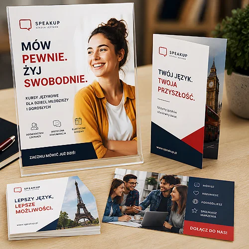
Instead of flooding the whole leaflet with one strong colour, pick one lead colour and one accent for the single most important element - the headline or the call to action. The eye instantly knows where to look.
Colour builds brand identity
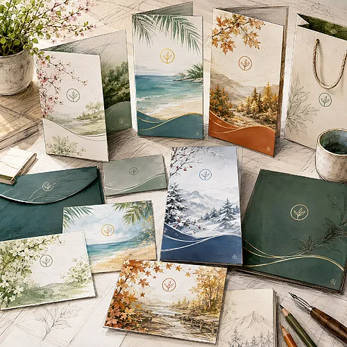
Colours are not just bait for attention - they carry information about who you are. An eco-friendly brand will naturally reach for shades of green and brown. A premium brand will build a sense of exclusivity with black and gold. One thing is key: the leaflet's colours should match the company's visual identity - the same ones that appear in the logo and other materials. An eco character is reinforced by the stock itself - eco flyers have a warm, natural shade that shifts every colour you designed, and they are never laminated.
Consistency pays off. When a reader sees the same colours on a leaflet, a poster and in social media, the brand sticks in memory and becomes recognisable. A random colour scheme dilutes that effect.
A good colour does not shout the loudest - it says exactly what the brand wants to say.
Contrast decides legibility
The most beautiful palette is useless if the text cannot be read. So after the emotions comes the craft: contrast between text and background. Dark text on a light background, or light on dark, reads effortlessly. Letters in a colour close to the background blend in, and the reader simply gives up.
The rule is simple: the more important the information, the stronger the contrast. The headline and the call to action have to be visible at once, even at a glance from a distance.
Look at the design through half-closed eyes, or in greyscale. If the key elements still stand out, the contrast is good. If everything blends together, fix the colours before the leaflet goes to print.
Match colours to your audience and industry
There is no single perfect palette for everyone. The same combination will work differently on a younger and an older audience, differently in fashion and in healthcare. Health tends to favour calm greens and blues. Fashion can carry bolder, more extravagant pairings.
It is also worth remembering the cultural context. The same colour can be read differently - in the West, white means purity, while in parts of Asia it is linked with mourning. If your leaflet targets a specific group, check how they read particular colours rather than guessing.
From idea to a ready file
Choosing colours consciously starts with three questions: what is the leaflet's goal, who is it speaking to and what colours does your brand have. The rest is consistency and order - one lead colour, one accent, strong contrast on what matters most.
Finally, there are the technicalities. Colours that look great on screen can print differently, because a monitor emits light while paper reflects it. So before sending your design, it is worth reading our guide on preparing files for print, and ordering ready leaflets straight away in the right colour version. If you want to go further and build a coherent set of materials, after leaflets the natural next step is posters that catch the eye.