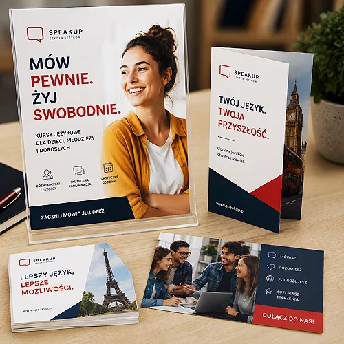
A language school naturally feels the urge to say everything at once. Levels from A1 to C2, enrolment dates, group sizes, methods, tutors, certificates, promotions - each of these matters. The trouble is that a leaflet trying to fit them all stops communicating anything. The client looks at a thicket of information and puts the material down instead of signing up.
Effective course promotion works the other way around. Instead of listing what you offer, it shows what the client will gain - and does it simply enough that the decision comes on its own. Below we show how to plan materials for a language school so they invite enrolment rather than overwhelm. The set is simple: leaflets, posters and business cards, each with a clear role.
- One benefit per material - the outcome the course delivers, not a list of lessons and levels.
- Speak the language of results: easy conversation on holiday, a promotion, confidence at work.
- An enrolment leaflet needs one clear call to action and an enrolment deadline.
- Posters work in the venue and on community boards - a short message visible from afar.
- Match the tone to the audience: you speak differently to parents, adults and companies.
- A trial lesson voucher lowers the decision threshold better than a long list of arguments.
One benefit instead of a list of lessons
The most common mistake in course promotion is describing the process instead of the result. The client is not buying sixty lesson hours or a communicative method - they are buying what they will be able to do after the course. That is why every material should carry one specific benefit, expressed in the language of the outcome.
Instead of writing "English course, level B1, twice a week", say what it gives: "Order a coffee in Rome without the stress" or "Lead a meeting in English and never lose your thread". The same information, but arranged around the client, not around the offer. The rest of the details - level, frequency, dates - can move to the background or go onto the website that a QR code leads to.
- Result, not process - show the moment when the language comes in handy, not the structure of the classes.
- One message per material - a leaflet about holidays is a different thing from a leaflet about English for work.
- A specific situation - the more vivid the scene, the easier it is for the client to see themselves in it.
This principle organises everything created later. If a material carries one thought, it becomes clear on its own. You will find more on how not to drown the message in an excess of content in our post on readability with a large amount of information.
An enrolment leaflet with a clear CTA
The leaflet is the workhorse of course promotion - it reaches the hand, the board, the mailbox, the counter in a cafe. Its job is not to tell the whole offer, but to lead to one action: signing up for a course or a trial lesson. That is why it needs a clear call to action and an obvious deadline.
A good enrolment leaflet has three layers: a catchy headline with a benefit, a short development that builds trust, and one clearly visible CTA - "Sign up by 15 September", "Book a free trial lesson". The enrolment deadline acts as a gentle nudge: it shows that the window for a decision is limited, so it is worth acting now rather than someday.
Leave plenty of light on the leaflet. Empty space around the headline and the CTA is not waste - it is what guides the eye where you want it. A leaflet filled to the edges with content looks difficult before the client has read a single word.
If the course has a more elaborate offer - several levels, a schedule, a price list - a folded leaflet is often a better medium. It gives more room without crowding: one benefit and a CTA on the cover, and the details inside, laid out in sections the client reaches for only once they are already interested. It is a natural way to reconcile simplicity with a full set of information. It is also worth reading our post on how to design a leaflet the client will keep for later.
Posters for the venue and community boards
A poster follows a different logic than a leaflet - it is read from a distance and on the move. A passer-by gives it a fraction of a second, so it has to work with one strong message. This is no place for a price list or a list of levels, only for one benefit and a clear signal of where to sign up.
In the school's own venue, a poster builds the atmosphere and reminds people of the current enrolment - students waiting for class have it right in front of them. On community boards, in libraries, cafes or clinics it works differently: it reaches people who were not yet thinking about a course. In both cases the rule is the same - a large headline, one benefit, a clear CTA and a QR code or a short address leading onward.
- A headline visible from a few metres - one thought, large type, strong contrast.
- One image or motif - a scene or symbol supporting the benefit, without needless ornament.
- A clear call and a way to make contact - where and how to sign up, ideally with a QR code to the enrolment page.
Tone matched to the audience
A language school rarely speaks to a single audience. A parent enrolling a child, an adult wanting to refresh their English and a company looking for team training are three different worlds - and each needs a different tone. The same material for everyone usually reaches no one.
To parents, speak of growth and reassurance: a safe atmosphere, small groups, visible progress in the child. To adults - of convenience and result: flexible schedules, a concrete goal, quick conversation instead of cramming grammar. To companies - of effectiveness and professionalism: training tailored to the industry, measurable progress of the team. You do not need a separate campaign for each group, but it is worth having separate materials where the message really differs.
Carry the same tone onto small but important carriers - the business cards of tutors and the office. A card handed out after a trial lesson or at a company meeting is your contact that stays with the client, so it should be visually consistent with the rest of the materials. If you want the whole set to speak with one voice, start from one benefit and one identity, and only then vary the tone. Our post on how to design marketing materials the client will remember will also help.
Local reach and the trial lesson voucher
Language courses are largely a local business. A student chooses a school that is close by - in the estate, in the district, near work or the child's school. That is why it pays to direct materials where your future students actually are: community boards, libraries, cafes, clinics, primary schools, office buildings. A leaflet left in a good spot can work more effectively than a broad, scattered campaign.
The strongest single tool is often a voucher for a free trial lesson. It lowers the decision threshold to zero - the client does not have to choose a course straight away, only to check whether the school suits them. You can weave the voucher into the leaflet as a separate section to cut out, or present it as a code to give at the office. If you are wondering whether to go with a voucher, a QR code or another mechanism, our post on whether a leaflet with a voucher, a QR code or a loyalty card works better will help.
Before you send anything to print, check the file preparation guidelines - good bleeds, resolution and contrast decide whether a poster headline will be legible from a distance. You will find the whole set in the print category, and as you assemble it, stick to one rule: one material, one benefit, one call. That is what makes course promotion inviting rather than overwhelming - and instead of putting the leaflet down, the client reaches for the phone and signs up.