
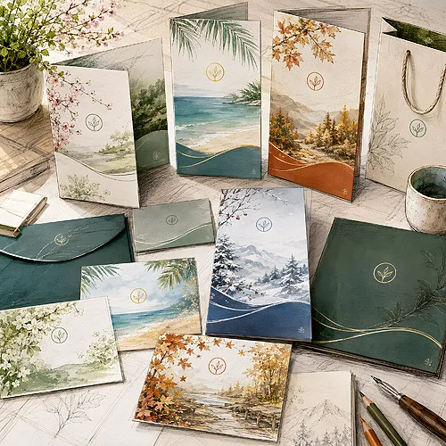
In spring a customer looks for something completely different than in December, yet your company is the same company all year round. This is the whole art of seasonal advertising: adapting to the mood and needs of the moment while staying recognisable. When you do it well, a customer sees a fresh poster or a new flyer and knows at once that it is you - before they even read the name.
The trouble begins when every campaign looks as if a different company made it. Green background in summer, navy in winter, a different font in autumn, a different logo in spring - and suddenly the brand dissolves into seasonal chaos. Below we show how to prevent this: what to change every quarter and what never to touch, so your advertising lives with the seasons yet stays yours.
- Change what is seasonal: slogans, offers, photos, accent colours and the occasion - they give a campaign its timeliness.
- Do not touch the core of the brand: logo, main colour, font and the way you speak to customers - they provide recognisability.
- Build one base template into which you slot seasonal content - it saves time and guards consistency.
- Plan the whole year in advance, quarter by quarter, so you never make a campaign in a panic a week before the season.
- Let print and digital channels speak the same language - the same graphic works on a poster, in social media and on a flyer.
What changes and what stays forever
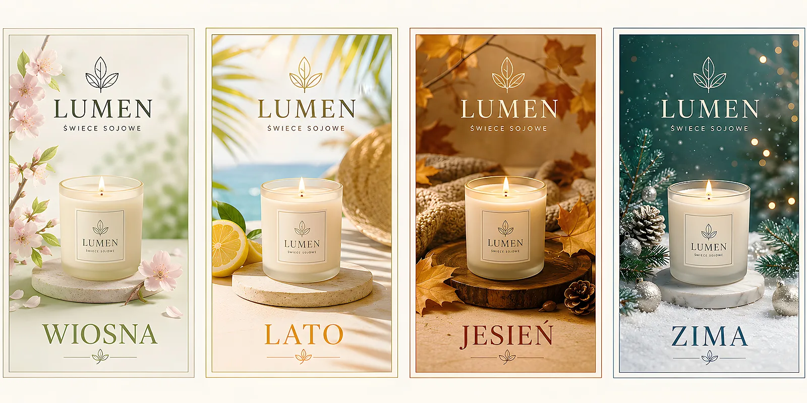
The simplest way not to lose your style is to split advertising into two layers: the constant one and the seasonal one. The constant layer is your company's signature - it is how customers recognise you. The seasonal layer is everything you adapt to the moment. Once you separate them, every next campaign becomes simpler, because you only change half of it.
- Stays forever - the logo, main brand colour, company font, tone of voice and the way you sign your materials. This is your unchanging skeleton.
- Changes each season - the headline slogan, photos, accent colour, the specific offer and the occasion you refer to.
- Changes rarely - the template layout, paper type, material format. It is worth keeping them stable and refreshing them once a year.
A well-chosen accent colour can work wonders. If your brand is navy, navy stays - but you can add a warm orange in autumn, fresh green in spring or gold in December. The brand is still navy, just with a seasonal breath. You will find more on choosing colours deliberately in our post on how to choose colours in advertising projects. December gold can be left to the paper itself - Prestige flyers offer decorative stocks from ranges such as ICEBLINK, STARDREAM or CHAGALL, so the effect comes from the sheet rather than the ink.
A base template that works all year
The secret of companies that look fresh yet recognisable every season is disarmingly simple: they have one template and merely slot new content into it. Instead of designing each campaign from scratch, you build a solid base once, with the logo, margins and space for the slogan fixed. You only swap the photo, the text and the colour accent.
What such a template should have
A good base template has fixed anchor points set in advance and clearly marked fields to swap. Thanks to this, even a material made in a hurry does not fall out of style, because the most important elements are locked.
- A fixed logo spot - always the same corner, the same size. Customers learn where to look for your signature.
- A field for the seasonal slogan - one, well-visible place for the message of the moment.
- A photo zone - a frame you swap with the season, but always in the same proportion.
- An accent strip - an element in the seasonal colour that refreshes the whole without touching the rest.
Before you start designing the next campaign, write down three things you must never change: the logo, the main colour and the font. Keep that note at hand for every new material. It is the cheapest way to avoid losing recognisability throughout the year - and to give designers and the print house a clear reference point.
A plan for the whole year, season by season
Seasonal advertising most often goes astray not from a lack of ideas, but from a lack of lead time. A summer campaign is started in June, a Christmas one in mid-December - and the result is haste instead of strategy. Mapping out the year in advance sets the rhythm and lets you prepare print calmly.
- Spring - a mood of freshness and a new start. Bright colours, slogans about renewal, offers to kick off the season. A good moment for posters announcing news and flyers with spring promotions.
- Summer - lightness, holidays, outdoor activity. Advertising reaches people where they spend time - posters in shop windows, stickers and event materials. A looser, energetic tone.
- Autumn - a return to routine, planning, a warmer palette. Time for offers that bring back the steady rhythm and to prepare what will launch at the end of the year.
- Winter and holidays - the most emotional season. Thank-yous, wishes, gestures towards the customer. This is the moment for company greeting cards and small gifts that build a relationship.
It is worth writing this schedule down in one place, even in a yearly company calendar, and marking the start dates of each campaign with a margin. Then the season never catches you off guard, and print arrives on time without the nerves.
Holidays and occasions without losing character
Holidays are a temptation to dress the brand up in a costume - to add Santa hats, snowflakes or painted eggs over the whole surface. The problem is that after such a disguise the company often disappears under the decoration. The customer sees the holiday but does not see you. The trick is to make the occasion an accent, not a fancy dress.
Instead of changing everything, add one seasonal detail to an unchanged base. A delicate motif in the corner, a warmer accent colour, a festive slogan - and that is enough. The brand stays itself, it just smiles at the season. The same rule applies to industry occasions: a restaurant can refresh its menu with a seasonal offer, and a shop can add a sticker with the message of the moment without touching the rest of its identity.
If you run a venue, a good example of the seasonal approach is printed menu inserts with seasonal dishes - you change the insert depending on the time of year, while the standard menu and the venue's identity stay untouched. Seasonal vouchers and small stickers with a current slogan work the same way - a fresh message on a stable brand foundation.
Print and digital channels with one voice
Seasonal advertising works hardest when all channels say the same thing. A customer who sees your poster around town in summer and comes across the same motif in social media in the evening remembers the brand far faster. Repetition builds recognisability - but only when the graphic is consistent.
So design a seasonal campaign in a way that lets one motif travel everywhere: onto a flyer, a poster, a post, an email footer and a shop window. The same colour, the same slogan, the same frame. Print and digital do not compete - they complement each other, because they reach the customer at different moments of the day. On how to combine both worlds locally, we wrote more in our post on what works in local advertising - print, social or both channels.
If you are just arranging printed materials for a seasonal plan, take a look at our print section or write to us via contact - we will suggest how to spread one design across all media without losing consistency.
The most common seasonal advertising traps
Finally, a few mistakes that blur a brand the fastest. It is worth knowing them, because it is easy to fall into them when one season chases another and there is no time for a calm decision.
- A new style every campaign - if you change the font and layout every time, the customer never manages to remember the brand.
- A disguise instead of an accent - a holiday or season used as decoration covering everything makes the company vanish under the motif.
- A last-minute campaign - haste takes away the chance to polish and to print calmly, and it shows in the result.
- Channels out of sync - a different motif on the poster and a different one online - repetition stops working for recognisability.
Seasonal advertising is not about inventing the company anew every time, but about dressing the same brand in an outfit suited to the season. Decide what your constant signature is, build a template, map out the year in advance - and then each season will feel fresh, and the customer will still recognise you at first glance. Because that is what it all comes down to: changing enough to be current, and staying yourself enough to be remembered.


