A corporate Christmas-carol album reaches your clients once a year, yet it stays on the shelf far longer. Its cover is the first thing the recipient sees - and either they instantly recognise your brand in it, or they take it for a random disc found online. The whole difference comes down to a few design decisions worth making before you even choose the carols.
A festive album is a rewarding medium. It blends a warm, sentimental mood with a chance to remind people of you at the best moment of the year. It is easy, though, to overshoot into sugary literalness - a tree, baubles and snow across the whole cover - and lose what really should stay in memory, namely your company.
A good carol-album cover reconciles two worlds: a festive atmosphere and a coherent brand identity. Below we show how to do it step by step - from what to settle at the start, through typography and hierarchy, to choosing the packaging and finish that give the whole thing an elegant, corporate character.
- The starting point is your company identity - colours, logo and typeface - not festive cliches.
- Add the winter mood subtly: one delicate motif instead of a tree across the whole cover.
- Set a clear hierarchy: album name, logo and an optional track list - each element has its own weight.
- Packaging and paper build the impression of quality before anyone plays a note.
- Repeat the same theme in the print on the disc itself - coherence shows the moment it is opened.
Start with the brand, not with Christmas
Although the album is festive, its job is corporate. So begin the design not by hunting for graphics with baubles, but with your own identity. Take out your brand guidelines, or at least a business card and letterhead, and check three things: what your colours are, how the logo looks in its basic version, and which typeface you use day to day. This is the foundation on which you will only then set the festive mood.
Such a starting point immediately orders your decisions. If your palette is cool and muted, the winter mood will fit into it naturally. If the brand plays with warm shades, you will steer the festive accent towards deep red or bottle green, still staying at home. You will find more on treating the disc and the box as one coherent project in our post on how to design a CD and packaging with a brand identity.
A subtle winter accent instead of literalness
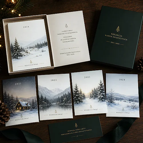
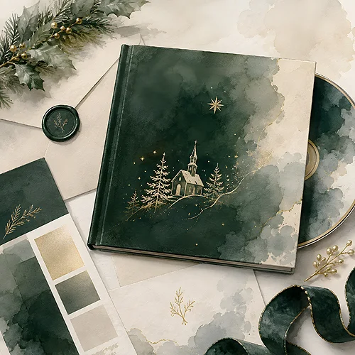
A festive mood is best built sparingly. Instead of filling the cover with every symbol at once, choose one delicate motif and let it resonate. A thin sprig of spruce in the corner, a single snowflake, a subtle ornament or a simple line outlining the layout - that is enough for the eye to read "Christmas" at once, while the brand stays in the foreground.
Colours alone work well too. Deep navy, bottle green, warm red or a cream background can build a winter mood without a single tree. The key is restraint: the fewer literal ornaments, the more elegant the result and the easier it is to stay consistent with the rest of your materials.
Run a simple test: cover up the logo and the festive details, leaving only the composition and colours. If the cover still looks like "yours", the winter motif is an addition, not a disguise. If it falls apart into a random jumble without the baubles, go back to the identity and rebuild it.
Hierarchy and typography of the cover
Several pieces of information meet on a cover, and each wants to be noticed. Without a set hierarchy, noise appears. So decide up front what matters most and lead the eye from element to element.
- Album name - usually the most important, so the largest and most legible. It announces what the disc is.
- Company logo - present, but it does not have to shout. It looks good in a corner or in the cover footer, as a calm signature to the whole.
- Track list - if it is to appear on the cover at all, then rather on the back or inside the packaging, in smaller type, arranged into a simple list.
Stick to a pair of typefaces: one for the name and headings, another for the body. The same pair on the cover, on the disc and inside the packaging does more for coherence than the most ornamental font used once. We wrote more about how the cover works for the brand in our post on the disc cover as an advertising surface.
Packaging and paper - digipack or booklet
The impression of quality forms before anyone hears the first carol. Packaging and paper create it. For a corporate festive album, two solutions most often work well. A digipack or a booklet gives a rigid, cardboard form with room for an extended design - cover, interior and track list in one. It is an elegant, gift-like solution that sits nicely in the hand.
The paper and finish speak of the brand too. Thick, good-quality cardboard immediately lifts the whole thing. With a digipack or an ecopack you choose the cover finish: matt lamination gives a muted, modern effect and pleasantly diffuses light, while velvet Soft Touch lamination adds a soft, deep finish you can feel under your fingers. If you care about a natural character, reach for the EKO version on Kraftliner - bare board with no lamination does the whole finishing job here. When you need only an aesthetic sleeve for the disc itself, classic CD-Box cases with printed covers kept in the same theme are a good choice.
Disc print consistent with the cover
The moment of opening decides coherence. If a completely different style appears on the disc once the cover is removed, the whole effect falls apart. So design the disc print as an extension of the cover: the same palette, the same typeface, the same winter detail on a smaller scale. On the disc itself, the album name, logo and a sparing motif are usually enough - there is no need to repeat everything from the packaging.
The printable area on a disc has its own specifics - the centre of the disc stays empty, and the design arranges itself in a circle. A well-planned print takes this into account from the start, instead of rescuing itself with cropping at the end. We gathered practical tips on how to match one with the other in our post on how to design a disc print and a cover consistent with your identity.
An elegant carol-album cover does not come from the number of festive ornaments, but from one good decision: brand first, Christmas second. Set the colours and typography, add a subtle winter accent, take care of a clear hierarchy, and finally choose the packaging and finish that convey the company's character. An album prepared this way will remind people of you warmly and tastefully for years - exactly as you want to be remembered.