A disc you hand to a client says as much about your company as a business card. If the print on the disc and the cover look as if they were made separately, the message falls apart. But if the logo, colours and letters are the same as on the rest of your materials, the whole thing feels professional at once. In this post we show simply how to design a disc print and packaging that match your brand identity - and how to prepare the files well.
- The disc and cover are part of your identity - they should speak the same language as the rest of the brand.
- The three pillars of consistency are the logo, brand colours and typography.
- The disc, cover and insert should look like one set, not three random elements.
- Leave a clear spot on the disc for the title and the key details.
- Prepare files on a template, with bleeds and text pulled away from the edges.
The disc as part of your brand identity
A visual identity is a set of constant elements by which you recognise a company: the mark, the palette and the distinctive lettering. A printed disc is simply another carrier of the same story. When a client picks it up, they should immediately feel it is the same brand they know from your website or business card.
That is why you do not design a disc from scratch. First you reach for what you already have - logo, colours, fonts - and carry them onto the disc and packaging. If you are still building a consistent company look, our post on how to create a series of consistent marketing materials will help.
Logo, colours and typography on the disc
Start with the logo. Place it somewhere visible but calm - usually in the upper part of the disc or near the centre. Give the mark some free space around it so it does not touch the text or the edge. The logo should be recognisable, not forced in.
Colours are the second pillar. Use exactly the same brand colours as on your other materials - the same shades, not something roughly similar. That way the disc fits into the rest of the brand. The third pillar is typography, the typeface. Stick to one or two fonts you use everywhere, instead of adding new lettering just for this occasion.
Remember the disc has a hole in the middle. Do not place the logo or important text right next to it - part could vanish into the hole. Treat the centre of the disc as an empty zone and build the design around it.
Consistency of disc, cover and insert
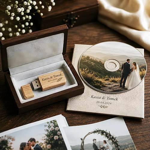
A disc set is usually three elements: the disc itself, the packaging cover and the insert or booklet inside. They look best when they form one family - the same style, the same palette, the same feel to the photos. They need not be identical, but they should clearly belong together.
A good rule is one leading motif that repeats across all parts. It could be a colour, a pattern or a frame that carries over from the cover to the disc. Such a common thread makes the set look considered, not like three separate ideas glued together. If you want an elegant cardboard package, a good choice is a digipack, which nicely joins the cover with a place for the disc.
The disc, cover and insert should look like one set, not three elements that happened to end up together.
The print area and space for details
You do not print the whole surface of a disc - there is an outer edge and an inner hole the design must avoid. These are the natural boundaries within which the print fits. So plan the artwork so the key elements land in the safe central area, away from both edges.
Leave a deliberate space for details too. On a disc you usually want the title, company name, maybe a short description of the contents or a website address. Plan a calm area for them, on a background where the letters stay readable. Light text on a dark background and the other way round always reads better than a caption that blends into a photo.
How to prepare the files for print
The safest way is to work on a template. For the disc you prepare a 120 × 120 mm square with no disc outline and no hole marked, and you run the background past the print area so no white rim appears. For the packaging you get a separate template with dimensions, bleeds and safety lines. That way nothing shifts a millimetre the wrong way.
Two things worth remembering. The first is bleed, a small overhang of the background beyond the cut line. When the background reaches all the way to the edge, bleed ensures no white strip appears after trimming. The second is pulling text and the logo a safe distance from the edge, so nothing important is cut off during trimming.
Prepare the artwork in print colours, not in screen colours, and check that the photos have the right resolution. We gathered more practical advice in the guide on preparing files for print.
From idea to finished disc
Once you have a consistent design for the disc and packaging, it is worth matching the production method to the run and purpose. For smaller series a printed CD, with the graphics printed straight onto the surface, works well. We write more about how the individual methods work and how to prepare for them in the post on printing on CDs and DVDs.
The most important thing, though, always stays the same: consistency. A disc designed in the spirit of your brand - with the same logo, colours and letters as the rest of your materials - builds a sense of order and professionalism. And that is exactly what stays in the client's memory for longer.
The shortest summary
Start with what you already have - your brand logo, colours and typography - and carry them onto the disc and cover. Make sure the disc, packaging and insert form one set, leave a clear space for details and prepare the files on a template with bleeds. That is how you get a disc that looks like part of a bigger, well considered whole.