Every new year brings a fresh breeze into design. It is not about a revolution, but about subtle shifts in taste - what looked modern not long ago can feel dull today, while things that seemed old-fashioned come back in a better version. We have gathered the most interesting directions setting the tone for advertising materials in 2026. Lightly, without jargon, and in a way you can actually use.
- Big, bold typography becomes the main hero of the design.
- Minimalism returns, but with one strong accent that draws the eye.
- Warm, natural palettes push out cold and sterile colours.
- Ecology and papers with character build trust and a pleasure to touch.
- Personalisation and hand-drawn elements add a human warmth.
Typography that speaks loudly
The biggest visible change is the lettering. Words grow, get bolder and boldly take the centre of the design. Instead of a small slogan hidden in the corner, we now see a single word stretched across the whole page. It works because the message is instant - the eye immediately knows what matters most.
Bold typography does not mean chaos. The secret is to keep the large font as one element, while the rest of the text stays calm and small. That creates a contrast which guides the eye from the headline to the details. If you want to brush up on layout basics, read our post on the rules of good graphic design worth knowing - typography is at the heart of it.
It is also interesting to mix typefaces of different character: a solid, heavy word next to a delicate, classic script. Such a duo works like a conversation between two people of different temperament - one speaks loudly, the other calmly adds the rest. Just be careful not to combine too many fonts at once. Two, at most three, and the design stays readable.
Minimalism with a single accent
Minimalism is not leaving, it is maturing. It used to mean mostly white space and restraint. Now designers add one strong accent to that calm - a vivid colour, an expressive shape or a single photograph. The rest stays quiet so that accent can truly shine.
It is a bit like a well-chosen detail on a simple outfit. One red patch on a black and white flyer can do more than ten elements fighting for attention. Such lean yet bold designs look great on advertising posters, where one instant message is what counts.
Before you add another element to a design, ask yourself: does it help the message, or just fill space? If it only fills space, drop it. Empty space works for the effect too.
Warm and natural colour palettes
Cold, technological hues give way to warmth. In 2026 the earth reigns at its best: sandy beiges, terracotta, muted greens, deep browns and soft cream tones. Such colours feel real, calm and friendly - exactly how most brands want to be seen today.
A warm palette builds trust faster than cold navies and greys. It looks good on materials that reach the client's hands and are meant to stay around. It works on business cards, invitations and also on classic advertising flyers, where a warm colour instantly warms up the whole first impression.
Colour is the first thing the viewer feels, before reading a single word. It is worth making it say straight away: we are friendly and real.
Ecology and papers with character
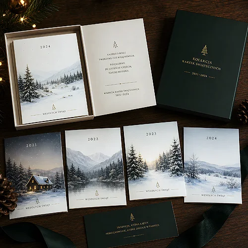
Care for the environment is no longer a trend, it is an expectation. In design you can see it in the choice of materials: natural, slightly rough papers, colours without artificial gloss, restraint in decoration. Such paper has its own smell and texture, and the client subconsciously feels they are holding something valuable.
Eco stocks pair beautifully with warm palettes and minimalism - one fuels the other. If you are wondering which paper really looks best, our guide on choosing standard, eco or decorative paper will help.
The human touch: illustration, personalisation and texture
Hand-drawn elements
After years of perfect, smooth graphics, we are coming back to imperfection. Hand-drawn icons, handwritten signatures, slightly crooked lines - all of it adds warmth and makes a design look made by a human, not a machine. In an increasingly digital world, that human trace really stands out.
Personalisation
Clients like to feel that something was made for them. A name on an invitation, a different colour variant for different groups, a small change of wording depending on the occasion - personalisation is no longer a luxury and is becoming a standard. It does not have to be expensive or complicated to impress.
The return of tactile print
The most interesting direction for last: texture you want to touch. Raised letters, embossing, varnish you can feel under your finger - print again engages the sense of touch, not only sight. This is something a screen will never deliver, which is why a well-designed, tangible material stays in memory longer.
This trend is partly an answer to digital fatigue. We stare at smooth screens all day, so a sheet with its own weight and texture instantly feels more valuable. That is why more and more brands consciously invest in print you can feel - because it is that physical impression which builds memory and affection.
Choose one tactile effect per project and commit to it. A single clear paper texture or a velvet Soft Touch film works better than several delicate decorations that blur into each other.
How to use these directions yourself
You do not need to bring in every trend at once - that is a shortcut to an overloaded design. Pick one or two that fit your brand and do them well. A warm palette plus a bold headline. Or minimalism with one accent on natural paper. Fewer directions, applied consciously, always look better.
If you want to see where these changes grow from, it is worth going back a year and reading how the printing trends for 2025 looked. You will notice that many of today's directions are a natural extension of what started earlier - only warmer, more human and more pleasant to touch. And we will gladly help bring these ideas onto paper, because we print with passion.