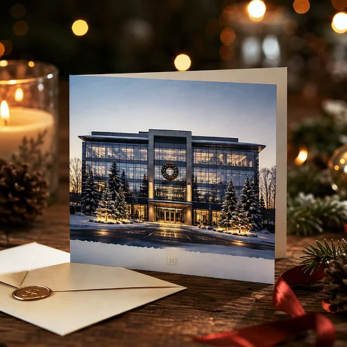
You have a great product shot or a frame from a session, plus an idea to add a background or extra elements from an AI generator. It sounds simple, but in practice these two worlds tend to clash - photography has its own texture and light, while AI graphics often look too smooth or too digital. The result is that the eye immediately catches it: here the photo ended, and here the computer began.
The good news is that combining the two is not a matter of luck, but of a few conscious decisions at the start. When you take care of shared light, a consistent palette and a uniform level of detail, the design looks like one whole rather than a collage stitched together by force. Below we show how to arrange it - from planning, through blending layers, to preparing the file for print.
- Photography and AI graphics blend well when they share light, the direction of shadows and a similar colour palette.
- Decide at the start what the hero is - usually the photo - with AI graphics playing the role of background or accent.
- Unify the level of detail and grain so one layer does not look sharper than the other.
- AI works great for backgrounds, textures and background elements, and less well for faces, hands and fine text.
- For print, convert everything to CMYK and check the resolution - AI graphics are often too small for large formats.
Start with one idea, not two files
The biggest mistake is treating the photo and the AI graphics as two separate tasks that only get glued together at the end. Coherence is born at the planning stage, not while blending layers. Before you generate anything, decide what mood the whole should have and which element matters most.
In most advertising projects the photograph becomes the hero - a real product, a face, a specific object. AI graphics then build the world around it: the background, the atmosphere, the extra elements. When you reverse these roles and expect the photo to match a generated background, it usually gets harder, because you cannot change a photo as easily as a prompt. That is why it usually pays to have the photo first, and only then ask the AI for the rest.
Before you start generating, describe the light and mood of the photo in one sentence - for example soft light from the left, a warm palette, delicate shadows. Then paste that sentence into your AI prompt so the graphics hit the same feel right away, rather than after the tenth attempt.
Three things that must match
For two image sources to look like one, they must share a few traits. These decide whether the eye reads the design as coherent or spots the seam. It is worth watching them deliberately with every combination.
- Light and shadows - if the light in the photo comes from the left, the AI graphics must have shadows on the right. A conflicting light direction is the first thing that reads as fake.
- Colour palette - set a shared range of colours and stick to it. AI graphics often lean into oversaturated tones, so you usually adjust them to the photo, not the other way around.
- Level of detail - photography has natural grain and small imperfections, while AI tends to be unnaturally smooth. A subtle grain added over the whole brings both worlds closer together.
If you want to go deeper into writing the prompts themselves, our post on how to write AI prompts to get better advertising designs comes in handy - a good prompt saves a lot of fixing at the blending stage.
What to hand to AI and what to shoot
Not everything is worth generating, and not everything is worth photographing. Dividing the roles between these two techniques is the heart of a coherent project. AI graphics have their strengths and the places where they still fail.
Where AI works great
The generator handles backgrounds, textures, abstract patterns, landscapes and atmosphere well. If you need a blurred background, an interesting surface under a product or a moody sky, AI will do it quickly and in many variants. It is also a handy tool for finding composition ideas before you move to the final version.
Where it is better to stay with photography
Faces, hands, fine text, logos and the real product are areas where AI can still add strange details - too many fingers, unreadable text, distorted proportions. Where credibility and specifics matter, a photo usually wins. We wrote more about typical quality pitfalls in our post on what quality problems AI graphics cause in print.
Technically blending the layers
Once you have the photo and matching AI elements, the most enjoyable part remains - putting it together into one image. The order of work really matters, because it lets you avoid going back to the start.
- Arrange the layers - place the photo and the AI graphics as separate layers so you can adjust each independently.
- Match the colours - adjust the temperature and saturation of the AI graphics to the photo, usually toning them down a little.
- Take care of the edges - where the two worlds meet, blur the transition or add a shared shadow so nothing cuts off with a hard line.
- Unify the texture - at the very end, add a subtle grain over the whole composition so one layer does not look sharper than the other.
This order gives you control at every step and makes the result predictable. If you combine elements in tools like online editors, our post on how to combine AI, Canva and a graphics program in one project can help.
Preparing the file for print
A design that looks great on screen does not always come out well in print - and AI graphics have a few pitfalls of their own here. Before you send the file, it is worth checking a few things.
- Resolution - generators often return images too small for a large format. Check that the graphics have enough pixels for the target size, because forced upscaling reveals the softness of AI.
- Colour mode - the screen works in RGB, print in CMYK. During conversion, intense, saturated AI tones can go flat, so it is better to see it earlier than after printing.
- Bleed and margins - if the AI background is meant to reach the edges, add bleed so a white frame does not appear after trimming.
You will find more about resolution itself in our post on what resolution of photos is right for print. We have also gathered the full set of technical requirements in the file preparation section - worth a look before you order anything with such a design.
From design to finished print
Once the file is coherent and technically correct, the most enjoyable moment remains - seeing the design on paper. Combining photography and AI graphics works great on materials where a strong image matters: flyers with a striking background, large advertising posters or the whole print offer where the image plays first fiddle. On a test print you immediately see whether the blend of layers holds up beyond the screen too. A strong background gains most on glossy coated stock - in classic flyers the paper and the lamination are chosen separately, so the contrast of the image can be pushed further by the finish.
Coherently combining a photo with AI graphics is not magic, just consistency - one light, one palette, one level of detail and a solid file at the end. Plan it at the start and, instead of a collage stitched together by force, you get a design that looks planned from the very first frame. If any doubts come up along the way about preparing such a file for a specific product, feel free to reach us through the contact page - we will tell you what to check before printing.