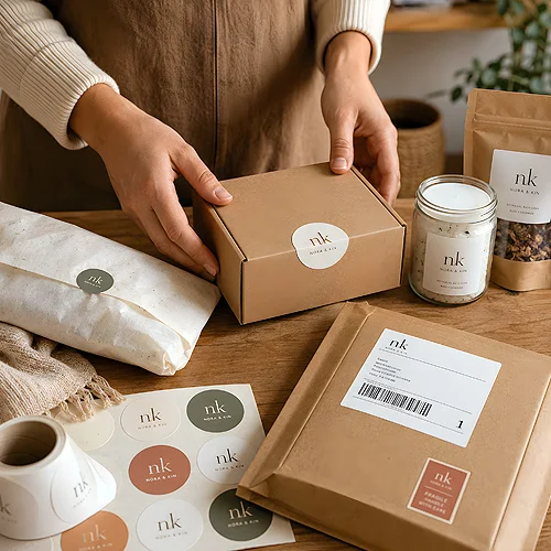
There is a moment before the customer sees the product. Fingers slide off the lid, a layer of paper rustles, something has to be gently parted. These are a few seconds in which the brand speaks without words - or says nothing at all. Paper filler, tissue in brand colours and a sticker closing the whole thing are the small things that do all the work in that moment. They cost little, yet they decide whether the unboxing will be remembered.
Unboxing, the very ritual of taking things out of the packaging, stopped being background long ago. People record it, show it to friends, come back to it in memory. It is not about opulence - it is about the feeling that someone gave it thought. Below we show how to build, out of paper, tissue and stickers, an experience that stays in memory longer than the box itself.
- The impression at unboxing is built in layers - each new one raises the tension before the product is revealed.
- Tissue and paper in brand colours turn the neutral interior of a box into a coherent, recognisable image.
- Paper filler instead of film combines aesthetics with an ecological message - and looks better in a photo.
- A closing sticker works like a brand seal - it organises the opening and signs off the whole thing.
- Ribbon, washi and small details tie the palette together - what counts is repetition, not the number of ornaments.
- Paper also carries a sensory message - touch, rustle, scent - that film will never convey.
Unboxing as a story told in layers
The best unboxing does not reveal everything at once. It works like a well-told story - it builds tension before it reaches the point, which is the product. Each layer you have to get through prolongs the moment of anticipation and makes the finale feel more valuable. That is why it is worth thinking of the inside of a parcel as several acts rather than a single gesture.
The first layer is usually a sticker or ribbon that has to be broken. The second is paper or tissue that has to be parted. The third is the product arranged so that it immediately presents its best side. Each of them is a chance to slip in colour, a logo or a small brand gesture. We wrote more broadly about how the mere arrangement of things inside affects their perception in our piece on how the arrangement of a product in a box changes its perceived value.
Break your unboxing into three layers and, at each one, ask a question: what does the customer see, hear and feel at this moment? If a layer carries no impression, that is the place to add colour, texture or a short message.
Tissue and paper in brand colours
The inside of a standard box is grey and nondescript - and that is exactly why tissue makes such an impression. It is enough to wrap the product in paper in your brand colour for the whole frame to gain character. A colour the customer knows from your website and logo suddenly appears in their hands. It is the simplest way to make packaging stop being anonymous.
Tissue has one more advantage - it is soft and delicate, so it raises the perceived value of the product without raising its weight. It rustles, folds nicely into pleats, and when parted it reveals the contents slowly. A well-chosen shade does more for the impression than many a pricier add-on.
How to pick a colour that works
Not every brand colour suits tissue directly. Very light shades can vanish in a photo, very dark ones can dominate the product. It is worth choosing a colour that contrasts with the contents but does not clash with them. If the product is light, darker tissue will bring it out nicely, and vice versa. Before you order a larger quantity, it is good to check how your shade really looks on paper - you will find pointers in the materials and papers section. It is also worth remembering how colour behaves in different light, which we cover in our piece on how light acts on metallic, pearl and textured papers.
Paper filler instead of film
Filler is a supporting character that can overturn the whole impression. Bubble wrap protects effectively, but it looks technical and is associated with cheap shipping. Paper filler - shredded strips, crinkle paper, paper wool - protects similarly, yet looks like part of the composition rather than a stopgap.
On top of that comes the message. Paper recycles easily, is renewable and is simply more natural to the touch. For a customer who pays attention to ecology, the very fact that there is no plastic inside is a statement about the brand's values. And in an unboxing photo, paper filler in the tissue colour simply looks coherent.
- Paper strips - light and springy, they fill empty spaces well and arrange nicely around the product.
- Crinkle paper - cushions delicate items, and its texture adds depth to the interior.
- Paper wool - a soft, nest-like form in which the product looks arranged with care.
What matters is that the filler plays in colour with the rest. Paper filler in the shade of the tissue and stickers creates one coherent interior instead of a jumble of random materials.
The sticker as a brand seal
A closing sticker is the detail that gives the most effect for the least effort. A round sticker with a logo, closing folded tissue, works like a seal - it signs the parcel and marks the moment when the unboxing begins. The customer has to break it, so they consciously step into the ritual of opening.
Stickers can be used in several places, and each time they work a little differently:
- On the tissue closure - as a seal broken first.
- On the paper filler or a card - as a small accent with a slogan or a thank-you.
- On the product itself - as an element that carries the packaging style onto the item inside.
It is worth attaching to the product a paper tag or hang tag with a short text too - one more carrier of the brand that stays with the customer after the box goes in the bin. And if a gift card or a voucher travels in the parcel, a rigid EKO card sleeve in kraftliner or grass-fibre Kazan paper holds it elegantly.
Ribbon, washi and a coherent palette
Ribbon and washi tape are details that are easy to overdo, so it is worth keeping to one rule: less, but consistently. One ribbon in the brand colour, tied around the tissue, gives more than three different ornaments fighting for attention. Washi with a repeating pattern works where you want to add rhythm, not weight.
The secret of coherence is the same as with every identity element - repetition. The same palette on the tissue, filler, sticker and ribbon makes the inside of the parcel look designed rather than gathered from whatever was at hand. The logo does not have to be large everywhere; sometimes its colour and one recurring detail are enough for the whole to read as yours.
The senses that film cannot convey
Finally, something easy to forget while planning on a screen: unboxing is a sensory experience. Paper has touch, rustle, sometimes a delicate scent - and all of it reaches the customer at the same moment as the image. Soft tissue under the fingers, the crack of a sticker being broken, the whisper of parting filler - these small things build an impression that no film can give.
That is why it is worth thinking of the inside of a parcel not as protection, but as the first live meeting with the brand. Plan it deliberately, build it from layers, choose one colour and one recurring detail - and an ordinary shipment turns into a moment the customer will want to show others. It is the cheapest advertising you have: a satisfaction that is born before the product even leaves the box.