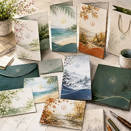
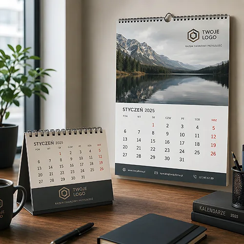
Imagine that every post, every flyer and every presentation from your company looks like it came from a single hand. The same colors, the same fonts, the same logo in the right spot. This is not about talent or a big budget - it is about one well-organized brand kit in Canva. You build it once, and after that you just swap in the content.
- A company brand kit in Canva holds your colors, fonts, logo versions and templates in one place.
- Consistency makes the brand look professional, and the work goes much faster.
- The rule of 2-3 fonts and a clear hierarchy is the foundation of readable materials.
- Reusable templates are made once, then you only type in new content.
- Before printing, remember about bleeds, resolution, exporting to PDF and moving from RGB to CMYK.

Why do you need a company brand kit?
A brand kit is a set of elements that define how your company looks. Colors, fonts, logo and ready templates kept together, ready to use at any moment.
Three reasons why it is worth having:
- Consistency. A business card, an Instagram post and a flyer look like siblings, not like random acquaintances. The customer remembers the brand because they see it everywhere in the same form.
- Speed. You do not start from a blank page - you open a template, type in new content and you are done.
- Order in the team. Everyone reaches for the same style. No more ten shades of the same blue.
In short: a brand kit saves time and makes the company look serious, even if you make the materials yourself.
Colors - your brand palette
Color is the first thing the eye catches. That is why it is worth setting a palette and sticking to it everywhere.
In Canva you add colors in the brand section. It is best to enter them as HEX codes - six-character notations like #1A73E8 that guarantee the color will always be exactly the same. If you have a brand book or a logo from a designer, you will usually find the HEX codes there.
A good palette usually has:
- 1-2 main colors - these build recognition (for example the logo color, the leading color).
- 2-3 supporting colors - for backgrounds, accents, buttons and small elements.
- Neutrals - a dark one for text and a light one for backgrounds, so everything reads well.
You do not need ten colors. Less is more - a few colors used consistently look more mature than a rainbow.
Save the HEX codes of your palette in a separate note or on the first slide of your brand presentation. When you order print or work with a designer, you just copy them - no guessing the shade.
Fonts - two or three typefaces and that is it
Fonts build the character of the brand, but it is easy to overdo them. The golden rule is: 2-3 typefaces, no more.
The simplest layout that always works:
- Heading font - stronger and more distinctive, for titles and slogans.
- Body font - simple and readable, for longer text and descriptions.
- Optionally a third accent font - used sparingly, for highlights.
In Canva you set your fonts in the brand section. If you have licensed company typefaces, you can upload them (in paid plans) - then your online and print materials look identical. If you do not have your own, pick typefaces from the Canva library and simply stick to your choice.
Hierarchy matters - that is, what is the largest and what is the smallest. A big heading, a smaller subtitle, even smaller text. Thanks to this the reader instantly knows where to look first.
Logo - keep every version at hand
One logo is not enough. In practice you need several versions, because different materials have different backgrounds and formats.
- Primary version - the full logo with the name, for a light background.
- Dark background version - often the same form but in light colors, so it stays visible.
- The mark - just the symbol without text, great for avatars, stamps and small spaces.
Upload all versions to the brand section in Canva. Then, in every new project, you drop in the ready logo with one click instead of hunting for the file across folders. Also make sure the logos are high quality - ideally in formats that do not lose sharpness when enlarged.
Reusable templates - the heart of saving time
This is where the brand kit really starts working for you. Instead of designing every material from scratch, you prepare templates and then only swap the content.
It is worth having ready-made pieces for what you do most often:
- Social media posts and graphics - in square and vertical story formats.
- Flyers and business cards - with dimensions taken from our templates (flyers, business cards) and the logo already in place.
- Presentations - a cover, a content slide, a summary slide.
- Recurring materials - offers, price lists (without specific amounts in the template), email signatures.
Once you make such a template well - with the right colors, fonts and logo - the next material takes a few minutes. That is a huge difference, especially when you publish regularly. If you want to go a step further, take a look at our post on how to create a series of consistent advertising materials - we show there how to turn one idea into a whole campaign.
Order, folders and teamwork
Even the best brand kit turns into chaos without order. A few habits to start with:
- Themed folders - social media separately, print materials separately, presentations separately. You will find everything in seconds.
- Clear naming - name projects so you can recognize them without opening, for example "Flyer autumn - promotion".
- Sharing - if you work with someone, invite that person to your team in Canva. Everyone uses the same templates and brand, and you can be sure no one picks a random color.
Order at the start is an investment that pays off with every next project.
From Canva to print - what to remember
Canva works great online, but print has its own rules. Before you send a project to be printed, it is worth paying attention to a few things.
- Bleeds - this is a margin beyond the edge of the project that lets the material be trimmed without white strips. In Canva, turn on the bleed option before exporting.
- Resolution - graphics and photos must be high quality so they are not blurry after printing. What looks good on screen is not always enough in print.
- Export to PDF - for print, choose the PDF format (in Canva usually "PDF for print"), not a regular image.
- RGB versus CMYK colors - the screen shows colors in RGB, while print works in CMYK. Some intense on-screen colors may look slightly different on paper. It is good to know this, especially with strong brand colors.
Sounds technical? Relax - we have gathered the most important rules in one place. Take a look at our guide on preparing files for print, and moving from screen to paper becomes simple. And if you want your project to stand out from the rest, our post on how to rework a ready Canva template so it does not look like dozens of similar ones will help too.
Practical steps to get started
If you want to build your brand kit today, do it in this order:
- Add the palette - gather the HEX codes of your colors.
- Set two, at most three fonts and remember which is for headings and which is for text.
- Upload all logo versions - for a light background, a dark one and just the mark.
- Make your first templates for the materials you create most often, and organize the folders.
You do not have to do everything at once. Start with colors and logo, and add the rest over time - every element you add means less work on the next project.
A good brand kit is not saving on quality - it is saving on time. Order set up once works for you on every new material.
And when your projects are ready to go out into the world - we will take care of the rest. All you need is to export them to PDF following our file preparation guide, and you focus on what really matters: your business.