
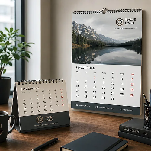
Most advertising materials have a short life - a flyer ends up in the bin after a few days, a banner disappears once the campaign ends, and a gadget often lands in a drawer. A calendar is the exception. Well designed, it hangs on the wall or sits on a client's desk all year and reminds them of your company every day, without being intrusive. It is one of the few carriers that someone actually wants to keep in sight.
That is exactly why a company calendar is worth treating not as a seasonal end-of-year gadget, but as a considered part of brand communication. In this post we show how to plan the design of a desk and wall calendar so that, for twelve months, it works for your image rather than simply counting the days.
- A calendar is one of the few advertising carriers a client keeps in sight all year long.
- The desk version is closer to hand and notes, the wall one works from a distance and offers a larger visual surface.
- The logo should be present but discreet - a calendar is meant to be useful, not a sales brochure.
- Plan the project ahead: printing, paper choice and distribution before year-end all take time.
- A style consistent with the rest of your materials means the calendar strengthens the brand instead of standing apart from it.
Why a calendar works longer than other materials
A calendar's strength lies in its exposure time. A flyer is glanced at for a moment, an online ad scrolled past in a second, while a calendar accompanies the recipient every working day. When someone checks a meeting date or jots down a note, their eyes drift onto your logo. It is regular, calm contact free of pressure - and that kind builds trust best.
Add to that its usefulness. A calendar does not pretend to be an advert - it is genuinely handy. The recipient does not treat it like a flyer to be thrown away, but like a tool they want to keep close. As a result the brand gains something rare: a presence the client chose to keep. If you are thinking more broadly about the role of print in building relationships, it is worth reading our post on how end-of-year corporate gifts build relationships.
Desk or wall - two different jobs
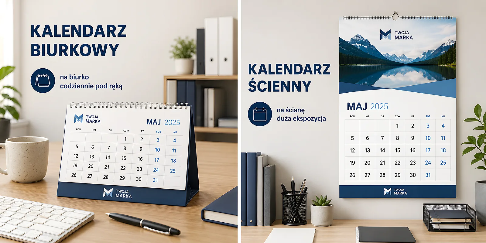
Although both types serve the same function, they work differently and are worth choosing deliberately. Often the best solution is to combine both in one shipment to key contacts.
Desk calendar
It sits on the desk, within reach, right next to the keyboard and notepad. It is a carrier for close contact - the recipient glances at it dozens of times a day. A compact form works well, with room for notes and a clear weekly or monthly layout. A logo placed on the stand or in the footer of each page is visible but not overwhelming. The desk version is a good choice for companies that want a presence in a client's daily work.
Wall calendar
This one works from a distance and over a larger surface. It hangs in a reception area, a staff kitchen or a home office where more people see it. It gives room for stronger graphics - a photo, an illustration, a brand motif. Here the logo can be part of the composition rather than just an afterthought. The wall version is great when you want the recipient's surroundings, not only the recipient, to associate with your brand.
Before you choose a format, consider where the calendar will actually end up. A client working at a desk will get more out of the desk version. A company with a busy reception or a workshop - the wall one, seen by many people. Choosing the place of display matters more than the format itself.
How to place the logo so it does not overpower
The biggest mistake with company calendars is treating them like an advertising poster. A huge logo in the middle of every page and sales slogans make the calendar stop being useful and start being annoying - and it quickly ends up in a drawer. The brand should be present, but in the background.
- A fixed, discreet brand zone - the logo in the page footer, on the stand or in a corner. A recurring place works better than a loud accent.
- Colours instead of captions - your brand palette can be woven into the lines, backgrounds and accents. That builds recognition subtly.
- Legibility of the day grid first - if the calendar is hard to read, the whole advertising point is lost, because nobody uses it.
- One brand element per page - a photo of your work, a graphic motif or a short thought. No clutter, so the whole thing can breathe.
A well-chosen calendar is a coherent part of your company's material system - alongside business cards, letterhead and folders. If you want it all to speak in one tone, it is worth keeping the same palette and typography as in your other printed materials. Consistency means each element reinforces the others.
Paper, finish and format - the practical side
The impression of quality starts with touch. A calendar someone picks up daily should be pleasant to handle and durable - it should not warp after a month or wear out along the folds.
- Weight and paper - thicker, stiffer paper stands up better to daily flipping and feels solid. Desk pages usually need more rigidity than wall ones.
- Surface finish - a matte coating looks elegant and does not reflect light, while gloss brings out photo colours more strongly. The choice depends on whether you go for photographs or calm graphics.
- A fitting format - set the dimensions and layout to suit the place of display. A desk calendar that is too big takes up precious space, a wall one that is too small gets lost on the wall.
- File preparation - correct bleeds, resolution and colour mode decide whether the print reflects the design intent. It is worth checking our file preparation tips beforehand.
If you are still wondering which type of calendar suits your company and audience, our post comparing types of company calendars will help. It shows who each form works for and makes the decision easier before you even start designing.
Planning and distribution step by step
A calendar is a seasonal item with a hard deadline - it has to reach the recipient before the new year begins. That is why it is worth spreading the work out calmly rather than rushing at the last minute.
- Concept and lead motif - first decide what the calendar is "about": photos of your work, illustrations, a brand motif. This is the foundation of the whole project.
- Design and print preparation - refine the page layout, the logo zone and the files. This stage decides the quality of the final result.
- Printing and finishing - the choice of paper, binding and coating. Plan it with time to spare before the shipping season.
- Recipient list - decide who gets the desk version, who the wall one, and who both copies. Key clients deserve a fuller set.
- Distribution before year-end - a calendar handed over too late loses its point. Plan the shipment so it arrives before recipients hang another one.
A calendar is one of the most patient brand ambassadors - it does not shout, does not get in the way, it is simply present all year. If you design it with usefulness in mind and treat the logo with restraint, it will quietly remind people of your company for twelve months. Calendar heads and backing boards can be ordered straight from the calendars section, and if you want to discuss the format, paper or print run for a specific audience, just get in touch - together we will find a solution that works for your brand all year round.


