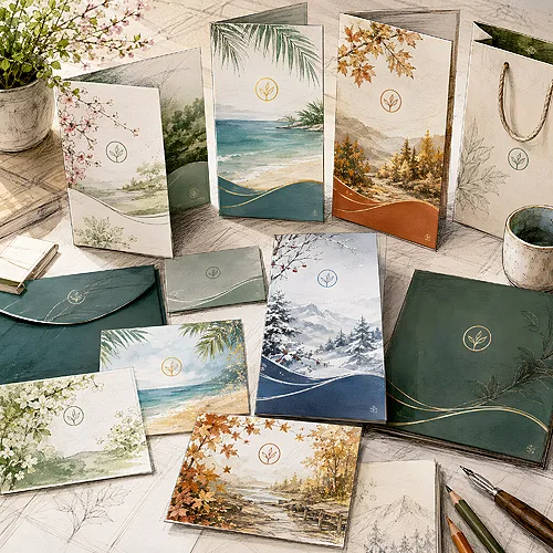
There's a kind of promotional gift the recipient doesn't perceive as an ad. It doesn't end up in a drawer full of junk or in the bin after two days. It stays on the desk, in the bag, in a coat pocket - and quietly works for the brand every single day. Nice, useful, with a discreet logo. These are exactly the items that work best, and not because they shout the loudest.
- A gift that looks like an ordinary, good object doesn't trigger resistance - and that's why it stays with the recipient longer.
- A discreet logo works better than a giant print: the brand feels like quality and care, not pushy advertising.
- Four rules of a good gift: usefulness, aesthetics, subtle branding and a good fit for the recipient.
- A loud gift goes to the bin. A nice, useful one goes into everyday life.
Why advertising that doesn't look like advertising works better
We all have a built-in filter for ads. We see a banner, a flyer or an object plastered with a logo - and the brain automatically puts up a wall. "Someone wants something from me". This defensive reflex means a pushy gift often loses before it even has a chance to work.
A nice, useful object with discreet branding bypasses that filter. It isn't perceived as an ad, just as a pleasant, handy little thing. There's no resistance, so there's no rejection. And since the object stays in daily use, the brand is present far longer than any single contact with classic advertising.
On top of that comes something more important than mere visibility - association. A good, well-made object suggests: "this company cares about detail, chooses quality, doesn't cut corners". The recipient transfers that intuition to the whole brand. A cheap gift says exactly the opposite.
The best promotional gift is the one the recipient uses with pleasure and never even thinks of as an ad.
Four rules of a gift that actually works
The difference between an object that stays and one that ends up in the bin isn't random. It comes down to a few simple rules. It's worth knowing them before ordering anything with a logo.
1. Usefulness above all
An object someone actually uses is in contact with the brand every day. A pen that writes well, a flash drive that goes back into the laptop every morning, a lighter in a coat pocket. Usefulness isn't an add-on - it's the foundation. Without it, even the prettiest gift is just an ornament that quickly gets boring.
2. Aesthetics you want to look at
A nice object stays in sight, an ugly one disappears into a drawer. A simple form, good colours, a pleasant material - this makes the gift something to display rather than hide. And every glance is another gentle contact with the brand.
3. Subtle branding
A logo doesn't have to be big to work. Quite the opposite - the more discreet it is, the better it fits the object's look and the less it resembles an ad. A small, elegant mark in the corner builds a sense of class. A print covering half the surface shouts "this is an ad" and switches on the defensive filter.
4. A good fit for the recipient
The same gift works differently for a young startup team and for a hotel or restaurant guest. It's worth thinking about who will receive the object and whether they'll really use it. A well-chosen gift delights. A poorly chosen one - even a pretty one - gets set aside.
Before you order a gift, ask yourself a simple question: would you carry this object yourself if there were no logo on it? If yes - that's a good sign. If you use it only because it's free, the recipient will probably set it aside quickly too.
A loud gift versus a nice, useful one
Picture two objects. The first: a cheap pen in a garish colour, with a logo along its whole length, barely writing. The second: an elegant pen that sits well in the hand, with a small, engraved mark. The first is handed over and forgotten. The second stays on the desk and gets used for weeks.
The difference isn't in the price itself, but in the approach. A loud gift puts the ad first and treats the object as a pretext. A good gift reverses the order: first comes an object you want to use, and the brand is present discreetly, in the background. It's exactly this reversal that decides effectiveness. We write more about why usefulness matters more than a low price in a separate post.
There's also a simpler route than inventing unusual objects - just take a thing people use every day anyway and make it truly well. A classic engraved pen is the best example: we reach for it without thinking, so the brand returns to the recipient's hands again and again. We show this mechanism in more depth in the post on how to turn an everyday object into an advertising medium.
How to translate this into your own order
Start with the recipient, not the catalogue. Think about what this person uses every day and what would genuinely make them happy. Only then look for an object that fits - and one that can be branded nicely and discreetly.
Go for quality of execution. Better fewer, but well made, than lots of cheap stuff that puts people off the brand. Remember that a gift is an ambassador of the company - it says as much about it as a business card or a website. In our gadget range - pens, flash drives and lighters - you'll find items that combine usefulness with aesthetics, and if you have doubts about branding or form - just get in touch and we'll pick the right solution together.
One last thought. A gift doesn't have to shout to be remembered. Sometimes the one that simply keeps someone company every day works best - quiet, handy and just nice enough that you don't want to hide it.