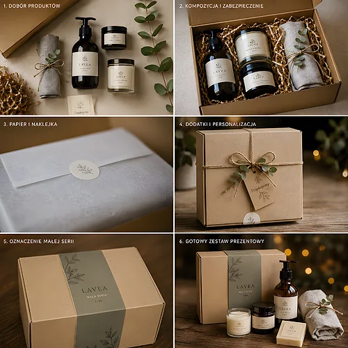
A corporate gift set works when, on opening it, the client does not see a random pile of gadgets but a considered whole. A few well-chosen elements in one style make a bigger impression than an expensive gift tossed into a random bag. The whole trick is to make the set look like one idea, not a shopping list.
The good news is that a coherent set needs neither a huge budget nor a design department. It needs one theme carried consistently through every element - from the packaging, through the gifts, to a small card with a message. Below we show how to put such a set together step by step, so it looks elegant and speaks about your brand with one voice.
- Coherence comes from one theme: a shared palette, a single pair of fonts and a recurring brand detail.
- Choose elements functionally - the set should be useful, not just striking in a photo.
- Packaging is the first impression - a folder, a box or a sleeve ties the whole thing into one narrative.
- Personalisation makes the difference: the recipient's name, a dedication or a small accent for the occasion.
- Plan the set at the start, so that adding a missing element becomes a simple formality.
Start with one theme
Coherence comes from repetition. When the same idea runs through every element of the set, the eye immediately sees a whole rather than a collection of separate things. Instead of choosing colours and styles for each gift separately, set a few constants and stick to them consistently - it is the cheapest and most effective route to elegance.
Brand palette and typography
The starting point is your company's visual identity. Choose two, at most three colours from the brand palette, one typeface for headings and one for body text. The same pair of colours on the packaging, on the message card and on a gadget print does more for coherence than the most expensive single gift. If the brand has a muted, elegant colour scheme, stick to it, because it is what builds the sense of class.
A recurring brand detail
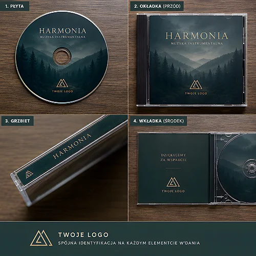
The simplest route to coherence is one element that appears everywhere. Most often it is the logo, but a distinctive pattern, a ribbon colour or a recurring symbol works just as well. The same detail on a folder sleeve, on a tag and on a flash drive print acts like the signature of the whole set - discreet, but recognisable. That same shade is easiest to repeat on the Twister model - nine casing colours to choose from, and the mark goes on it as a UV print or an engraving.
Before you order anything, prepare a small set of constants: two brand colours, two fonts and one recurring detail. Write them down and keep them at hand for every element. That way even a gift added later will fit in with the rest without any fuss.
Choose elements with an idea
An elegant set is not the one with the most items, but the one in which every item makes sense. Instead of adding more gadgets, think about the recipient: what they will actually use, what will stay on the desk longer, what they will be glad to receive. A few well-chosen elements always beat a full box of random trinkets.
- A functional element - something that stays in daily use and reminds of the brand. Data carriers work well here, such as branded promotional flash drives, which land on the desk and come back to hand regularly.
- An element with value - a small gift that brings pleasure. It could be an invitation to use a service in the form of an elegant voucher in the brand colours.
- A personal element - a message card or a short dedication. It is what turns a package of gadgets into a gesture aimed at a specific person.
- A tying element - packaging and company materials that keep the whole thing in one style and organise the contents.
It is worth matching the selection to the occasion and the relationship. A welcome set for a new employee will differ from a gift for a long-standing partner or a holiday present. One common denominator remains: every element should match the rest and the brand.
Packaging makes the first impression
The contents of the set matter, but it is the packaging that decides the first reaction. Before the recipient sees the gifts, they see the box, the folder or the sleeve - and already at this stage they judge whether they have received something considered. That is why packaging deserves to be treated as a full-fledged part of the project, not an add-on at the end.
An elegant company folder in the brand colours neatly organises the contents and instantly raises the standing of the whole - the information materials, the voucher and the card all go in one place instead of loosely wandering around the box. If you are after a premium impression, go for a consistent finish: the same paper, a recurring detail and a muted colour scheme on every part of the packaging.
- One paper for everything - a card, a sleeve and company materials on the same well-chosen paper look like a matching set, not a jumble.
- A recurring finish - if you decide on an enhancement, repeat it consistently. One recurring finishing detail ties the set together as strongly as colour.
- A muted colour scheme - less is more. Elegance is born from limiting the palette, not from an excess of ornaments.
Personalisation that builds a relationship
Personalisation is what sets a mass mailing apart from a genuine gesture. The recipient instantly feels the difference between a package handed out to everyone equally and a set that looks prepared just for them. It is not about grand efforts - often a name on the card and a few sentences of your own are enough.
It is worth considering a few levels of personalisation, depending on who you are giving the set to and how closely you work with that person.
- Brand print - the company logo and colours on the elements of the set. This is the base that reinforces the image with every use of the gift.
- Recipient personalisation - a first name or surname on the card, a dedication for a specific person. The simplest way to make the gesture personal.
- An accent for the occasion - a small motif matched to the moment when you give the set. Without going overly literal, as a subtle signal.
If you are looking for an idea to coherently combine print, small gadgets and an element that lasts longer, take a look at our post on how to plan personalised gift sets that combine print, music and gadgets. Many of the tips there come in handy when composing the whole.
Plan the set step by step
The last piece of the puzzle is the plan. Even the best-conceived set loses out when it is made in a rush, with elements arriving in different styles at the last minute. Spread the work so that the whole thing can be assembled calmly and in one aesthetic.
- The theme first - set the palette, the fonts and the recurring detail. This is the foundation you will match everything else to.
- Then the choice of elements - pick the gifts functionally, for the recipient and the occasion, not for the effect in a photo.
- Next the packaging - choose a folder, a box or a sleeve that will hold the contents and keep the style.
- Personalisation last - add the brand print, the recipient's name and a dedication once you know the final list of people.
If you want to see what you can put a set together from, browse the full range in our product catalogue, and for a larger order or a non-standard idea simply write to us - we will help match the elements so that the whole thing holds together.
An elegant corporate gift set is not a matter of a big budget, but of one good idea carried consistently. Set the theme, repeat it everywhere, choose the elements wisely and close them in coherent packaging - and the set will take care of making your brand look as professional and considered as the way you work.