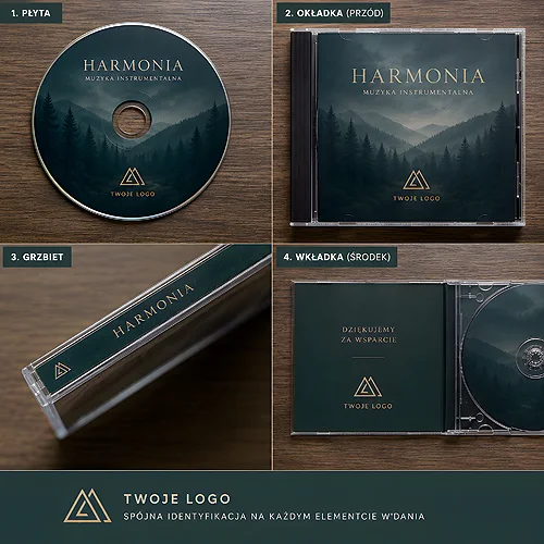
Some brands want to be talked about - and some make people want to linger a little longer. That second group knows that luxury is not a shout but an atmosphere. And atmosphere is easiest to build with sound. An original music album, released by a premium brand as part of an image campaign, is one of the most elegant ways to tell your story - without a single word of advertising.
- A premium brand's music album is not a giveaway but a deliberate part of its identity - the audio counterpart of its visual language.
- It works because it builds emotion, shows attention to detail and stands out from standard corporate gifts.
- The physical object matters: beautiful print, elegant packaging, paper, finishing and a booklet telling the album's story.
- A limited edition, numbering and handing copies to VIPs or press turn the disc into a real carrier of prestige.
- The music must be legal - original or licensed. That is a condition, not a detail.
Not a gadget, but a deliberate part of identity
The difference between a corporate gift and an image album is the same as between a branded pen and an invitation to a dinner remembered for years. A gadget ends up in a drawer. A well thought-out music album ends up on a shelf next to the things someone genuinely loves - and comes back through their headphones in the middle of the day, when no one is telling them to think about the brand.
A premium brand that creates its own polished compilation or a curated selection of tracks says something important about itself: that it cares about the experience, not just the product. That it thinks of the client in terms of moments, not transactions. It is a subtle message, but subtlety is precisely the currency of luxury.
Why it works for premium in particular
Premium brands compete not on price but on feeling. A music album plays exactly on that field - it adds a layer to the brand that competitors usually lack.
- It builds emotion and association. A melody can evoke a brand faster and more warmly than any slogan. Sound bypasses the rational barrier and lands straight in the mood.
- It shows attention to detail. If a brand cared even about something the client did not expect, imagine how it treats the things that matter most. The album becomes proof of an obsession with quality.
- It stands out from standard gifts. A calendar or a notebook arrives every year from ten companies. An original album arrives from one - and that one is remembered.
- It tells the brand through sound. This is the audio side of the identity - just as the colour palette and typography have character, so can a brand's soundtrack.
A logo is seen for a second. A well-chosen album is listened to for quarter-hours - and people come back to it of their own accord.
Music aligned with the brand's character
The key is not "nice tracks" but tracks that sound like the brand. Before the first song is chosen, it is worth naming the brand's character in a word or two and sticking to it to the end.
- Elegance - understated, acoustic sounds, jazz, classical in a modern arrangement, nothing loud.
- Modernity - clean, minimal electronic production, space and breathing room in the mix.
- Calm - ambient, gentle pianos, music that lowers the pulse and leaves room for thought.
The choice should be as deliberate as choosing a typeface for the identity. If the brand speaks of calm and the disc plays energetic pop, the listener will feel the dissonance - even if they cannot name it. Consistency matters more here than the popularity of the tracks.
Try a simple test: play the working playlist in the background as you enter the brand's website or its physical space. If the music and the visuals sound like one thing - you are on the right track. If something jars, that is a signal to swap a track, not to change the brand.
The physical object matters - tangible luxury in the age of streaming
The paradox is beautiful: the more music we keep in the cloud, the stronger a disc you can hold in your hand becomes. In a world where everything is available in a second, an object someone gave attention and craft to becomes a luxury again. That is why a premium image album lives in physical form - and that form has to be flawless.
The medium and the print
The disc itself is only the starting point. A careful, precise print on the surface - matched to the identity's colours - decides the first impression. If you want a premiere, unique run, an elegantly printed CD with a refined print works beautifully and can be perfected in every detail.
Packaging, paper and finishing
It is the packaging that turns a disc into an object rather than just a piece of plastic. An elegant case or a digipack made of solid board gives the whole thing weight - literally and in perception. It is worth reaching for good paper and a cover finished with film - matte, gloss or velvet Soft Touch - and, on the 4P and 6P digipack, matte film with spot varnish that lifts the mark itself. Each of these adds that second in which someone holding it feels they are holding something considered.
A booklet with the album's story
An insert or a small booklet is the place where the brand can tell the concept: why these particular tracks, what mood they were meant to build, what connects them to the company's philosophy. This turns a set of songs into a narrative - and a narrative stays in the mind longer than the sound itself.
How to weave the album into the campaign
The album works most powerfully when it is not a standalone thing but part of a larger story. A few proven moves that raise its standing:
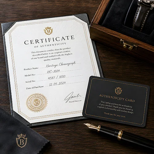
- A limited edition and numbering. A finite number of copies and a hand-applied number turn the disc into a collector's object. What is scarce is valued more.
- Handing copies to VIPs, press and key clients. The album makes a wonderful gift at a season-closing meeting, a press briefing or a thank-you for the best partners.
- A premiere event. An evening where the album is played live for the first time ties the campaign together and gives the media a concrete reason to write about the brand.
- Consistency with the visual campaign. The cover, colours and typography of the disc should play with the rest of the materials - from invitations to the key visual. The album is an instrument in the orchestra, not a soloist playing its own tune.
A bridge to the digital world
The physical object need not close itself off from streaming - it can invite it in. A discreet QR code on the cover or in the booklet leads to an online playlist, a campaign page or an extended version of the album. The listener gets a disc for the shelf and a link for listening on the go - one object, two worlds.
The legality of the music - a condition, not a detail
The most beautiful album can turn into a problem if the music is not cleared properly. A premium brand cannot afford that - the reputational risk outweighs any saving. There are three safe paths:
- Original music - composed specifically for the brand and fully its own. The most expensive to produce, but also the most unique and free of complications.
- Licensed tracks - with a proper, documented licence for the specific use (print run, distribution, gifting).
- Royalty-free music - with clearly defined terms, checked for commercial use and for the production of physical media.
This is not a box to tick at the end - it is the foundation the whole project stands on. Before printing begins, it is worth having the paperwork in order.
Keep the licensing questions separate from the creative ones and settle them as early as you can. A cover choice can be changed in a week. The rights to the music, after hundreds of discs are pressed, cannot.
From idea to a finished album
A good image album emerges where music, graphic design and print craft meet. It is a little like directing - you have to bring the character of the sound, the look of the cover and the quality of the physical execution into one coherent whole. That is exactly why it pays to lean on someone who has walked this path many times.
If you are thinking about an original album as part of an image campaign, we will gladly help you choose the medium, packaging and finishing, and guide the project from concept to a finished, elegant series. Write to us through the contact form - we will tell you what works and suggest solutions matched to your brand's character.
If you are looking for more inspiration, take a look at our posts on how to match music to an industry's character and how to turn a disc with music and a company logo into an unusual, memorable gift.