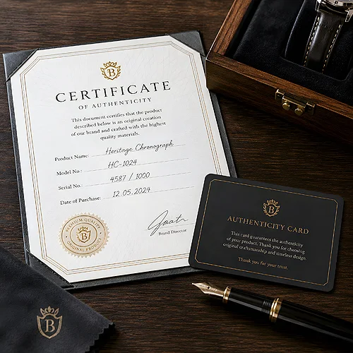
Premium is easily confused with excess. These articles point somewhere else: the sense of value usually comes from restraint and care in small things. The same design on a different paper, with a different finish, can read in a completely different way.
What genuinely lifts the feeling of quality
A few elements come up again and again, whether the subject is packaging, a disc cover or an invitation.
- Paper - metallic, pearl or clearly textured stock catches light differently from a smooth sheet.
- The film on top - gloss lifts colour, matt calms it down, Soft Touch is pleasant under the fingers.
- Colour - muted, darker shades with one accent are read as elegant.
- Inside the box - a product with a little space around it looks worth more than one squeezed in.
- Restraint - a single strong accent beats three competing ones.
Elegance without overdoing it
One thread deals with recycled and natural materials, long associated with plainness. The articles show that textured paper and a quiet palette can look very good indeed when the design stays sparing. Light works the same way: pearl and metallic papers change as you tilt them, so it is worth seeing a sample in your hand before you decide.
If you are preparing a gift or a product for posting, start with the pieces on packaging and on arranging the contents. That is the first impression a customer gets when the parcel opens, and it is the easiest one to improve.