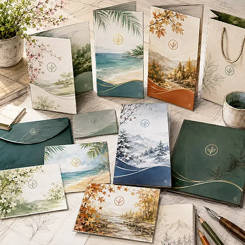
A tag is often the first thing a customer touches when they pick up your product. Before they read a description or check a price, they already feel the paper and see your logo. This small piece of card does a surprising amount - it introduces the brand, organises the information and makes the item look considered rather than accidental. In retail and handmade goods it is a detail that works for the impression of quality almost for free.
- A tag carries several things at once: the brand name, price, contents or a short product story.
- It works everywhere - from clothing and handmade goods to cosmetics, food and gifts.
- You choose the shape and format to suit the product: rectangle, square, circle or a die-cut hang tag.
- The hole and the way it is attached are on your side - the customer hangs the tag on their own string, ribbon or cord.
- Paper and finish decide the impression; consistency with the rest of your materials makes the tag part of a bigger whole.
What a tag really does
At first glance a tag is just a price or a name. In practice it combines several jobs in one place. It tells who is behind the product, how much it costs, what it is made of and how to care for it. It can also be room for a short story - a line about the item being made by hand, in a small studio or from local materials.
That last part can do the most. A customer holding a nicely written hang tag gets a signal that they are dealing with a brand that cares about detail. And if it cares about the tag, it probably cares about the product too. This small thing builds trust before a single word is spoken.
The tag as a small carrier of content
It is worth thinking of a tag as a miniature business card for the product. You have a few centimetres here on which you need to fit the most important things, and do it legibly. That is why a good tag starts with hierarchy: the name and logo on top, then the practical information, and the story or tagline only at the end, if there is room. The customer should grasp in a few seconds what they are holding and who it is from.
The back of the tag is a space easy to forget. You can fit a care instruction, washing symbols or a QR code leading to the shop. Thanks to that the front stays clean and elegant, while the back plays a practical role - without cramming everything into one place.
Where tags and hang tags work best
A hang tag is versatile because it does not have to be permanently joined to the product - you hang it or attach it, so it fits almost anywhere. A few examples show right away how many uses it has:
- Clothing and accessories - a tag with the brand, size and contents, looped over a hanger or button.
- Handmade goods - candles, jewellery, ceramics, knitwear; the tag tells who made it and how.
- Natural cosmetics - soaps, balms, products in small jars; the tag carries the ingredients and how to use them.
- Food and preserves - jams, honey, bread as a gift; a tag with a name and date looks homemade and cared for.
- Gifts and packaging - a tag instead of a card, with a wish or just the studio logo.
In each of these cases the tag does the same thing: it turns an ordinary product into something that looks prepared with the recipient in mind.
Seasons, collections and limited editions
A tag is also a handy tool when your offer changes with the season. One hang tag for the spring collection, another for the festive one, and yet another for a small limited series - it is a simple way to signal that a product is part of something current. You do not have to change the whole packaging; just swap the tag and the product tells a new story right away.
For limited editions, numbering or a short note that the series is small and unique works well. A customer who receives an item with a number feels they are holding something special. It costs nothing in the design, yet it can genuinely raise the value of the product in the recipient's eyes.
Before you settle on the tag content, list what the customer MUST know (brand, price, contents) and what would be a nice extra (story, tagline). Take care of the essentials first and add the rest only when there is room - a crowded tag loses its legibility.
Shapes and formats - match the product
A tag does not have to be a classic rectangle, though that always works and is the easiest to design. A square looks modern and packs the content into a tight block. A circle or oval softens the whole and suits cosmetics or handmade goods well. And if you want to stand out, a die-cut shape can help - the tag can echo what you sell. Shape, paper, print and finish are picked separately in our classic hang tags, so a die-cut tag is built around one particular product.
It is worth matching the format to the size of the product. Small jewellery suits a tiny hang tag, while a larger item can take a bigger tag with room for more content. It is about proportion - the tag should complete the product, not overwhelm it or get lost beside it.
A good tag does not fight the product for attention - it completes it so the whole thing looks like one considered piece.
The hole and attachment - what is on your side
A hang tag has to be fixed somehow, and the simplest solution is a hole through which you thread a string, ribbon or cord. When designing the tag it is worth planning room for it right away - with a proper margin from the edge, so the paper does not tear when worn.
The way it is attached stays on the customer side. They pick the string, the colour of the ribbon or the cord that suits their product and taste. Your job is to prepare the tag so it can be hung comfortably - the rest is their space to play with. Thanks to that the same tag can look different on jute string and on an elegant satin ribbon.
Reinforcing the hole and thicker card
The spot with the hole is the most prone to tearing, because it bears the whole weight of the hung product. That is why with thinner paper it is worth thinking about reinforcement - a thicker card or an extra margin around the opening. The bigger and heavier the thing hanging on the tag, the sturdier the stock you need.
If the tag is to hang for a long time, for example on a product sitting for weeks on a shelf, the card has to survive it without waving. A thicker, stiffer material that holds its shape works here.
Place the hole in the same spot on all your tags - usually at the top, centred. That way the products hang level next to each other and the whole collection looks consistent, even if the individual tags differ in content.
Paper and finish
What a tag is made of can be felt in the fingers straight away. Thicker, stiffer card gives an impression of solidity and holds well on a string. Paper with a light texture or in a natural, ecological shade suits handmade goods and products where a homely character matters. Smooth white card, on the other hand, looks clean and modern. Natural shades live in our eco hang tags, where eight ecological papers are on offer, among them Kraftliner, grass-based Kazan and Flora, and the tags run without film.
The finish is another layer. Matt film looks elegant and sits pleasantly in the hand, gloss film boosts the colours, and Soft Touch velvet film gives a soft finish you feel in your fingers at once. There is no need to use everything at once - one well-chosen accent does more than several forced ones. If you are not sure which stock to choose, our guide to materials and papers will help.
How the finish shapes brand perception
The choice of paper and finish is not only aesthetics - it is also a message about what your brand is like. Natural, rough card says "craft, close to nature", while smooth white with a delicate emboss says "elegance, precision". Before you pick a material, it is worth asking what impression should stay with the customer once they set the product down.
The finish also works on the sense of touch, which sticks in the memory more strongly than it seems. A tag pleasant in the hand makes the product feel more expensive and better made, even before the customer opens it. It is one of those details that raise perceived quality without changing the product itself.
Consistency with the rest of your identity
A tag works hardest when it is not a separate creation but a part of a bigger whole. The same logo, the same colours and the same typeface as on the packaging, the website or social media make the brand stick in the memory as consistent. The customer does not have to analyse it - they simply feel that everything fits together.
That consistency pays off. When the hang tag, label and packaging speak one visual language, a small product starts to look like a considered brand. If you use labels on jars or packaging alongside your tags, it is worth keeping one style - we write more about their role in our post on stickers and labels in a company. You will also find ready die-cut shapes, papers and finishes in our range of tags and hang tags.
How to prepare a tag design
Before you send the file to print, take care of a few technical things so the result on paper matches what you see on screen. Plan room for the hole and keep the text away from the edges, so nothing gets trimmed when cutting. Keep the bleed, and set important elements - the logo, the name - with a margin from the edge. Remember too that colours from the monitor can come out slightly different in print, so prepare the file in the right colour space.
With a two-sided tag, check that the front and back are set in the same direction - otherwise one side may come out upside down. And with rounded corners or an unusual die-cut, keep the most important elements away from the cutting spots, because the rounding eats a little of the margin.
If you are designing tags for the first time, do not worry - you do not have to know everything. You can order ready tags and hang tags from us in several formats, and if any questions come up along the way about shape, paper or how to prepare the file, simply write to us through contact - we will suggest what will work for your product.