When most correspondence happens by email, it is easy to consider letterhead a thing of the past. Why print a header when the letter will be sent as a PDF anyway? And yet in many situations something physical, with a logo and company details, still works more strongly than another attachment. Classic office stationery has not vanished - only its role has changed: from an everyday tool it has become a signal that the company cares about details and treats the matter seriously.
So it is worth looking at letterhead, envelopes and notepads not sentimentally but practically. Where do they genuinely work for the image, and where has email actually replaced them? And how to choose them so they are coherent with the rest of the company's materials rather than a random add-on from a drawer? Below we break it down into its parts.
- Office stationery has not vanished - it has shifted from an everyday role to an image one and builds an impression of professionalism.
- Letterhead lends weight to official documents: contracts, offers, certificates, formal correspondence.
- A company envelope makes a first impression before the recipient opens the mailing - it works as a preview of its value.
- Company notepads are a practical carrier of the brand at meetings and reception, present without being pushy.
- Coherence is key: stationery should speak one language with the business card, folder and rest of the print.
Letterhead - when a PDF is not enough
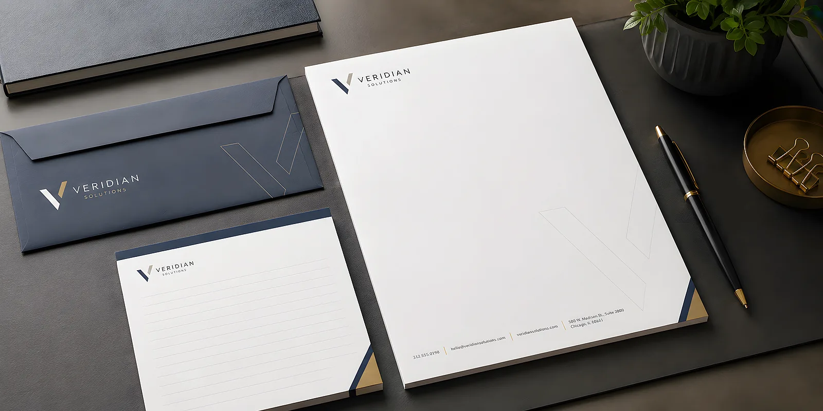
There are documents that practically demand a physical form - contracts, official letters, certificates, references. Here letterhead does something email cannot: it lends the content gravity. A letter with an elegant header, logo and company details is perceived as more credible than a plain sheet of text. It is still a strong signal in formal relations, especially in industries where trust matters - law firms, advisory companies, institutions.
Letterhead also comes in handy as a backing for an offer handed over in person. When a rep leaves a document on elegant paper rather than a home-printer printout on a plain sheet, the client reads it as a sign of care. Well-designed letterhead does not have to be richly ornamented - often a clean header, a subtle footer with details and well-chosen paper are enough to make the whole thing look serious.
Envelopes - the first impression before the letter is opened
The envelope tends to be the most underrated element of stationery, yet it is what reaches the recipient's hands first. A plain white envelope with a stamp disappears in the pile of mail. A company envelope with a logo and brand colours works as a preview - it signals that inside there is something prepared with the addressee in mind.
When an envelope truly works
A company envelope matters most where the contents are valuable: with invitations to industry events, mailings to key clients, welcome materials for new partners. In such situations the envelope builds anticipation before the recipient even reaches for the knife. It is worth ensuring its style - colour, logo placement, finish - matches the rest of the materials, because then the whole thing is perceived as thoughtful rather than gathered from various sources.
If you are sending an important mailing to a client, treat the envelope like a book cover - it decides the mindset with which the recipient opens the contents. The same graphic theme on the envelope and on the letter inside makes the whole thing look like one buttoned-up set.
Company notepads - a brand's presence without pushiness
Notepads are an element easy to forget, yet one that can be surprisingly effective. A company notepad at a meeting, in reception or on a client's desk is present without shouting - someone jots a note, a phone number, a reminder on it, and the brand incidentally stays in view. It is advertising that does not sell directly but fixes the name and logo in everyday situations.
- Note pads - a classic that works at meetings and in conference rooms. The client writes remarks on your paper and takes it with them.
- Reception pads - a small but noticeable accent that adds professionalism to the space where you welcome guests.
- Notepads as a small gift - left with the client after a meeting, they serve as a practical item that genuinely comes in handy.
A notepad's value comes precisely from its usefulness. A gadget that ends up in a drawer ceases to exist. A notepad someone uses reminds them of the brand every time they reach for a pen. Practical company notepads therefore work longer than many a striking but useless gift. It is worth remembering that the notepad's format matters too: a smaller one fits in a jacket pocket at a meeting, a larger one works on the desk during daily work. A well-chosen size means the notepad not only looks good but genuinely lands in the user's hand and stays there.
Coherence - what ties stationery into a whole
The biggest mistake is treating stationery as a collection of separate elements ordered along the way. Letterhead in one style, an envelope in another, a notepad in yet another - and the whole credibility effect blurs. Stationery works for the image only when it speaks one visual language.
So it is worth thinking of it as part of a larger set of company print - together with the business card, folder and offer materials. The same typeface, the same palette and a consistent logo mean each element strengthens the others. We write about using further brand carriers in a company in our post on stickers and labels in a company, and it is worth ordering stationery in the same theme as the business cards, so the whole set speaks one language. Stationery is easier to settle starting from its smallest piece - with business cards you choose gloss, matt or Soft Touch film, and that finish sets the tone you match the rest of the set to.
How to approach ordering stationery
Stationery is an investment that pays back over years, provided you plan it well. Instead of ordering everything at once and at random, it is worth arranging it in a sensible order.
- Start with visual identity - set the palette, logo and typeface that will be shared across all elements.
- Design letterhead as the base - it sets the tone for the rest of the stationery and is most often created first.
- Match envelopes and notepads to the same theme - so they form a set rather than a collection of mismatched print.
- Check the files before printing - if in doubt, our guide to preparing files will help you avoid typos and a shifted logo.
Does classic office stationery still matter? It does - only differently than before. It is no longer an everyday tool but a signal: that the company is organised, cares about details and takes relationships seriously. In a world where most communication is digital and fleeting, something well printed and tangible stands out precisely because it is rarer. And standing out is half the battle in business.