Picture a shelf with five versions of the same product standing side by side - different flavours, different colours, maybe a limited edition. The customer reaches for one, puts it back, picks up another. If, at that moment, they cannot tell at a glance which is which, part of their attention slips away. Good labelling of the series, edition and variant does the opposite - in half a second it tells the customer: this is the one you are looking for.
Labelling variants seems like a trifle as long as the product line is small. With two versions, a different box colour is enough. But as series multiply, seasonal editions, flavour variants and limited releases pile up - and without a coherent system it turns into a mess in which both the customer and the producer get lost. Below we show how to design labels so that the whole line is readable and every new variant slots into it effortlessly.
- Clear labelling rests on a few constants: the series name, the edition number, the variant colour and a recurring symbol.
- Colour is the fastest recognition key - assign one shade to one variant and stick to it across the whole line.
- Limited and numbered editions gain value when the number is visible and set within a coherent system.
- Stickers, bands and tags are flexible carriers of labels - you can differentiate variants with them without changing the whole packaging.
- The most important rule: one logic across the whole line - the same element always means the same thing.
What clear labelling is made of
Before you start designing, it is worth breaking labelling down into its parts. The customer does not analyse the label consciously - they catch several signals at once and decide based on them. The fewer of those signals they have to decode, the better. Good labelling usually stands on four legs.
- Series name - a word or short phrase that ties a group of products into one family. It builds the line's recognisability.
- Edition number or name - information about which iteration of the product the customer is dealing with. Especially important for seasonal and limited releases.
- Variant colour - the fastest visual signal. The customer does not read, they see, and immediately know which variant it is.
- Recurring symbol - a small icon, shape or mark that appears on every product in the line and acts like its signature.
Not every product needs all four elements at once. It is worth setting them at the start, though, because then adding another variant is just a matter of dropping a new value into a ready scheme, rather than inventing labelling from scratch.
Colour as the recognition key
Of all the signals, colour works fastest. Before the customer reads the flavour or variant name, their eye has already registered the shade and assigned it to a specific version. That is why colour is the strongest tool in labelling variants - provided you use it consistently.
The rule is simple: one shade to one variant, across the whole line, no exceptions. If green marks the mint version in one product, it cannot mean something else in the next. The customer quickly learns this code and starts using it without thinking - reaching for the green box because they know it is mint. Different substrates and finishes can also change how the same colour is perceived. We write more about this in our post on how printing technology affects a large area of solid colour - and with variants that differ precisely in shade, this is especially relevant.
Before you expand your variant palette, check whether the chosen colours also differ for someone who sees colours differently. Pairs such as red and green can be indistinguishable for some customers. Adding a second signal to colour - a symbol or a name - makes the system work for everyone.
Limited and numbered editions
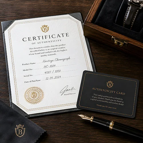
A limited edition plays by its own rules. Here labelling not only organises, it also builds a sense of exclusivity. A visible edition number tells the customer they are holding something that does not exist in unlimited quantity. An individual copy number is added afterwards by hand or with a stamp, because a print run comes out identical piece by piece. It is a small detail, yet it can genuinely raise the perceived value of the product.
For the number to make an impression, though, it has to be legible and set within a coherent system. It helps when it is immediately clear this is a special edition - a different colour accent, an extra symbol, a highlighted name. At the same time, despite that distinctiveness, the limited edition should still look like part of the family, not a completely alien product. It is a subtle balance: it should be recognisable as part of the line and, at the same time, exceptional.
Systems of codes and labels
When there really are many variants, colour and name alone stop being enough - a system of codes comes in handy. It can be a simple scheme in which the first segment marks the series, the second the variant and the third the edition. Such a code helps not only the customer, but above all you: when ordering, storing and restocking the range. What matters is that the code's logic is explicit and predictable, not random - then every new product itself points to how it should be labelled.
Stickers, bands and tags as carriers
Not every label has to be printed permanently into the packaging. It is often more convenient to differentiate variants with an element added on top - and here stickers, bands and tags work brilliantly. Their advantage is obvious: you can assign the same base packaging to many variants, changing only the carrier that bears the label. The most room for a variant name and a series code comes from square and rectangular stickers - you match the format to how many characters have to fit.
- Stickers - the most flexible. One box design, with the variant defined by a sticker in the right colour and with the right symbol. It is easy to add a new variant without touching the rest.
- Bands - a wrap around the product that immediately catches the eye. Great for marking a limited or seasonal edition, because it visually sets a copy apart from the standard version.
- Tags and hang tags - work well where the label is meant to carry a little more content than colour alone. A tag fits the series name, edition number and a short description of the variant.
With these elements it is worth taking care of the technical file preparation, so that colours and small symbols come out exactly as planned. The file preparation guide will help here, and if you are unsure about choosing the substrate for stickers or tags, take a look at the materials and papers section.
One logic across the whole line
You can have beautiful colours, clever codes and elegant bands and still lose the customer - if every product runs on slightly different logic. The secret of a good labelling system does not lie in a single idea, but in consistency. The same element must always mean the same thing across the whole line.
In practice this comes down to a few simple decisions. The edition number always in the same spot on the packaging. The colour always assigned to the same variant. The series symbol always in the same form. A customer who understands this logic once on one product carries it automatically to all the others - and that is exactly when the system starts working in your favour. The same coherence we write about when discussing how a marketing material can grab attention without photos applies to labelling too - a recurring, legible mark works harder than a striking but inconsistent graphic.
Where this proves its worth
Systematic labelling comes in handy wherever one product has many faces. In collections and themed series it organises the whole and helps the customer assemble a set. In seasonal editions it quickly signals that something is new or a limited version. In flavour and colour variants it lets the customer land on the one they are after without hesitation.
- Set the constants - series name, edition numbering method, colour-to-variant assignment and the line symbol.
- Choose the carrier - decide what bears the label: print in the packaging, a sticker, a band or a tag.
- Assign the colours - one shade to one variant, checked for distinguishability.
- Design the template - one layout in which you swap only the name, number and colour for each new variant.
- Stick to the logic - the same element always in the same place and with the same meaning.
Good labelling of series, editions and variants is not about each product shouting the loudest. It is about the whole line speaking one predictable language - which the customer learns once and uses effortlessly. Set the constants, repeat them consistently, and let the colour, number and symbol do the rest.