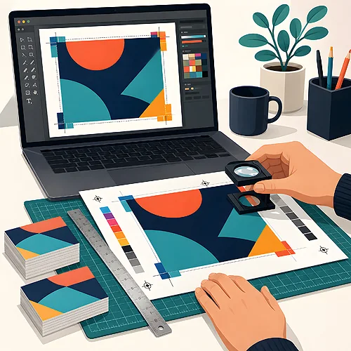
A large, solid patch of colour looks innocent in a project - a navy background under a logo, a deep red on a cover, a calm green across a whole poster. On screen it is perfectly smooth. On paper it is often the hardest fragment of the entire design, because it is precisely on a big flat area that streaks, unevenness and subtle shade differences show up most easily. The good news: a few conscious decisions are enough to make that patch come out even and deep.
You do not need to know printing presses to plan a project wisely. It is enough to understand why a large background is a challenge and what the result depends on - and then match the technology, paper and finish so they all pull in the same direction. Below we explain it in plain terms, step by step.
- A large, solid patch of colour reveals streaks, unevenness and shade differences most strongly - the eye catches them at once.
- For large print runs, offset usually gives a more even, more stable background; digital printing is convenient and cost-effective for smaller quantities.
- Paper matters enormously - coated stock holds colour more evenly than heavily absorbent uncoated paper.
- A matt finish forgives more than gloss, which highlights every streak and reflection.
- Rich black and thoughtful colour build-up give a deeper, fuller background than a single ink.
- A spot colour (Pantone) can give the most uniform result when the background is central to the brand.
Why a large background is a challenge
When colour covers a small fragment, any imperfections disappear among the other elements. On a large, empty surface there is nowhere to hide - the eye is handed one smooth area and instantly picks up any departure from evenness. That is the source of most problems people only notice on the finished print.
- Streaks and banding - faint lighter or darker bands across the background, caused by uneven ink laydown.
- Uneven coverage - spots where the colour seems thinner or more saturated, especially on absorbent paper.
- Visible joins - on very large formats, where the print is made up of fragments, the boundaries can be noticeable.
- Registration issues - if the colour is built from several inks, a minimal shift of one of them can leave a microscopic outline at the edges.
None of these is a verdict. They are simply the places where it is worth making decisions consciously, rather than hoping it turns out fine. The larger and more uniform the patch, the more attention it deserves at the design stage.
Digital or offset for large solids
This is the first fork that genuinely affects the evenness of the background. Both technologies can print large patches of colour, but they suit different situations - and it is worth deciding this before the project goes into production.
When offset
Offset lays down ink in a more controlled, repeatable way, so on large surfaces it usually gives a more even, more stable background. It is a good choice when you want a large print run and you want every copy to look the same. The larger the quantity, the more offset pays off and the more fully it shows its advantage on solid areas.
When digital printing
Digital printing is convenient and fast for smaller quantities - it needs no press preparation, so a small run can be more cost-effective. It works brilliantly for personalisation and short series. With large, solid backgrounds it is simply worth paying closer attention to the choice of paper and finish, which we come to shortly - these most often decide the final impression of evenness.
Not sure which technology will handle your background better? Give us the planned run and the type of project, and we will suggest what delivers a more even result. A large patch of colour is exactly the case where it is worth asking before printing - a correction after the fact costs far more than one question in advance.
The role of paper and finish
Technology is one thing, but what you print on and how you finish the surface can shift the perception of the background just as strongly. The paper decides how the ink settles, and the finish decides how the colour reflects light.
- Coated paper - has a closed, smoother surface, so the ink does not soak in unevenly. The result is usually more uniform and predictable on large solids.
- Uncoated paper - is absorbent and natural to the touch, but draws the ink in more, so a solid background can look less smooth. This is not a flaw - it is a matter of matching it to the project.
- Matt finish - scatters light and forgives a fair amount of small unevenness; streaks are less visible and a large patch looks calmer.
- Gloss finish - deepens and saturates the colour, but mercilessly highlights every streak, reflection and fingerprint on a dark background.
If your project is mainly a dark, solid background, matt will usually be the safer choice. Save gloss for projects where you want intensity of colour and are ready for the surface to be more demanding. You will find more about the stocks themselves on our materials and papers page, and how texture reacts to light is nicely shown in the post on how light works on metallic, pearl and textured papers.
Rich black, build-up and spot colour
The way you build the background colour itself has a surprisingly large effect on how deep and even it looks. This is the most technical part, but it can be told simply.
The most common example is black. A black background built from a single ink alone can look flat and greyish on a large surface. So-called rich black - black enriched with an addition of other colours underneath - gives a much deeper, fuller background. Conscious build-up of other dark shades works similarly - a touch of extra colour underneath makes the patch gain depth, rather than looking like a thin layer of ink.
When the background is the heart of the project and must be perfectly uniform - for example a company brand colour across an entire cover - offset printers sometimes reach for a spot colour, that is Pantone. We accept paper artwork in CMYK only; spot colour is available on CD screen printing. This is one specific ink mixed in advance, rather than a colour assembled from several inks on the press. As a result the background is exceptionally even and repeatable, with no risk of micro-shifts between inks. This solution is especially valued where a uniform colour on a large surface is key to the brand's image - and best of all, simply consult your specific project with us via the help section.
Designing with a bleed on the background
The last element is the file you prepare yourself. Even the best technology will not help if the background was not designed with production in mind. Two simple rules matter here.
- Extend the background to the bleed - the colour must run beyond the cut line by a few millimetres. That way, after trimming, no white strip appears at the edges, even if the knife shifts minimally.
- Keep coverage even across the whole file - build the background as one consistent colour, without on-screen-invisible gradients or overlays that can produce unevenness on paper.
- Keep important elements away from the edges - move the logo and text on a solid background away from the cut, so nothing important falls into the margin.
- Check the file before printing - if a large patch of colour is key, it is worth sending the project in for a look in advance.
If you want to be sure the file is ready, take a look at our guide on preparing files - you will find specific tips on bleeds and margins there. And when the project is ready to go, head straight to the print offer and choose a product.
A large patch of solid colour does not have to be a lottery. Choose the technology for the run, pick a paper and finish that forgive more, build the colour with depth and run the background to the bleed - and what looked good on screen will come out just as even and deep on paper. And if you have doubts about a specific project, simply ask: with large solids, one question before printing saves a lot of disappointment after it.