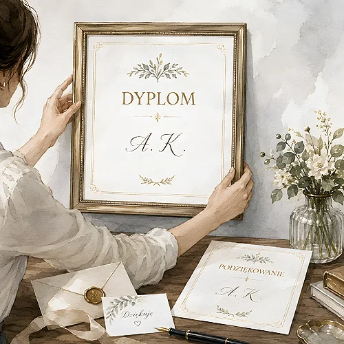
Decorative paper tells a story on its own. It has visible texture, a soft sheen or a distinct colour, so the design has to leave room for it. When both compete for attention, the result is noise.
What happens to a design on textured stock
On strongly textured paper small letters lose their crispness, because the edge of each stroke sits on an uneven surface. Large flat areas of colour come out less even than on a smooth sheet. Simple, sparing layouts with plenty of empty space gain, though - the material becomes part of the design rather than a backdrop.
- Less content - the richer the paper, the calmer the design should be.
- Larger lettering - small type on texture is harder to read.
- Careful with photographs - an image on textured stock loses detail and depth.
- Check the base colour - on cream and grey sheets bright shades go quiet.
When it is worth it
Metallic, pearl and textured papers shine where print is picked up and held: invitations, menu cards, folder covers, thank you notes. Light strikes at different angles, the material shifts and the whole thing feels more valuable than the design alone would suggest. They serve less well on leaflets carrying a long offer, or anywhere information has to be grasped quickly.
The safest route is to order a few versions of the same design and compare them in your hand. Paper is judged by touch, not by a photograph on a screen.