A certificate is one of the few printed pieces whose fate the recipient decides. Nobody throws it away straight away and nobody hangs it up automatically - the sheet sits on a desk for a day or two and then goes either onto a wall or into a drawer with the rest of the paperwork. That decision takes seconds, and it depends mostly on things you settle at the design stage.
It has very little to do with ornament. The certificates that genuinely hang in consulting rooms, training halls and behind the counters of small businesses are usually calmer graphically than the forgotten ones. They do have three things done properly: a legible name, a specific reason and a paper that can be picked up without feeling like a printout from the office machine. Below we go through those decisions one at a time.
- The recipient name is element number one - it should be the largest text after the heading.
- A specific reason and a date turn a decorative sheet into a document worth keeping.
- Paper does more here than graphics, which is why the Prestige version on decorative stocks genuinely earns its place.
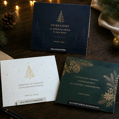
- A certificate and a thank-you card carry two different tones - do not swap them around.
- Choose a format that fits a standard frame, because that decides whether anyone will hang it at all.
What decides whether somebody hangs it up
The recipient looks at a certificate for a moment and subconsciously checks one thing: is this about me. If it is, the sheet stands a chance of reaching a wall. If it looks like a ready-made print with a name added at the end, it goes into a binder.
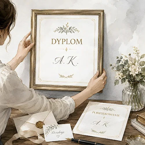
- First name and surname - set large and spelled correctly, with the full form of the surname and the right accented characters. These are the most important words on the whole sheet.
- A specific reason - not general appreciation, but exactly what for: completing a course, second place in a competition, ten years of service.
- Date and place - without them the certificate stops being a document and turns into decoration.
- A signature - with the name and role of the person giving it. An anonymous certificate carries no weight.
Decorative borders, ribbons and background patterns are extras. You may have them, but none of them will make anyone hang up a sheet on which they have to hunt for their own name.
The typography of the name, element number one
The most common mistake looks like this: an enormous heading at the top, an official formula in small type below it, and somewhere in the middle, at the same size, the name of the recipient. The effect is the opposite of the one intended - the loudest word is the one everybody already knows.
Reverse that hierarchy. The name should be the first thing you can read from two metres away. Give it a line of its own, more air around it and a noticeably larger type size than the rest. The formula can safely be reduced, because only the person concerned ever reads it, and only once. Remember long surnames and double first names too: the layout has to hold the longest name on your list on a single line. We wrote more about how personalisation changes the way print is received in our piece on personalised printing.
A handwritten signature or a scan
A signature added by hand works best, because you can see that somebody actually picked the sheet up. With a dozen certificates that is a quarter of an hour. With several hundred it becomes an organisational problem, and a printed signature makes more sense.
If you go for the printed version, scan the signature at high resolution from a white sheet rather than photographing it with a phone. A photograph brings in a greyish background and ragged edges, and both show up far more clearly in print than on screen.
Why paper does more here than graphics
A certificate gets picked up. It passes through the fingers of the recipient before it is even read, and that is why the stock decides the first impression more than the layout. The same composition on thin office paper and on a stiff decorative sheet are two different objects.
- The classic version - certificates in a calm, universal form. They work where legibility and repeatability matter most, for example across large training series.
- The eco version - natural and ecological papers with a visible texture and a warmer shade. They suit organisations, volunteering and brands that talk about the environment somewhere other than their advertising.
- The Prestige version - premium decorative stocks: pearlescent, metallised, felt-marked and structured. Here the effect comes from the paper itself, with no lamination involved.
Decorative paper has its own requirements. Texture and sheen can swallow small, thin lettering, and heavily coloured backgrounds behave differently on it than on coated stock. Before you pick the most spectacular structure, have a look at our piece on whether every design looks good on decorative paper.
On papers with a pronounced texture, avoid hairline rules and very small type. A thin line drops into the hollows of the structure and comes off the press looking ragged - this is the single most common source of disappointment with the Prestige version.
A certificate or a thank-you card
These are two different prints, even though they are often produced on the same day and for the same occasion. A certificate states a fact: somebody finished something, took a place, earned a title. Its tone is official and its layout symmetrical, because it is meant to look like a document.
A thank-you card is a gesture. It does not confirm an achievement, it expresses gratitude towards a sponsor, a volunteer, a partner or a customer. It can be warmer in tone, less symmetrical and written as a full sentence rather than an official formula. If you are looking for a ready-made form, have a look at our thank-you cards, which work well for smaller, more intimate occasions. The most frequent mistake is a thank-you written in the language of a certificate - a phrase along the lines of it is hereby certified that sounds cold and strips the gesture of its point.
Where certificates work outside school
Schools are the obvious case, but a good share of orders comes from companies and organisations for which a certificate solves a specific problem: how to close something off so that a trace of it remains.
- Competitions and tournaments - for a placing, and in younger age groups often for taking part at all.
- Training courses - proof of completion that the participant hangs in their treatment room or shows to clients.
- Volunteering and community projects - usually as a thank-you card, also addressed to the businesses that helped.
- Staff anniversaries - a round number of years, handed over in front of the team.
- Customer competitions - a simple way to give the winner something to hang up and show off.
Format, frame and the order of work
Here is the criterion people forget most often: if the certificate is meant to hang, somebody has to buy a frame for it. An unusual format means a made-to-measure frame, which in practice means no frame and a sheet in a drawer. Sticking to popular sizes is a simple way of making the decision easier for the recipient.
- Decide what exactly you are confirming - one sentence, before you open any design software.
- Choose a format that matches a frame available in shops rather than an idea for an unusual shape.
- Plan the hierarchy: name, reason, date, signature - in that order of importance.
- Match the paper to the standing of the occasion, not to whatever is left of the design budget.
- Check the longest name from your list inside the finished layout.
- Convert the type to curves, meaning to drawings of letters rather than editable text, so the decorative face carrying the name cannot be swapped for another one. You will find the rest of the requirements in our file preparation guide.
A certificate is cheap to produce and disproportionately strong in effect - provided you treat it as a document about one specific person rather than as a certificate in general. Set the name large, say plainly what it is for, choose a paper somebody will want to touch, and leave room for a signature. The rest will take care of itself, on a wall somewhere.