Some papers you want to touch before you even read them. A pearl sheen that shimmers in the light, delicate ribbing you can feel under your fingers, a texture like canvas or linen - decorative papers can turn ordinary print into something remembered for a long time. But they have a trap too: it is easy to overdo them. In this post we show how to use their charm without falling into excess.
- Metallic papers give a subtle, pearl sheen - a premium effect without shouting.
- Ribbing and texture add depth and a pleasure to touch.
- They work best where elegance matters: invitations, business cards, diplomas.
- The rule is simple: one strong effect instead of several at once.
- Paper should support the content, not compete with it.
How decorative papers differ
Metallic and pearl
Metallic paper carries a delicate, pearl sheen that changes with the angle of the light. It is not a loud glare like foil, but a subtle glow that makes a design look more expensive than it really is. It is ideal where you want to add a note of luxury without a single extra graphic element.
Ribbed
Ribbed papers have subtle, parallel lines you can feel under your fingers. They give an impression of order and class, a bit like a well-cut pinstripe suit. They look great in elegant and formal designs, where seriousness and solidity matter.
Textured
Here we enter the world of touch. The texture can resemble canvas, soft felt or a naturally rough sheet - in the Prestige lines these are ICEBLINK Kremowe płótno 250 g, MODIGLIANI and CHAGALL felt-finish 260 g, and RIVES Shetland Natural 250 and 350 g. These stocks engage the senses the most - the recipient feels the difference before they consciously notice it. Texture adds depth even to a very simple design.
Why they feel premium
The secret lies in touch. Our brain links unusual texture and sheen with something rare and valuable. When we pick up a material that is smoother, heavier or more expressive than an ordinary sheet, we take it more seriously at once. It works subconsciously, and that is why it is so effective.
Importantly, this effect comes from the paper itself, not from an excess of graphics. Often a clean design on a nice stock is enough to make the whole thing look elegant. If you want to understand better how the stock itself affects the look of print, read our post on how paper weight and types change print.
It is also worth remembering that decorative paper takes colours differently from a plain one. A metallic stock can gently warm the colours and add depth to them, but strongly saturated backgrounds will come out darker on it than they look on screen. That is why, with such papers, it is best to go for calm colours and plenty of empty space - then the material does the work and the design simply keeps it company.
The best decorative paper is the one that needs no explanation. It is enough for someone to pick it up, and they already know they are holding something special.
Where they work best
Decorative papers like occasions that are important in themselves. These are materials meant to stay with the recipient for longer or appear at a special moment.
- Invitations - weddings, anniversaries, company events. Here a pearl sheen or a texture builds the mood before the envelope is even opened. They work beautifully on elegant Prestige single-card invitations, where all the attention rests on one beautiful card.
- Elegant business cards - a metallic or ribbed stock makes a card stand out in a wallet full of ordinary ones. See how it looks on Prestige business cards.
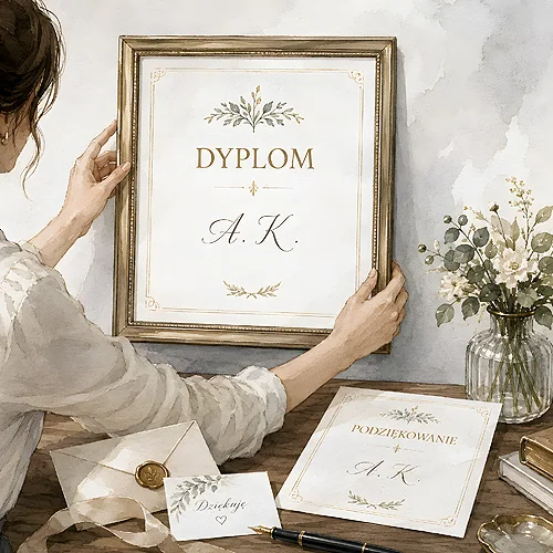
- Diplomas and thank-you cards - texture adds gravity and makes a document worth framing and hanging. You will find the same stocks on Prestige diplomas.
When ordering on decorative paper, check the full name and weight of the stock in the calculator - for example STARDREAM OPAL pearl 285 g or MODIGLIANI felt-finish 260 g. The exact name tells you more than a photo on a screen. Sheen and texture must be felt in the hand - on screen they never look as they truly are.
How not to overdo it: less is more
Now for the most important part. Decorative papers are like strong perfume - a touch delights, an excess overwhelms. The most common mistake is wanting to combine everything at once: a metallic stock, plus embossing, gilding, varnish and a colourful graphic on top. The result? Instead of elegance you get a fairground.
One strong effect instead of several
Choose one thing that is meant to impress and let it resonate. If you go for pearl paper, keep the design on it calm and clean. If you want a bold texture, skip the extra decoration. One hero per design - a simple rule that rescues almost any idea.
Matching the content
Paper should support the message, not fight it. A metallic sheen suits an invitation to a formal gala beautifully, but not necessarily a flyer with practical information. Before choosing an eye-catching stock, ask yourself whether it fits the character of what you want to say. Elegant paper on a plain announcement looks just as odd as a tracksuit at a ball.
It is also worth thinking about where the material will end up and how long it is meant to last. Texture and sheen make the most sense where someone will pick the print up and look at it closely - within arm's reach, at a table, at ease. On a material that only flashes by from a distance, subtle effects will get lost anyway, so there is no point wasting them there.
If you hesitate between two effects, choose the more subtle one. A delicate sheen or a light texture almost always looks more classic than a strong, showy decoration.
Decorative or plain paper? A matter of taste
Not every design needs a decorative paper - and that is fine. Sometimes a clean, good standard paper will be a better choice than an eye-catching stock used by force. The whole art is in sensing when it is worth reaching for something special and when to let it go. If you want to compare the options, our post on choosing standard, eco or decorative paper will help.
Decorative papers are a beautiful tool, but they work best in the hands of someone who knows when to stop. One consciously chosen effect, matched to the content and the occasion, can make a bigger impression than a whole palette of decorations. And if you are unsure which paper will be perfect for your design, we will gladly advise - we print with passion and love it when the result truly delights.